As an Amazon Associate, I earn from qualifying purchases at no extra cost to you.
13 Repainting Kitchen Cabinet Ideas (That Upgrade Rooms Fast)
 ByRayan

Since I spent years staring at dingy, honey oak cabinets, I know the pain of a tired kitchen. You want a change, you need a change, but you feel stuck. My kitchen used to look like a dusty relic from a bad movie set. I finally bit the bullet, grabbed a brush, and learned the hard way that paint is pure magic.
Most people think buying new cabinets is the only way to fix an old room. That is flat out wrong, and it is a massive waste of your hard earned cash. You are just looking at a simple update, not a full renovation, so do not let anyone tell you otherwise. Forget the stress, ignore the pricey contractors, and let us just get to work.
You will learn how to pick the right paint, prep the doors correctly, and avoid the amateur mistakes that lead to peeling. I will show you how to choose colors that actually look good, not just trendy, and how to get a finish that feels like a factory job. My goal is simple, I want you to finish this job and feel like a pro.
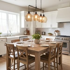
1. Classic White for Brightness
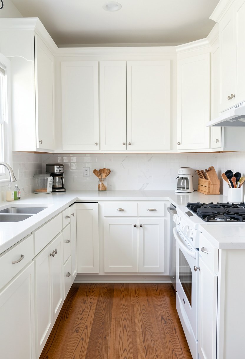
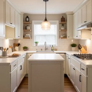
White paint is the king of kitchen upgrades, and for good reason, it works every single time. Stop listening to people who claim white is boring, because they are clearly tired of a room that feels like a clean, open space. If your kitchen is small, white cabinets will make the walls seem to disappear, and that makes the whole area feel twice as big.
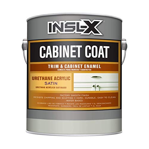
Picking the right white is harder than it looks, though, because some whites look yellow and others look like a hospital room. Go for a crisp, neutral white, and test a sample on your actual doors before you buy a gallon. Do not just grab the first can you see at the store, because that is a classic rookie move. I suggest a satin finish, it cleans easy, and it hides small bumps better than a flat paint.
Take your time with the edges, use a smooth roller, and keep your coats thin to avoid drips. A thick glob of paint looks cheap, and once it dries, it is a nightmare to sand down. You want a finish that looks soft, clean, and intentional. When you nail the shade, the entire kitchen will feel like a brand new home, and you will never miss that old wood.
- White paint creates a massive sense of space.
- Choose a neutral white to avoid yellow undertones.
- A satin finish is best for cleaning and durability.
- Thin coats prevent the ugly drips of cheap paint.
2. Deep Navy for Drama
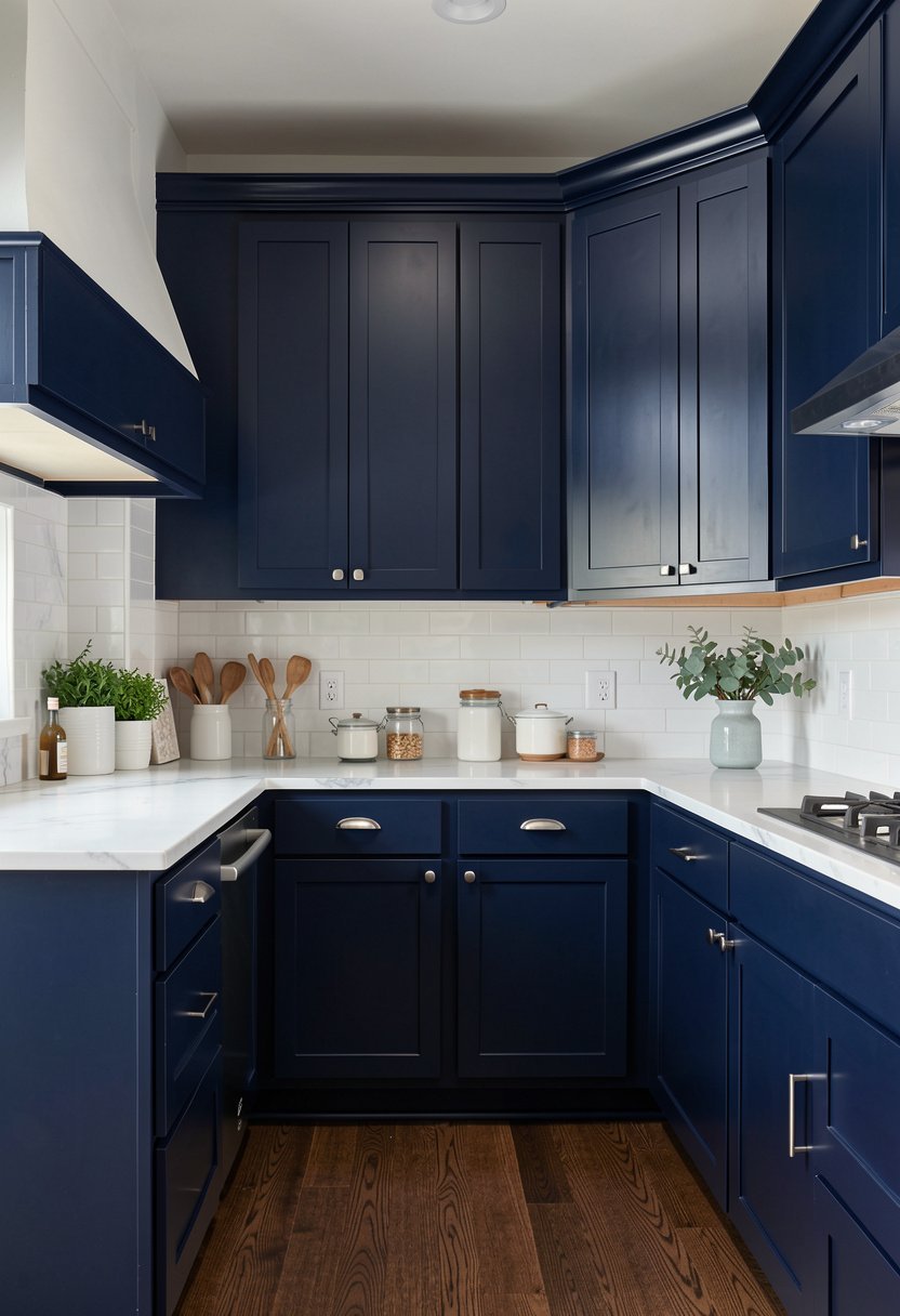
Dark blue is for people who want a kitchen with real punch, and I absolutely love it. If you want to make a statement, navy is the way to go, and it hides kitchen messes better than almost any other color. Some people worry that dark paint makes a room feel like a cave, but that is only true if your lights are bad. Add some under cabinet lights, and watch the room transform into something elegant.
You need to prime your cabinets properly before you go dark, or the old wood grain will show through. I use a heavy duty primer, two coats if I can, and it makes the blue look rich and solid. Do not skip the sanding part, because paint will not stick to a glossy finish, and you will be back here in a month fixing chips. It is a bit of work, but the result is worth the sweat.
Navy pairs perfectly with gold hardware, and it looks expensive even if you bought the pulls at a discount store. People will walk in and think you spent a fortune on custom work. It is a bold look, it stands out, and it shows you have taste. Just be ready for everyone to ask for your secret, because a navy kitchen always draws a crowd.
- Navy hides stains and kitchen splatters perfectly.
- Dark cabinets need excellent lighting to pop.
- Always prime the surface to block old stains.
- Gold hardware brings out the richness of blue.

3. Sage Green for Soft Calm
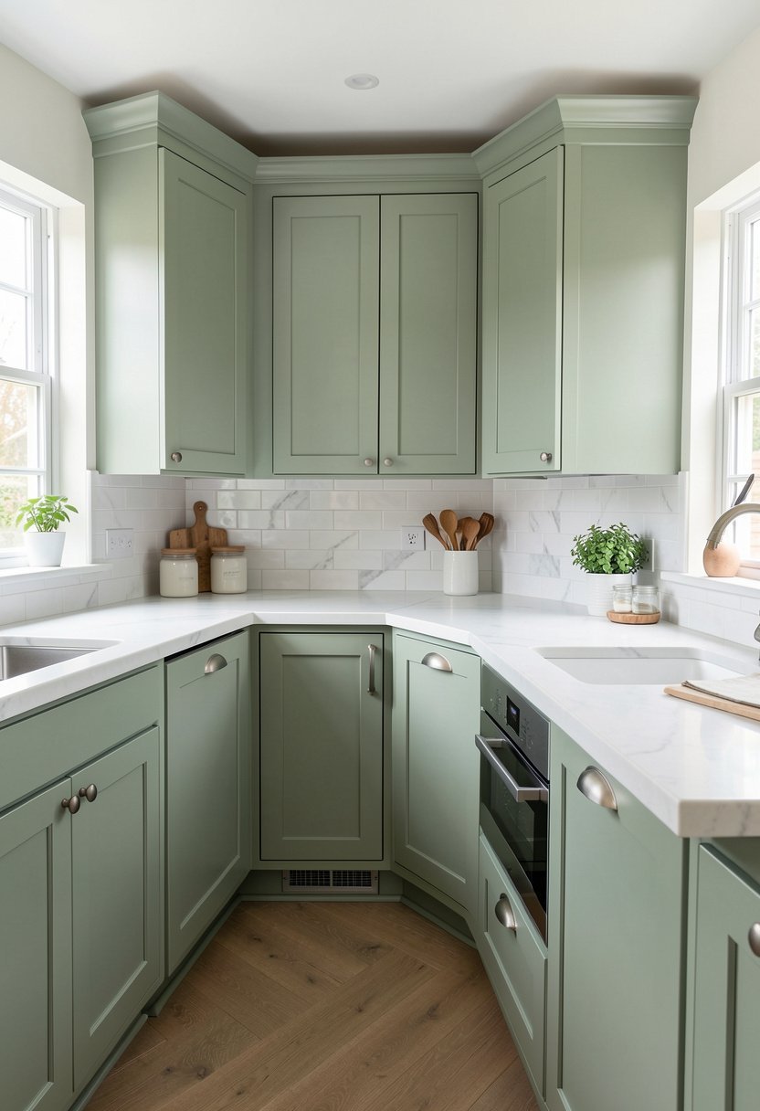
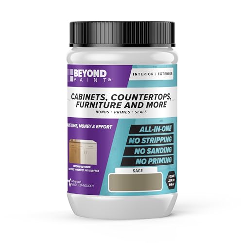
If you want a space that feels like a breath of fresh air, sage green is your best friend. It is not too bright, it is not too dark, and it manages to feel trendy without looking dated. I painted my own island this color, and it immediately changed the mood of the room. It feels grounded, peaceful, and surprisingly natural, especially if you have a few plants nearby to tie it all together.
You should consider how the light hits your kitchen during the day before you pick your green. If you have lots of windows, a lighter green is fantastic, but a darker, earthier sage works well in a kitchen with less natural sun. Do not fall for the neon green samples, as they will look like a science experiment on your cabinets. Keep the tone muted, and you will have a timeless, cozy kitchen vibe.
Green is a flexible color, so it looks great with wood floors or even modern tile. I like to keep my counters clean when I use green, because the color does the talking for me. It is a sophisticated choice that feels warm and welcoming to anyone who walks in. If you want a kitchen that does not feel like a cold showroom, this is definitely the color to pick.
- Sage green offers a calm and peaceful aesthetic.
- Match the green shade to your natural lighting.
- Avoid neon tones to keep the look sophisticated.
- This color works well with many different floors.
4. Black for Modern Edge
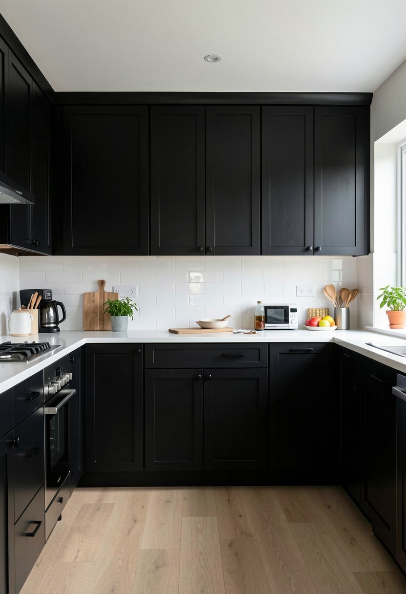
Black cabinets are the ultimate power move, and I think everyone should try them at least once. People get scared of black because they think it is too harsh, but that is nonsense. When you balance it with light countertops and white walls, the result is incredibly sharp and clean. It is the best way to get a modern, high end look without spending a single penny on expensive new cabinets.
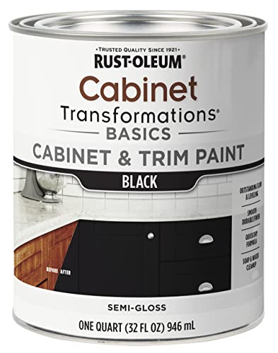
You must choose a high quality paint for black, or it will look like a chalky nightmare. I only use an enamel paint that cures into a hard shell, because it holds up to the banging of pots and pans. Do not rush the drying time between coats, and make sure your room is well ventilated, because black paint can be strong. If you follow the rules, your kitchen will look like it belongs in a magazine.
Black looks best with minimalist hardware, so keep the pulls simple and thin. You do not need fancy, busy designs when your cabinets are doing all the heavy lifting. It is a moody, dramatic choice that makes the rest of your decor look more expensive, too. My kitchen feels like a chic studio now, and I honestly think I can never go back to lighter colors again.
- Black adds a bold and modern edge instantly.
- Use enamel paint for a durable, hard finish.
- Balance the look with light walls and counters.
- Keep hardware simple to match the sleek vibe.
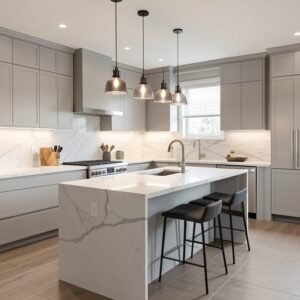
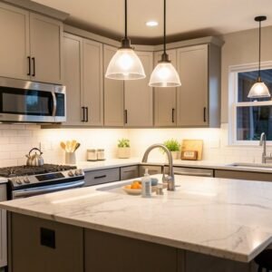
5. Gray for Neutral Style
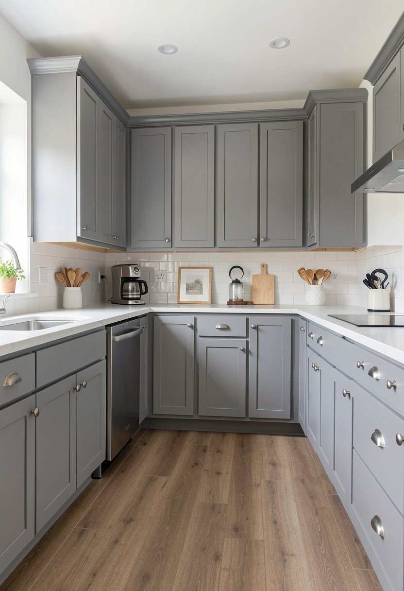
Gray is the safe, reliable choice that never really goes out of style, and it is a massive step up from plain, yellowing wood. If you cannot decide on a bold color, go with a nice, cool gray. It bridges the gap between white and black perfectly, and it is almost impossible to mess up. I have seen hundreds of gray kitchens, and they always look clean, organized, and very well put together.
The trick is to find a gray that does not look like cold concrete. You want a gray with a hint of warmth, maybe a bit of brown or blue undertone, so it feels like a home instead of a hallway. I suggest you grab three different gray samples and look at them at different times of the day. A gray that looks great at noon might look sad and dark at night, so keep an eye on it.
Gray acts like a blank canvas for your art and rugs. You can change your kitchen accessories every season without worrying about clashing with your cabinets. It is a low risk, high reward project that makes your home feel brand new. If you are nervous about painting for the first time, start here. You will get a professional result without any of the panic or second guessing.
- Gray is a timeless and very safe choice.
- Avoid concrete tones by picking warmer grays.
- Test samples during different times of the day.
- Neutral cabinets allow for easy decor changes.

✅ See Also: 11 Rustic Farmhouse Kitchen Cabinet Ideas
6. Two Tone for Depth
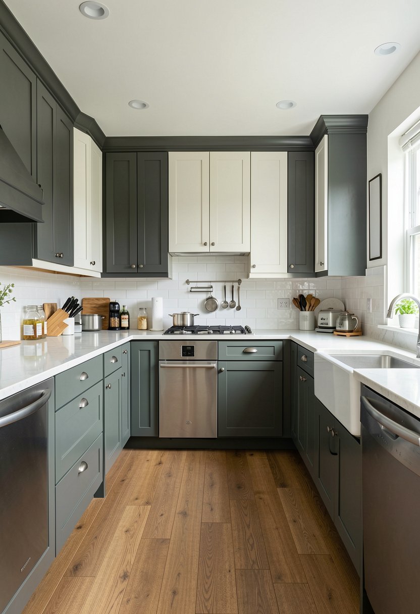
Two tone kitchens are my favorite way to keep a room from feeling flat and predictable. Paint the bottom cabinets a dark color, maybe charcoal or navy, and keep the upper cabinets a crisp, bright white. It keeps the heavy color grounded at the floor level and keeps the top of your room feeling airy. I did this in my last house, and it really opened up the space in a surprising way.
You do not need to be a designer to get this right, just pick two colors that belong in the same family. If you pick a cool blue for the bottom, pick a cool white for the top. Do not try to force two warm tones together, or the contrast will look messy and disjointed. Take a second to look at the room as one big picture, and if it feels balanced, you are on the right path.
The best part of this idea is that it breaks up the wall of cabinets. A sea of uniform doors can feel very repetitive, but two tones add immediate character. It is an easy way to hide dirt on the lower cabinets while keeping the kitchen bright at eye level. This is a smart, stylish move that always gets compliments, and it makes you look like a total decor expert.
- Two tone setups add depth to any kitchen.
- Place dark colors on the bottom for grounding.
- Use matching color families for a better look.
- This style breaks up visual boredom effectively.

7. Moody Charcoal for Texture
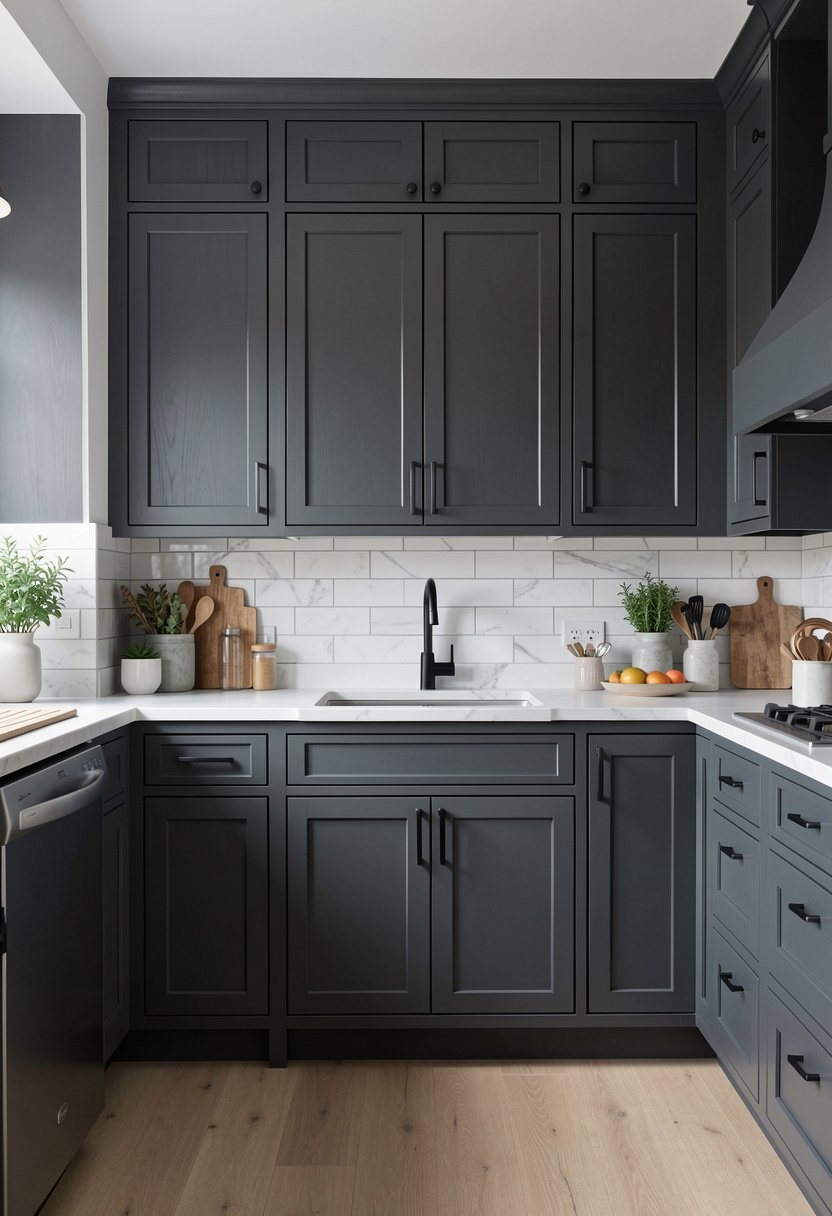
Charcoal is not quite black, but it has all the depth and drama you could ever want. It feels softer on the eyes than jet black, and it looks beautiful in almost any lighting. When I switched to charcoal, my kitchen suddenly felt much more intentional and curated. It is a fantastic option if you want to hide the occasional bump or scratch, as the matte finish absorbs light rather than reflecting it.
You need to pay attention to your walls when you go this dark. If you paint your walls the same charcoal color, you get a seamless, immersive look that feels very expensive. If you prefer contrast, stick to a bright, stark white wall to make the cabinets pop. Both ways look great, but you should commit to one or the other early on. Don’t leave it to chance as you go.
Charcoal is a great choice for kitchens with lots of stainless steel. The metal shines against the dark paint, and it creates a clean, industrial vibe that feels very modern. Just make sure you add some wood elements, maybe some cutting boards or a stool, to keep the space from feeling too sterile. It is a sophisticated, grown up look that will last for years without ever needing a refresh.
- Charcoal provides drama without being too harsh.
- Match walls to cabinets for a seamless feel.
- Stainless steel looks amazing against dark gray.
- Add wood accents to warm up the dark tone.

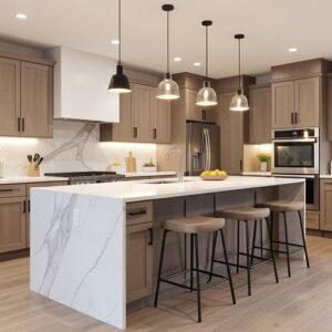
8. Cream for Warmth
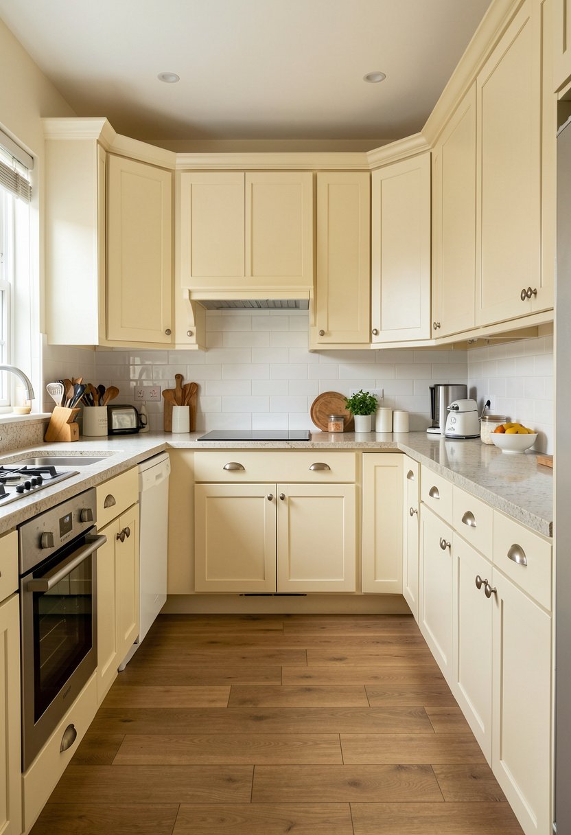
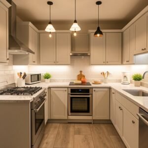
If you think white is too cold, then creamy off white is your perfect answer. It brings a gentle, buttery warmth to the room that makes everyone feel right at home. I used a warm cream in a kitchen that had zero natural light, and it honestly saved the space. It is much more forgiving than bright white, and it makes older hardware look intentional rather than just outdated and dusty.
The biggest mistake people make with cream is choosing a yellow that looks like buttered toast. Avoid anything that looks even slightly like egg yolk, or your kitchen will look like it has not been cleaned since the eighties. Stick to the softest, lightest cream you can find. It should look white until you put it right next to a piece of pure white paper, and then the creamy tint appears.
Cream is incredibly easy to style because it loves natural textures. Use rattan baskets, wood bowls, and linen towels to really play up that soft, organic feeling. This color is timeless, and it is a classic for a reason. You will never walk into a cream kitchen and think it looks dated or silly. It is warm, inviting, and arguably the most comfortable color for a busy family kitchen.
- Creamy white brings warmth to any dark space.
- Choose subtle shades to avoid a yellow mess.
- Cream works beautifully with natural textures.
- This color choice is timeless and very inviting.

9. Soft Blue for Calm
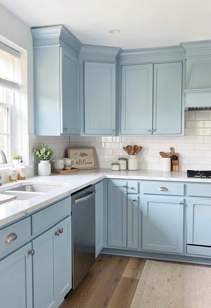
Soft blue is the perfect choice if you want your kitchen to feel like a spa. It is gentle, soothing, and it brings a unique color into the room without being overwhelming. I remember painting my cabinets a light, dusty blue and feeling an immediate sense of calm every time I walked in for coffee. It is a great alternative to the standard white or gray, especially if you have a busy life.
You need to be careful with blue because it can lean very bright if you are not paying attention. Aim for a blue with a hint of gray, what people often call a slate or powder blue. This keeps the look sophisticated rather than feeling like a children’s play area. If you go too bright, you will regret it, so always test your paint on a scrap board before you touch a single cabinet door.
Blue looks wonderful with silver or polished nickel hardware. It is a light, clean look that makes the whole kitchen feel airy and open. I like to keep my counters simple when I use this color, maybe just some white marble or light wood. It is a fresh, modern choice that makes your home feel like a peaceful getaway. You will definitely enjoy your morning routine more with this color.
- Soft blue creates a soothing, spa like feel.
- Pick a blue with gray to keep it mature.
- Test colors carefully to avoid bright mistakes.
- Silver hardware pairs best with soft blue tones.

10. Taupe for Earthy Style
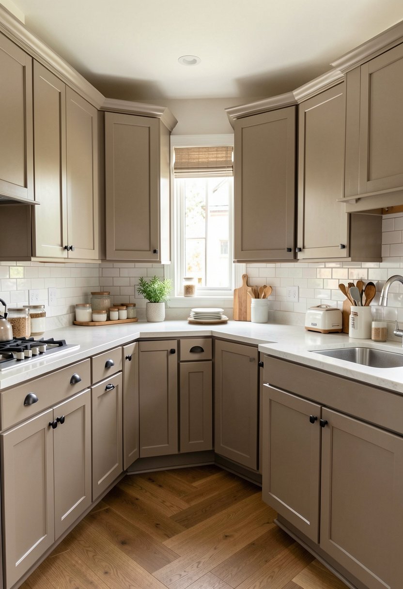
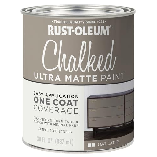
Taupe is the secret weapon of the design world, and I am surprised more people do not use it. It is that perfect mix of gray and brown, and it feels incredibly earthy and grounded. My kitchen felt like a cold box until I switched to taupe, and now it feels like the heart of the home. It is warm, neutral, and it hides dust and crumbs better than almost any other color I know.
Do not think of taupe as boring, because it has so much depth depending on the light. It changes throughout the day, looking a bit cooler in the morning and much warmer in the evening. It pairs exceptionally well with brass or antique bronze hardware, creating a vintage look that feels very high end. This is a great choice if you have a lot of wood floors or brick in your kitchen.
If you have a small kitchen, taupe is a great way to add color without shrinking the room. It feels like a neutral but adds so much more personality than white or gray. You can easily layer other colors like terracotta or forest green against it, too. It is a versatile, stylish color that shows you have put thought into your space. Trust me, it is a total winner.
- Taupe is a perfect mix of gray and brown.
- It works well with brass or antique bronze.
- The color changes beautifully with the lighting.
- Taupe is versatile and hides dirt very easily.
11. Custom Color for Unique Flair
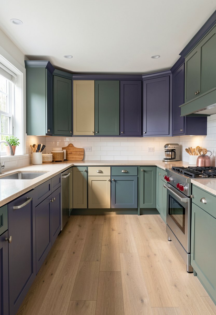
Sometimes you just need to be brave and go with a color that makes you happy. Whether it is a deep plum or a soft terracotta, a custom color gives your kitchen personality that nobody else has. I once painted a kitchen a dusty, muted berry, and I was nervous, but it turned out to be my favorite room ever. Do not be afraid to step away from the crowd and pick something that reflects you.
You need to be sure about your choice, though, because custom colors are harder to touch up later. I always order an extra quart just in case I drop a bowl or scratch a door down the road. If you are picking a bold, custom shade, keep the rest of your kitchen simple. Let the cabinets be the star, and keep your tiles and counters neutral to make sure the room stays balanced.
A custom color is the fastest way to make a generic kitchen look like a custom design. People will assume you paid for a luxury renovation because the color is so specific. It is a bold move, but if you love the color, that is all that matters. Stop worrying about what a buyer might think ten years from now, and just enjoy your home exactly the way you want it today.
- Custom colors give your kitchen unique character.
- Keep the rest of the room neutral for balance.
- Always buy extra paint for future touch ups.
- Don’t worry about resale, focus on your joy.

12. Matte Finish for Texture
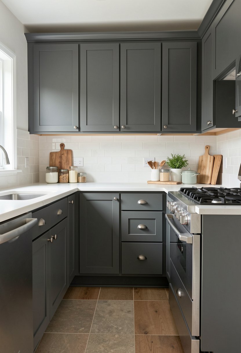
Forget everything you know about shiny, plastic looking cabinets. Matte paint is the current gold standard, and it looks much more expensive than the high gloss stuff. I changed my cabinets to a matte finish, and the whole kitchen immediately looked softer and more high end. It hides imperfections in the wood, and it does not show fingerprints as much as you would expect, which is a huge win for me.
You need to look for a paint labeled as matte or flat enamel to get this look. Do not buy wall paint, because it is not strong enough for cabinets and will turn into a sticky mess. You want a durable product that is built for high traffic. I apply it with a high quality brush and a small foam roller to get that perfectly smooth, chalky look that feels so luxurious and professional.
Matte finish works with any color, but it looks especially striking in dark tones like black or charcoal. It adds a sophisticated depth to the cabinets that makes the light fall differently across the doors. If you have been struggling with a dated, shiny kitchen, this is the easiest way to make it look current. It is a simple, smart change that elevates your entire home in one weekend.
- Matte paint creates a high end, luxury look.
- Use enamel formulas for durability and strength.
- Matte finishes help hide dents and scratches.
- The texture feels sophisticated and very modern.

13. Distressed Look for Charm
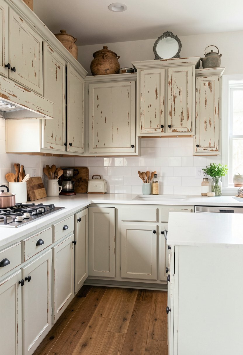
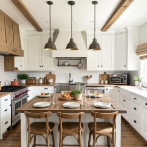
If you want a farmhouse or rustic vibe, a light, distressed paint job is a fun way to do it. You paint the cabinets, let them dry, and then lightly sand the edges to show the wood underneath. It adds character to a plain kitchen, and it is honestly a very forgiving way to paint. If you mess up a spot, you just call it part of the charm. It is stress free, creative, and looks great.
You must be careful not to overdo it, because too much sanding makes it look like you ruined your cabinets instead of styling them. Stick to the corners and the edges where a door would naturally wear down over time. I suggest starting slow, standing back to look, and only adding more if you really need it. You can always take off more paint, but you cannot put it back on easily.
This style is perfect for kitchens that feel a bit too polished. It adds a lived in, cozy feel that makes guests want to hang out and have a coffee. If you are tired of a sterile kitchen, this is the best way to inject some soul and history into the room. It is a quick, inexpensive upgrade that turns a boring space into a welcoming, rustic kitchen retreat.
- Distressed finishes add soul and cozy charm.
- Focus sanding on natural wear areas like edges.
- Start slow to avoid taking too much paint off.
- This style hides imperfections with total ease.

Final Thoughts
I hope you feel ready to grab that brush and change your space. Painting cabinets is the fastest way to get a new kitchen without a huge bill. It takes some patience and a steady hand, but the results are totally worth the effort. Do not let the prep work scare you off, just take it one cabinet at a time. I know you’ve got this.
| Kitchen Paint Idea | Style Vibe | Difficulty Level |
|---|---|---|
| Classic White | Open | Medium |
| Deep Navy | Dramatic | Hard |
| Sage Green | Calm | Medium |
| Black | Modern | Hard |
| Gray | Neutral | Easy |
| Two Tone | Creative | Hard |
| Charcoal | Moody | Hard |
| Cream | Warm | Easy |
| Soft Blue | Spa | Medium |
| Taupe | Earthy | Easy |
| Custom Color | Unique | Medium |
| Matte Finish | Luxury | Medium |
| Distressed | Farmhouse | Easy |
| Priming Surface | Essential | Easy |
| Sanding Edges | Essential | Medium |
Frequently Asked Questions (FAQs)
Is Painting Kitchen Cabinets a Permanent Solution?
No, it is not permanent like a stone countertop, but it lasts for years if you do it right. You should use a high quality enamel paint that dries into a hard shell. If you prep your surfaces well, you will not have issues with peeling.
Can I Paint My Cabinets Without Taking Them Off?
You can, but I highly recommend taking the doors off. It is much easier to paint a flat surface than a vertical one. If you keep them on, you will almost certainly get drips, and you cannot paint the edges perfectly.
Are There Specific Paints I Should Avoid Using?
Do not use cheap latex paint meant for living room walls. It is too soft for a kitchen and will feel sticky for months. Always buy cabinet specific paint that resists grease and moisture. It is worth the extra few dollars.
Do I Really Need to Sand the Cabinets First?
Yes, you absolutely do. If you skip the sander, the paint will sit on top of the old finish and chip off within weeks. You only need to scuff the surface to make it dull, not strip it all the way down.
Should I Use a Brush or a Roller for Painting?
Use both. Use a high quality brush for the edges, grooves, and corners where a roller cannot reach. Use a small, dense foam roller for the large, flat panels. This combination gives you the smoothest finish possible without streaks.
Will Dark Colors Make My Small Kitchen Feel Tiny?
Not if you have good lighting. Dark cabinets can actually add depth and make a small space feel more interesting. Just ensure you have bright overhead lights and maybe some under cabinet lighting to keep the room from feeling closed.
Can I Paint Over Laminate or Thermofoil Cabinets?
Yes, but you need a very strong bonding primer. Laminate is very smooth, so the paint will slide right off without a good primer. If the thermofoil is peeling, you should fix or remove those loose areas before painting.
Will the Paint Smell Stay in My Kitchen for Long?
It depends on the paint. If you use a water based enamel, the smell usually clears up in a day or two. Open your windows, use a fan, and the air will be clean quickly. It is not a forever smell.