As an Amazon Associate, I earn from qualifying purchases at no extra cost to you.
12 Red Kitchen Cabinet Ideas (You’ll Wish You Knew Sooner)
 ByRayan

You might think red cabinets are just for loud, tacky diners, but you are wrong. People usually run from bold colors because they fear making a mess, but they actually end up with a boring, beige kitchen that puts everyone to sleep. I have seen so many people waste money on gray paint just to play it safe, and I am tired of it. It is time to stop being scared of your own house.
I once painted my old, beat-up kitchen cabinets a deep, rich shade of cherry red, and it changed my whole life. The room went from a sad box to a space with real heart, warmth, and soul. It was like finally turning the lights on in a dark room. Today, I am going to share 12 red kitchen cabinet ideas that prove you can be bold, classy, and happy all at once.
We will talk about picking the right shade, pairing it with tiles, and balancing the look so it does not feel too much. You will learn how to make red work for you, even if you keep your walls light, clean, and simple. Stop following the crowd, stop picking safe colors, and let us get to work.
Deep Burgundy for a Classy Look
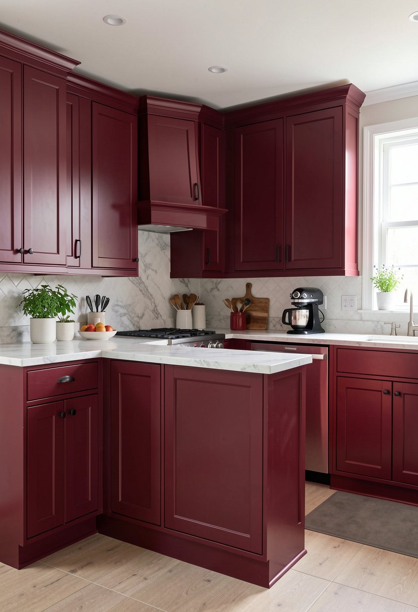
If you want red but fear it might look like a toy, go for deep burgundy. This color is dark, moody, and feels like a warm hug on a cold night. I have tried light reds, but they feel cheap, while burgundy feels expensive. It hides dirt better than white, which is a total win in my book.
People often make the mistake of pairing dark cabinets with dark floors, and that is a bad idea. Keep your floors light, like oak or white tile, so the room stays open. If you have low ceilings, skip the dark walls and keep them white. This gives the eye somewhere to rest while the red cabinets do all the heavy lifting.
Go get some sample swatches, tape them up, and watch how they look at night. Do not trust the little paint chip, ever. Trust the wall.
- Choose a matte finish to reduce glare.
- Use light floors to balance the dark tone.
- Avoid dark paint colors on your kitchen walls.
- Pick high quality brass hardware for a pop.

Bright Cherry for a Fun Vibe
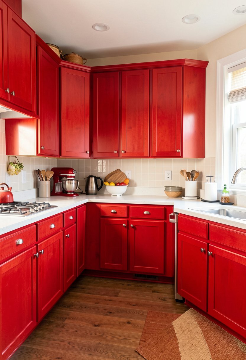
Sometimes you just need to have a little fun with your space, and cherry red is the way to do it. This shade is loud, proud, and pulls you into the room the second you walk through the door. I used this in a tiny apartment once, and it made the whole kitchen feel like a party. It is not for the shy, but it is for the brave.
Most folks try to pair this with black, but that makes it look like a scary circus. Please, do not do that. Pair your cherry cabinets with crisp white counters and stainless steel appliances instead. It keeps everything fresh, clean, and modern, which is exactly what you want for a small, busy kitchen area.
Take a risk, paint the cabinets, and enjoy the energy. You only live once, so why live in a beige house?
- Pick a glossy finish for a retro feel.
- Keep your countertops white and very clean.
- Use silver handles to keep the look modern.
- Add white lighting to make the red shine.

✅ Also Read: 12 Pink Kitchen Cabinet Ideas (Anyone Can Copy)
Red and White for a Fresh Start
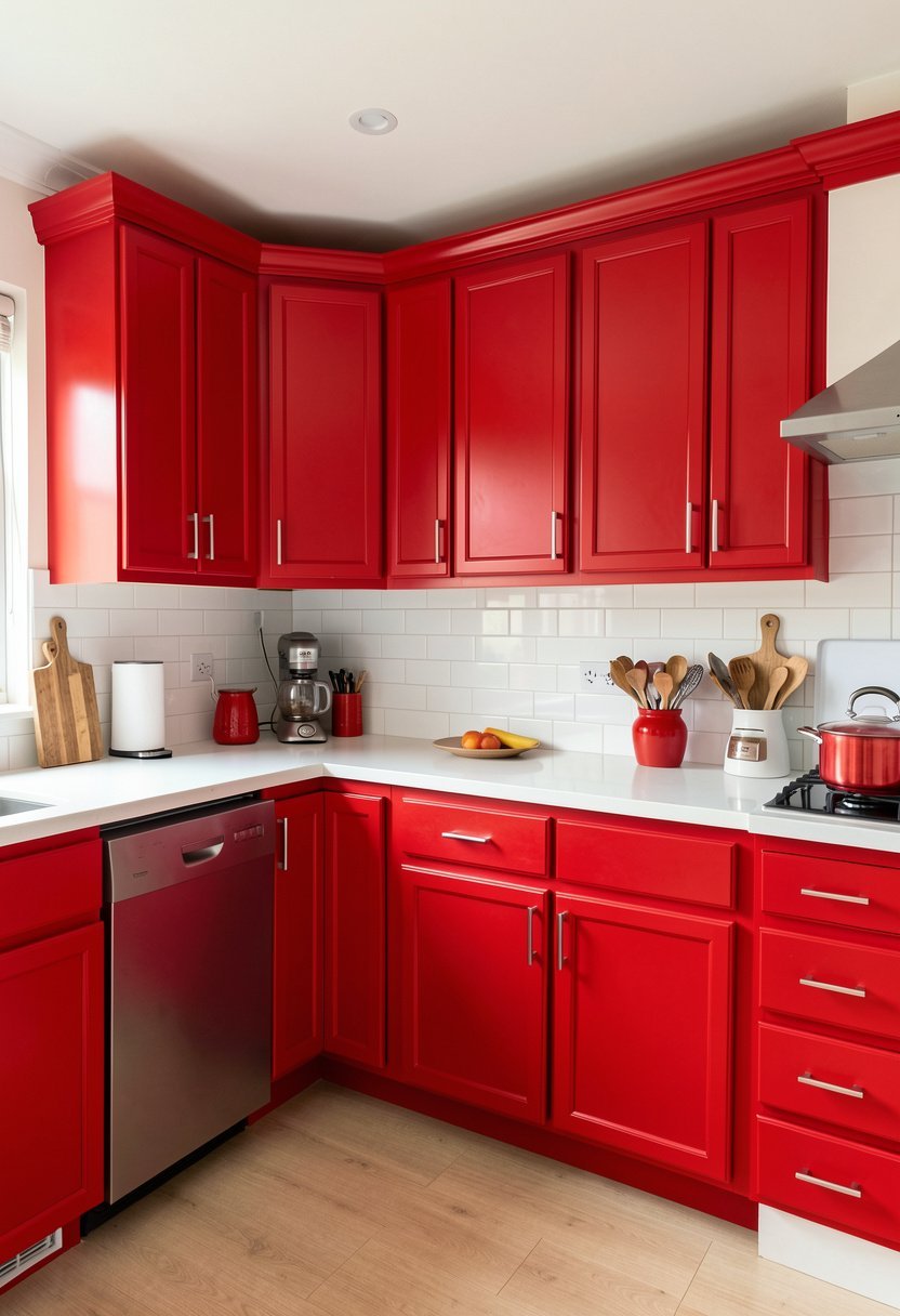
You can never go wrong with a classic, two-tone look using red and white. I used red for my base cabinets and white for my upper cabinets, and it works every time. It breaks up the color, keeps the room from feeling heavy, and makes the ceiling feel a bit taller. It is a foolproof way to play with style.
Forget those people who say you need to match everything perfectly. Mixing white cabinets with red ones creates a natural balance that feels custom and thoughtful. You can even add a fun rug with a hint of red to tie the whole kitchen together. It looks like a designer did it, but it is actually a very easy hack.
Try this if you want red without the total commitment. It is the best way to dip your toes into bold color.
- Use red for the bottom cabinets only.
- Put white cabinets up high for balance.
- Use a white backsplash to keep things light.
- Add wood shelves to warm up the space.

Farmhouse Red with a Distressed Finish
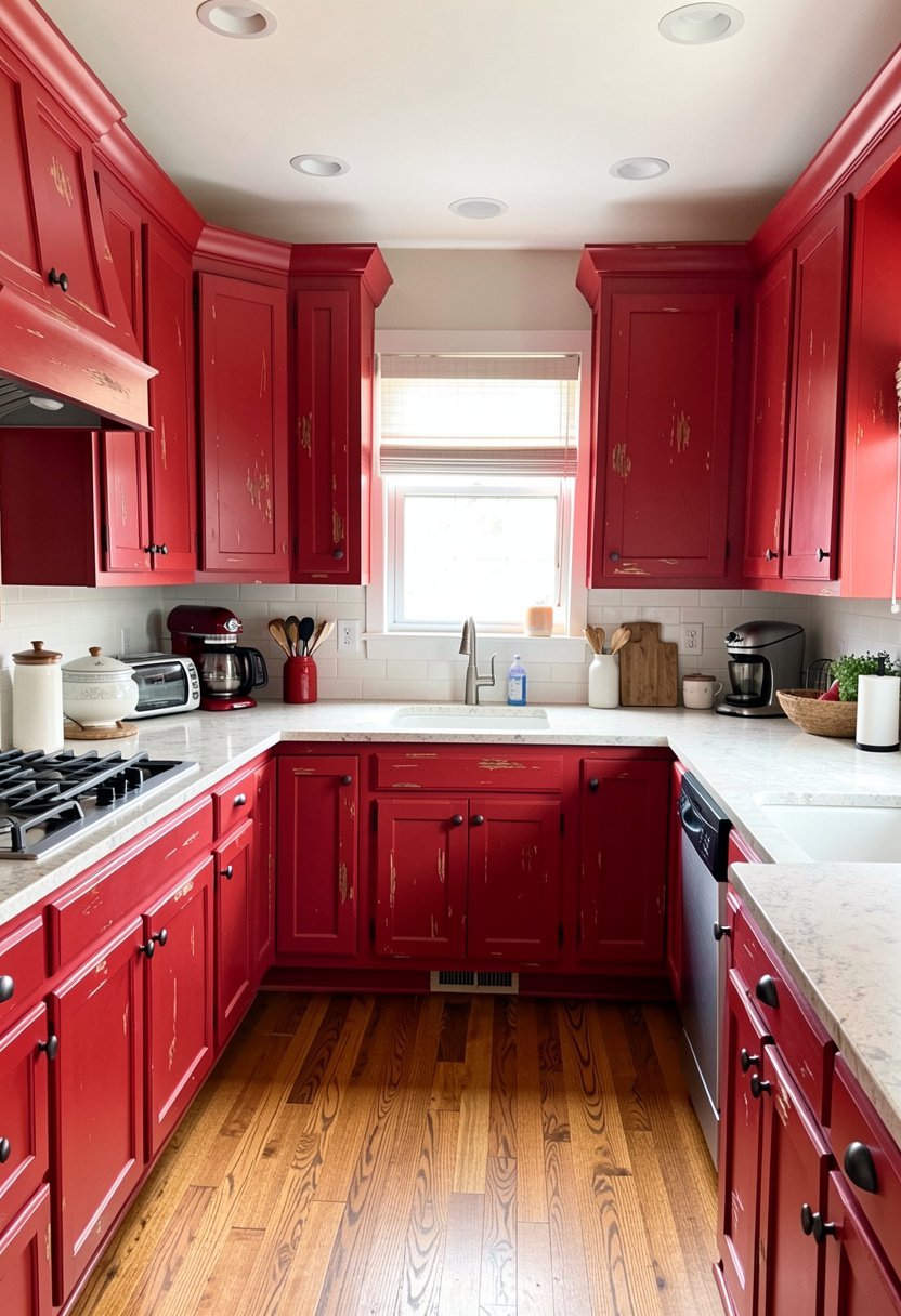
If your home feels like an old, comfy barn, you need a red with a worn, vintage feel. This is called farmhouse red, and it is usually a bit muted, like a faded barn door. I spent a weekend sanding down my cabinets to get this look, and it was the best workout I ever had. It adds so much charm to a house.
Many people buy fake, pre-distressed wood, but it rarely looks real. If you want this look, do it yourself, or hire someone who knows how to sand it just right. It should look like it has been there for fifty years. Pair it with copper pots and pans to really lean into that warm, rustic, and very inviting country vibe.
Do not overthink it, let it look a bit rough. That is the whole point of this style.
- Use a dull, flat paint for an antique look.
- Add dark, iron handles to match the style.
- Hang your copper pots on a wall rack.
- Keep the decor simple with wooden accents.

Tomato Red for a Modern Edge
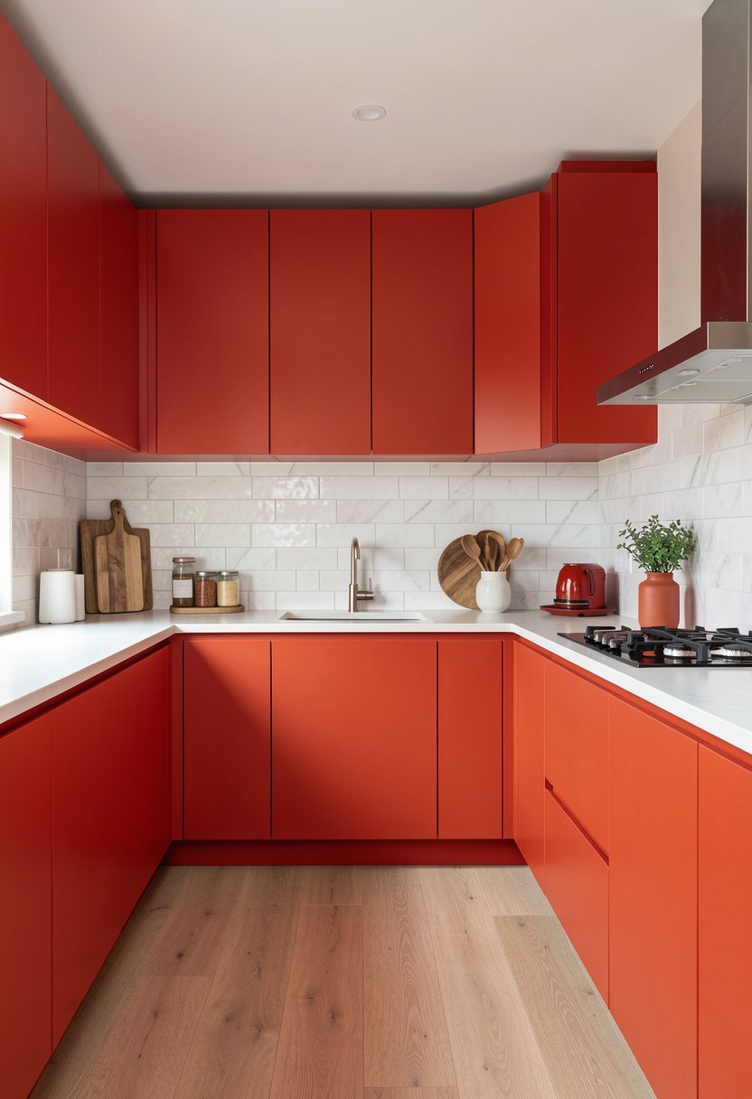
Tomato red is a bright, punchy color that screams modern and cool. I once saw a kitchen like this with slab doors, and it looked like a page from a high end magazine. It is bold, sharp, and very clean. If you love a sleek kitchen with no clutter, this is your winner.
Some people worry this color will date their home, but that is just silly talk. A clean, modern kitchen never goes out of style. Just make sure your hardware is hidden or very slim. If you use chunky, ornate handles, you will ruin the whole modern vibe instantly. Keep the lines straight, keep the color flat, and keep it extremely simple.
This is the ultimate look for someone who wants a kitchen that feels like a piece of art.
- Use flat doors with no extra trim.
- Keep hardware hidden or very thin.
- Use light gray counters to soften the red.
- Add long windows to let more light in.

Earthy Brick Red for Warmth
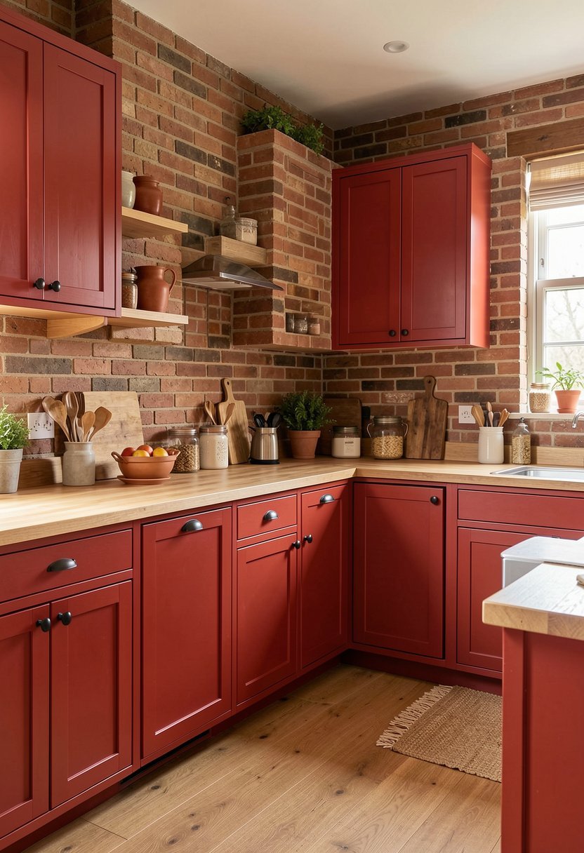
If bright red makes your head spin, try brick red. It has a bit of brown in it, which makes it feel earthy, grounded, and very easy to live with. I have used this in rooms where I wanted a cozy, warm feel. It is not as aggressive as candy apple red, but it still makes a huge statement in any home.
Do not pair this with cool tones like blue or gray, it will just look sad. Pair it with warm creams, tans, or natural wood tones to keep that earthy, cozy vibe going. It is a very forgiving color that hides scuffs and kitchen messes well. It is basically the perfect color for a family kitchen that actually gets used daily.
This is the safest way to go red without losing your mind.
- Use cream colored walls for a warm feel.
- Choose wood floors to match the earthy tone.
- Add soft, warm lighting under the cabinets.
- Keep decor minimal with woven or jute items.

✅ See Also: 11 Rustic Farmhouse Kitchen Cabinet Ideas
Red Cabinets with Black Accents
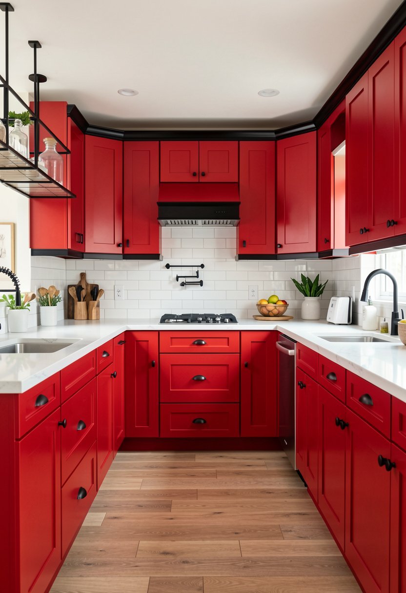
Going red and black is a very moody, sophisticated, and bold move. I have seen this done in large kitchens with lots of natural light, and it is stunning. It feels high-end, dramatic, and very chic. If your kitchen is small, skip this one, because the dark colors will make it feel like a cave.
Most people get scared of black, but you just need to balance it out. Use red for the cabinets and black for the counters or the hardware. It gives the room a sense of depth that you just cannot get with white or beige. If you want a kitchen that looks expensive, this is exactly the path you should take.
Be brave with this look, and you will have a space that feels truly special.
- Use black stone counters for a heavy look.
- Add gold hardware to pop against the red.
- Install big lights to keep the room bright.
- Keep the floor light to lift the space.

Glossy Red for a Retro Look
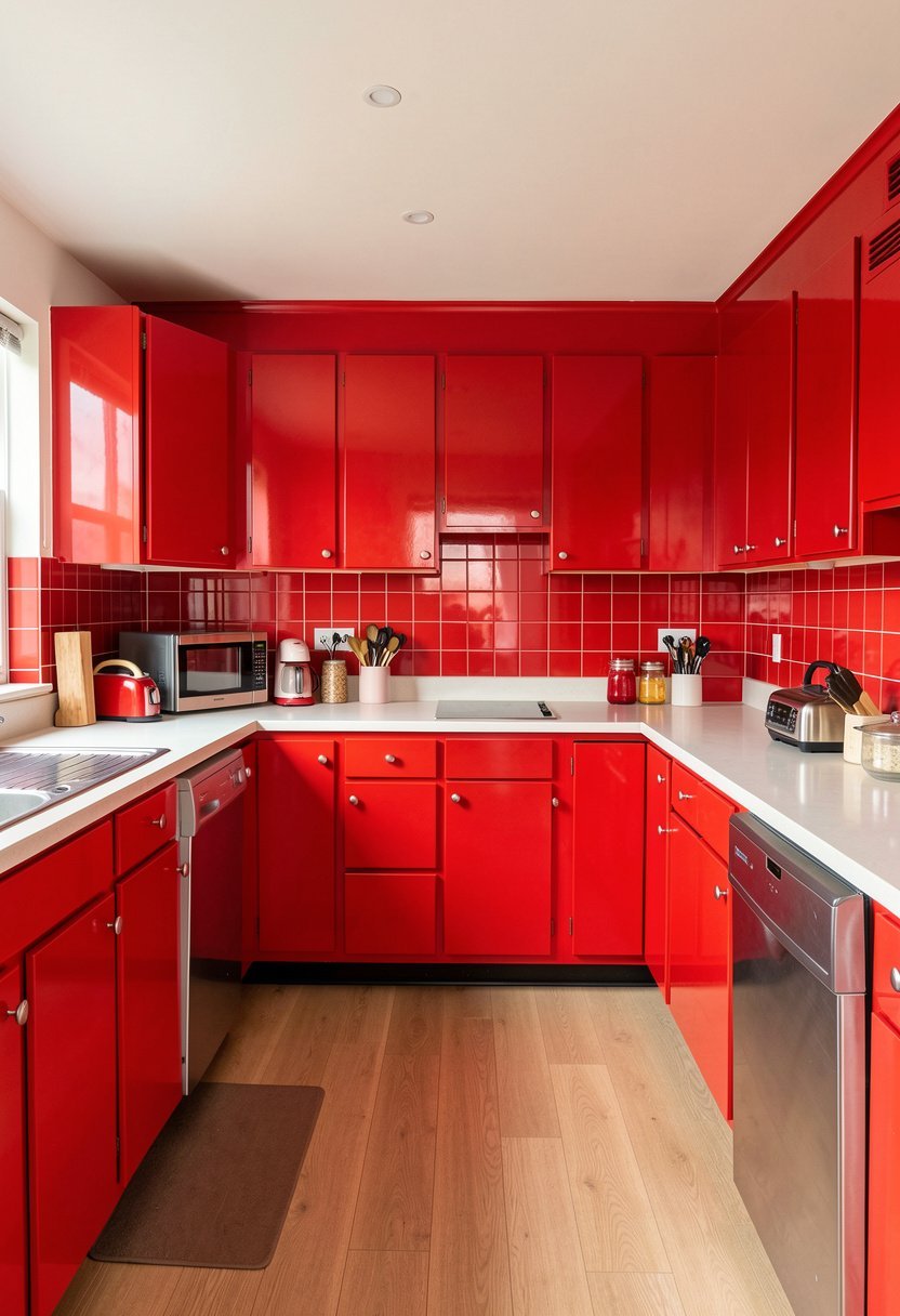
If you love the vibe of a 1950s diner, go for a super high-gloss red finish. It reflects light, makes the space pop, and brings a ton of energy. I used a high-gloss finish on my cabinets once, and it looked so shiny that I could see my face in it. It is playful, fun, and very hard to ignore.
A big mistake people make is using a glossy finish on old, damaged wood. The shine will show every single scratch and dent. If you want glossy, your surface needs to be smooth as glass, or you will regret it. Take the time to sand and prime, or hire a pro, because there are no shortcuts with this specific, shiny look.
This is a fun, bold choice for anyone who wants a unique kitchen.
- Make sure your base is perfectly smooth.
- Use a high-quality lacquer for the shine.
- Stick to simple, white subway tile walls.
- Add red and white checked rugs for fun.

Red Cabinets with Open Shelving
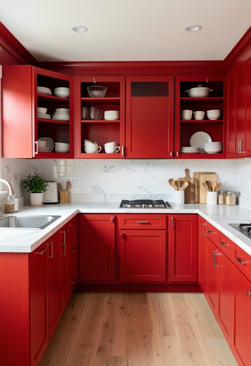
Open shelving is a great way to show off your favorite dishes, and it looks perfect with red cabinets. I love how the plates look against the painted wood. It feels like a boutique shop, not just a kitchen. It forces you to keep things tidy, which is honestly a good habit to have in any home.
Don’t use cheap, plastic bins on your shelves. Use nice glass jars or white ceramic plates. If you keep the items on your shelves color-coordinated, the whole look feels professional. It is one of those small touches that makes a massive difference in how a room feels. Red cabinets set the stage, but the shelves add the personality.
This is for people who love to display their favorite things at home.
- Use thick, natural wood for the shelves.
- Keep the dishes on display clean and simple.
- Use under-shelf lights for a nice glow.
- Avoid cluttering the shelves with small junk.
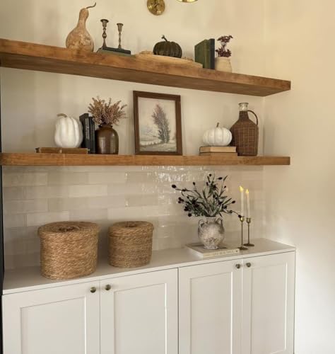
Two-Tone Red and Natural Wood
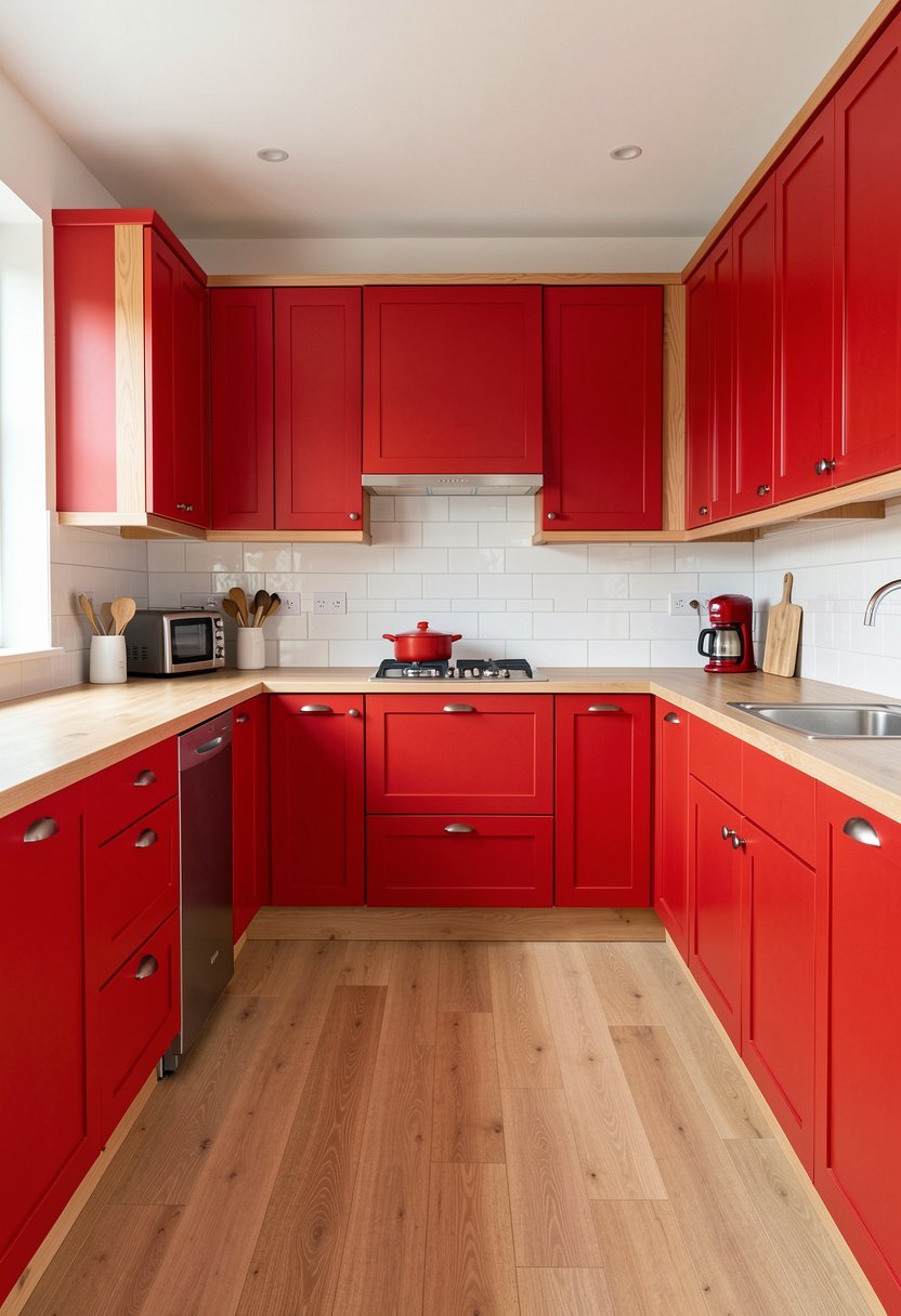
Mixing red paint with natural wood is a brilliant way to get a balanced, organic look. I once did a kitchen with red base cabinets and natural oak upper cabinets, and it felt like a dream. It takes the sharp edge off the red and makes the room feel much softer, warmer, and more inviting.
A common error is using wood that is too dark, which clashes with the red. Stick to light, airy woods like ash, maple, or white oak. This keeps the look fresh and stops it from feeling like an old, dark lodge. It is a very smart way to blend modern paint with traditional materials for a result that feels truly timeless.
This is a great look if you love nature but want color.
- Use light wood for the natural grain.
- Keep the red paint finish matte, not shiny.
- Use simple, black handles for a nice contrast.
- Add some green plants to finish the look.

Red Cabinets with Gold Hardware
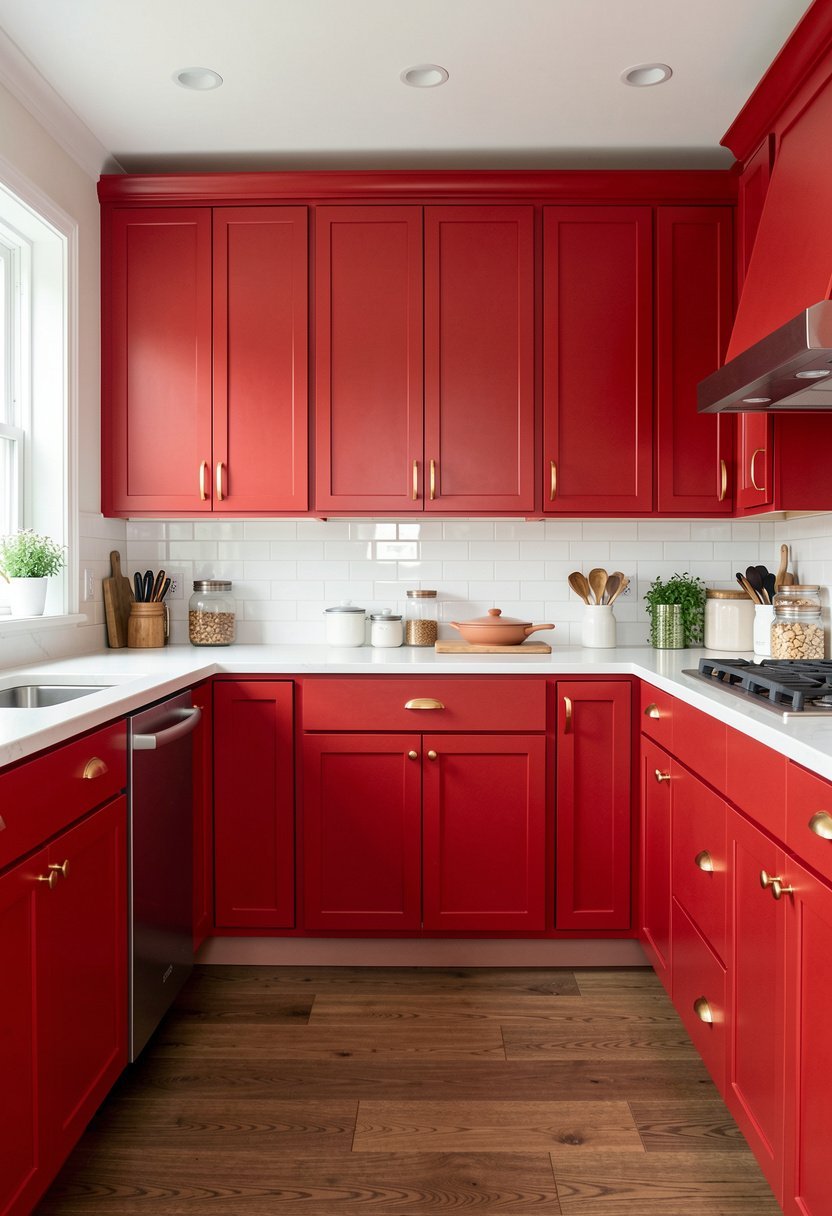
Gold hardware is the best friend of red cabinets. It adds a touch of glamour and makes the color look richer and more luxurious. I swapped out my boring silver handles for brushed gold ones, and it changed the whole mood. It instantly made my kitchen look like it cost twice as much to build.
Don’t go for cheap, bright yellow gold. Go for a soft, brushed gold or a muted brass finish. It looks much more expensive and doesn’t stand out as harshly. If you have a deep red cabinet, the gold will glow beautifully, especially at night. It is a tiny change that provides a huge, dramatic impact on the entire look.
Swap the handles, and you will see what I mean.
- Buy high-quality brushed brass handles.
- Use a warm red tone for the paint.
- Keep the kitchen faucet in a matching gold.
- Avoid mixing too many different metal finishes.

Accenting with Red Kitchen Cabinets
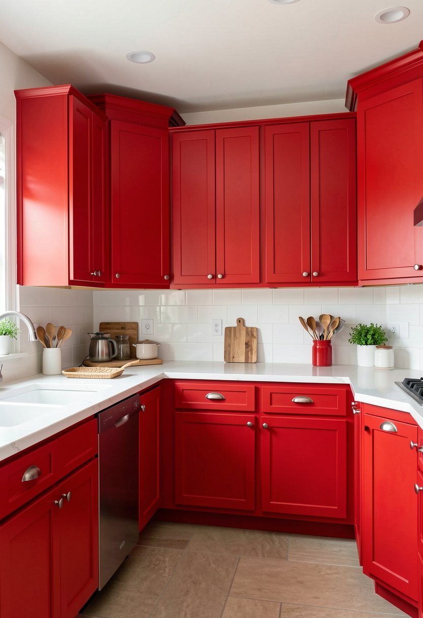
If you are not ready to paint every single cabinet, start with a smaller, secondary piece. Maybe just your kitchen island or a pantry unit. I started with my island, and it was the perfect way to test the waters. It brings a pop of color without overwhelming the whole house, which is perfect for beginners.
Most people try to paint the whole room, panic, and then hate it. Don’t do that. Painting one piece is a small, low-risk project that you can finish in a weekend. If you love it, you can always do the rest later. It is a smart way to learn how the color reacts to your home’s light.
This is the smartest way to start your journey into a red kitchen.
- Paint the island a bold, bright red.
- Keep the surrounding cabinets white or gray.
- Match the island color to a piece of art.
- Keep the island countertop a neutral stone.

Final Thoughts
I hope these ideas help you feel brave enough to add some color to your home. Red is not as scary as it looks, and it really adds life to a kitchen. Do not listen to the people who tell you to play it safe with white, it is your kitchen, so paint it a color you actually love. Take a chance, grab a brush, and you’ve got this.
| Idea Number | Kitchen Cabinet Style | Best Color Pairing |
|---|---|---|
| 1 | Deep Burgundy | Light Oak Floors |
| 2 | Bright Cherry | White Countertops |
| 3 | Two-Tone White | Wood Shelves |
| 4 | Farmhouse Distressed | Copper Hardware |
| 5 | Modern Tomato | Gray Countertops |
| 6 | Earthy Brick | Cream Walls |
| 7 | Black Accents | Gold Hardware |
| 8 | High Gloss | White Subway Tile |
| 9 | Open Shelving | White Ceramics |
| 10 | Natural Wood Mix | Light Ash Wood |
| 11 | Gold Hardware | Brushed Brass |
| 12 | Island Accent | Neutral Surround |
| 13 | Matte Finish | Soft Lighting |
| 14 | Red Cabinetry | Slate Flooring |
| 15 | Bold Color | Simple Decor |
Frequently Asked Questions (FAQs)
Is It Hard to Keep Red Cabinets Clean?
It is not hard at all, but you have to be smart about the finish. Glossy red shows every single finger print, so avoid that if you hate cleaning. A matte or satin finish is much better for a busy family kitchen, as it hides dust and small smudges very well.
Can I Paint My Old Cabinets Red Myself?
You absolutely can, but do not skip the prep work. If you do not clean, sand, and prime the cabinets, the red paint will peel off in a week. Take your time with the prep, use a good quality primer, and your hard work will pay off for years.
Are Red Cabinets a Passing Trend?
They are only a trend if you paint them a weird, neon shade that hurts your eyes. If you pick a classic, deep, or earthy red, it will look just as good in ten years as it does today. Do not worry about trends, just pick a color you like.
Do Red Cabinets Make a Kitchen Look Smaller?
Dark red cabinets can make a small kitchen feel a bit tight if the room lacks light. If you have a small space, keep the upper cabinets light, or use open shelving to create some air. Bright red in a small space can feel very exciting and cozy.
Should I Use Red On All the Cabinets?
You do not have to, and honestly, sometimes less is more. If you are worried about too much color, try painting just the bottom row or just the kitchen island. This gives you that pop of red without taking over the entire look of the room.
Will Red Cabinets Hurt My Home Value?
Most buyers actually love a kitchen with character, but they hate a kitchen that looks like a DIY disaster. If the paint job is professional, clean, and styled well, it can actually help sell your home. Just avoid sloppy work and clashing, cheap looking hardware.
Does Red Go with Stainless Steel?
It goes perfectly with stainless steel. The cool, metallic look of the appliances balances the warm, bold look of the red cabinets. It is a very popular, modern, and professional combination that you see in many high-end kitchens today. It creates a great, sharp contrast.
Will Red Cabinets Clash with Wood Floors?
They look amazing with wood floors as long as you pick the right tone. If your cabinets are a cool, blue-based red, they might clash with warm, yellow-toned wood. If you have warm red cabinets, they look beautiful with almost any natural, medium-toned wood floor in your house.