As an Amazon Associate, I earn from qualifying purchases at no extra cost to you.
12 Two Tone Painted Kitchen Cabinet Ideas (That Make Mornings Nicer)
 ByRayan

Many people think their kitchen needs a total gut job to look new. They spend way too much money, and they stress out for months. Most of this is just for show, honestly. You really do not need a sledgehammer to fix a tired space.
The real problem is that most kitchens look like a boring white box. People play it safe, they pick one color, and they end up with a room that has zero soul. It makes me sad, watching folks waste their time painting everything the same shade, while their home stays dull.
Today, I will walk you through 12 two tone painted kitchen cabinet ideas that really work. You will learn how to pick colors, where to place them, and why this simple change beats a full remodel. Grab a coffee, relax, and let us fix your space.
Dark Lower Cabinets with White Uppers
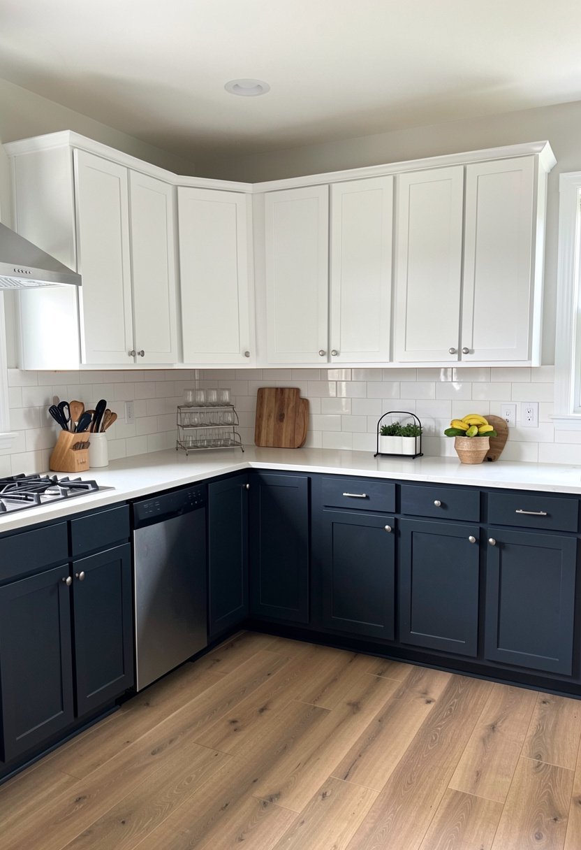
People love this classic look, and for a good reason. It grounds the room, it hides the scuffs from your shoes, and it keeps the space feeling bright near the ceiling. You should put the dark shade on the base units, and keep the light color up top. It mimics the horizon, it feels natural, and it never goes out of style. Stop painting your kitchen like a hospital room, and give those lower cabinets some real color. Navy blue or deep charcoal works wonders here, and it makes the white paint look cleaner by contrast. You want a kitchen that feels stable, not one that feels like a blank page. If you want a safe bet that still looks expensive, this is it. Trust me, it works every single time, and you will never regret picking a color that actually hides your daily kitchen spills.
- Dark colors hide dirt well.
- Light uppers keep things open.
- Navy is a timeless choice.
- Focus the dark on bases.
Matching the Island to the Walls
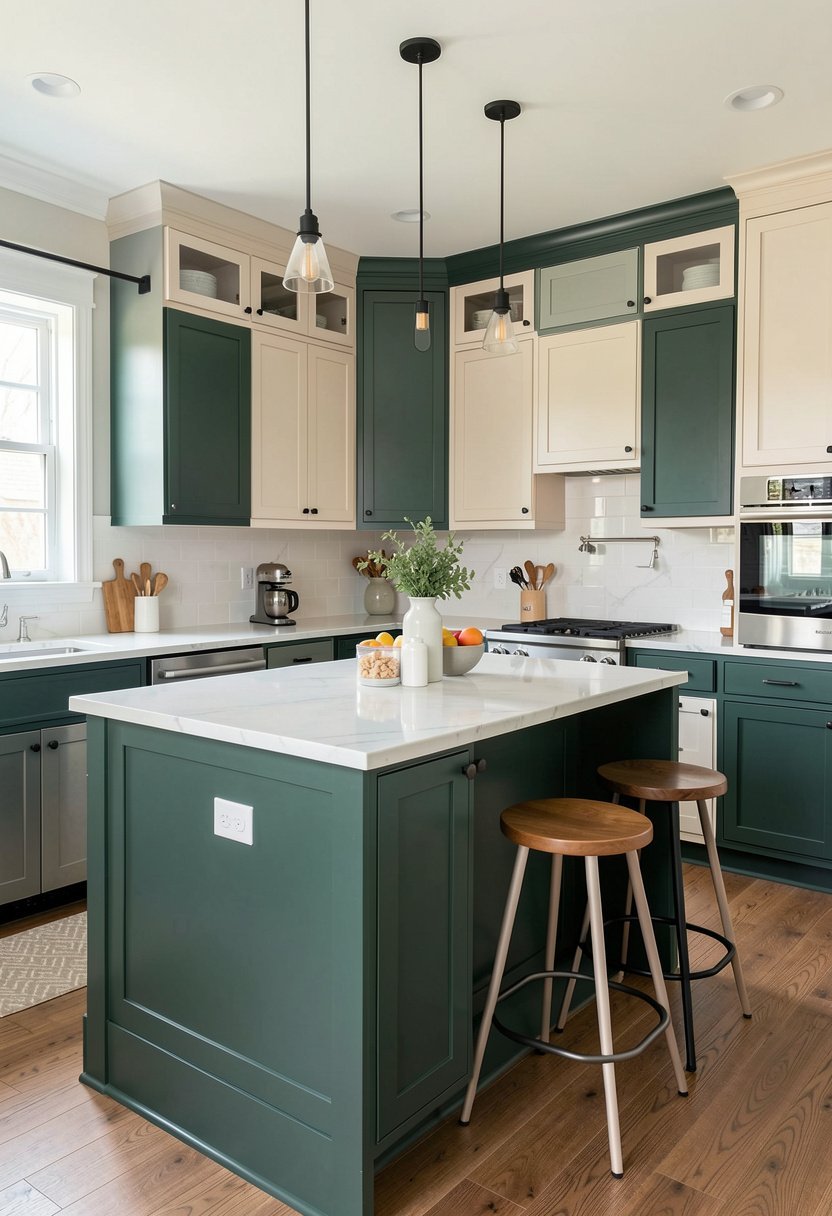
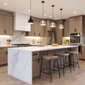
Most folks make the mistake of painting the island the same as the perimeter cabinets. Please stop doing that, as it is a waste of a great focal point. Pick a bold, moody color for the island, and let it stand out against the rest of the room. I love a forest green island against soft cream cabinets, as it adds depth without feeling too busy. This trick anchors the kitchen, it creates a heart for the room, and it looks like a professional designer was involved. It is an easy way to add drama, and it costs nothing extra if you are already buying paint. Do not be afraid to go dark here, even if your kitchen is small. It actually adds a sense of luxury, and it makes the space feel finished and very intentional.
- Make the island stand out.
- Use bold, moody colors here.
- Contrast against neutral walls.
- Avoid the matchy matchy look.

Pastels On the Top and Bottom
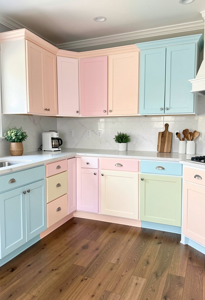
If you are tired of moody colors, try two soft pastels. This is a brave move, but it pays off if you pick the right shades. Think about a dusty blue on the bottom, and a light mint or soft gray on the top. It feels breezy, it looks sweet, and it makes your coffee taste better in the morning. People are often too scared to use color, but life is too short for plain white. Keep the undertones the same, and it will look like a soft, painted picture. It is a light way to change a room, and it makes everything feel calm. Do not mix a warm pink with a cold blue, because that will look like a mistake. Stay in the same color family, keep it soft, and enjoy your new kitchen aesthetic.
- Use soft, breezy pastel shades.
- Match the cool or warm undertones.
- Avoid clashing color families.
- Create a calm morning space.
Wood Tones Mixed with Painted Uppers
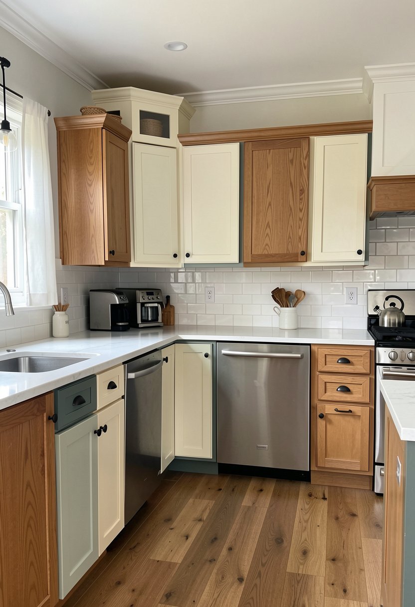
Wood is coming back, and I am here for it. Do not paint over that nice wood if it is still solid. Instead, keep the natural grain on your lower cabinets, and paint the uppers a crisp white or a soft beige. The wood adds warmth, it breaks up the flat paint, and it makes your kitchen feel like a cozy home. People try to hide wood because it feels dated, but it actually adds a texture you just cannot buy in a can. It is a smart way to save money, it looks high end, and it adds character. Just make sure the wood is clean, and the paint is a smooth, flat finish. It is a classic look that feels modern, earthy, and very grounded. Stop fighting the wood, and let it shine instead.
- Keep natural wood lower cabinets.
- Paint upper cabinets crisp white.
- Wood adds necessary warm texture.
- Avoid painting over good grain.
Bold Brights On the Island Only
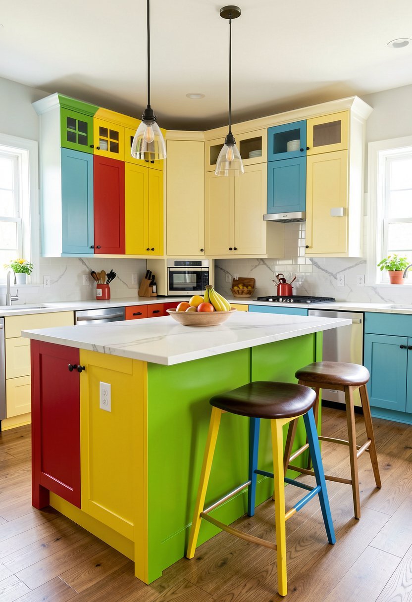
Are you scared of color? Keep your walls and cabinets neutral, and throw a punch of bright yellow or red on the island. It is the easiest way to add a personality without painting the whole room. I have seen this work in a hundred tiny kitchens, and it always makes people smile when they walk in. It is playful, it is fun, and it is easy to repaint if you get bored. Most people hide their personality in their own home, but this is your chance to shine. It takes one afternoon, a little bit of paint, and it totally changes the energy of the room. Do not let your house be boring, because your space should be as bright as you are. Just keep the island color vibrant and clean.
- Limit bright color to islands.
- Keep perimeter cabinets neutral white.
- Personality makes a house home.
- Easy to change later on.
The Vertical Split Between Cabinets
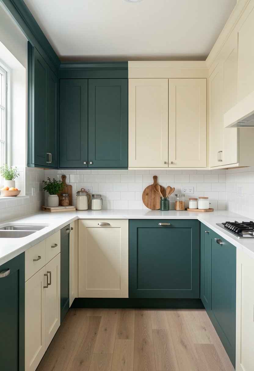
Some people paint the tall pantry doors a different color than the base cabinets. I love this trick because it creates a vertical column of color that draws the eye up. It makes your ceilings feel taller, and it adds a clever design detail. Try a deep charcoal for the tall cabinets, and a soft gray for the rest. It looks custom, it looks expensive, and it makes your kitchen feel like a home office or library. People usually just paint everything the same, and they wonder why their room feels flat. This is how you stop that. It is simple, it is smart, and it works if you have tall cabinets. Just be sure to pick colors that look good side by side, and you are set. It is total genius, really.
- Tall units create vertical interest.
- Draw the eye toward ceilings.
- Use charcoal for tall units.
- Contrast with lighter base cabinets.
Two Shades of the Same Color
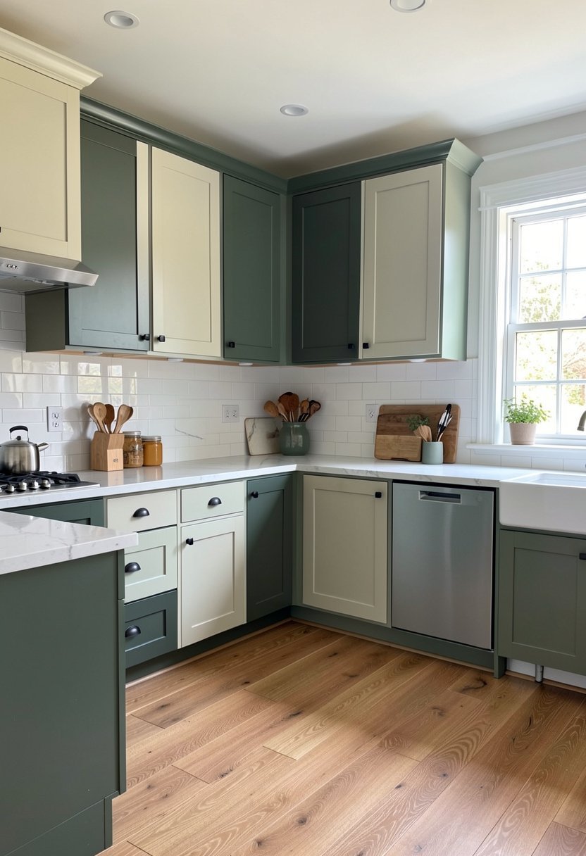
If you want a look that is calm and steady, try a monochromatic style. Pick one color you love, and get it in two shades. Use the darker shade on the lower cabinets, and the lighter version on the top. It is a very sophisticated way to do a two tone kitchen, and it never looks messy. People often fail by picking colors that are too similar, so make sure the dark one is truly dark. It adds a subtle layer of detail, it looks like a professional job, and it creates a sense of harmony. I use this when I want the kitchen to feel bigger. It is clean, it is quiet, and it is a design trend that will never die out. It is basically foolproof.
- Use shades of one color.
- Darker goes on the bottom.
- Lighter shade on the top.
- Creates a very calm feeling.
Gray and White for Modern Looks
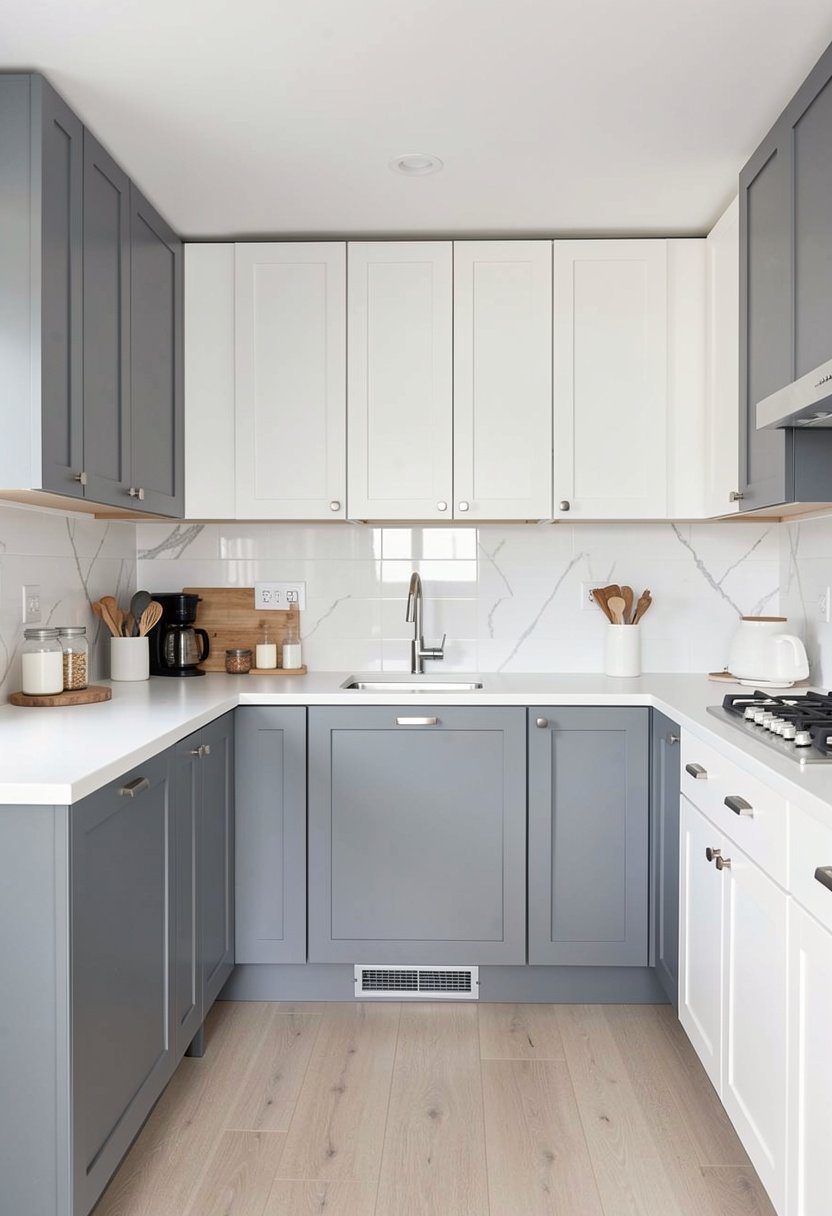
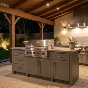
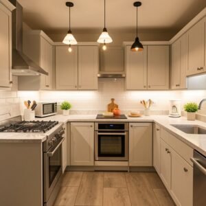
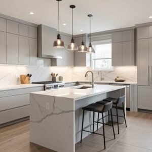
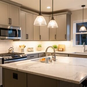
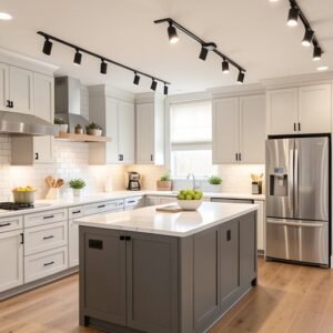
Gray is a classic, and it works with anything. Use a soft white for your upper cabinets, and a medium gray for the lower ones. It is crisp, it is clean, and it fits any modern home decor style perfectly. I have done this for clients who are scared of bold colors, and they always end up loving the result. It is not boring, it is balanced. It feels like a tailored suit, it is easy to live with, and it hides kitchen wear and tear better than all white. Do not fall for the myth that gray is sad. If you pick the right shade, it is the most relaxing color you can find. It is a safe harbor in a busy house, and it looks great with silver handles.
- Use gray on base units.
- Keep white on upper cabinets.
- Classic look for modern homes.
- Hides daily kitchen messy spots.
Black and Wood for Drama
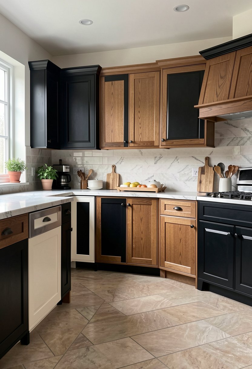
Do you want a kitchen that looks like a high end magazine feature? Paint your cabinets matte black, and bring in wood open shelving on the walls. It is bold, it is moody, and it looks like you spent a fortune on design. The wood warms up the black, and the black makes the wood grain pop. I love this for a small kitchen because it adds depth and makes the space feel cozy. People are afraid of black paint, but they are wrong. It makes a room feel larger because the corners disappear into the dark. It is a bold move, but you have to go for it. If you want drama, stop being shy. Black is the best color for cabinets, period.
- Matte black is very bold.
- Wood shelves bring warmth back.
- Makes small rooms feel deep.
- Black paint creates nice shadows.
Green and Gold Details
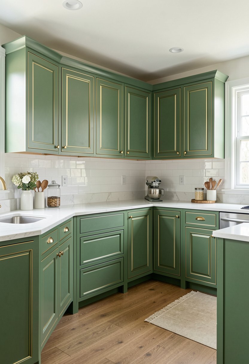
Green cabinets are the best thing to happen to homes lately. I prefer a deep, rich sage or an emerald green for the lower cabinets. Pair this with brass or gold hardware, and your kitchen will look like a dream. It feels organic, it feels fresh, and it looks great with white walls. It is a bit of a classic, but it never gets old. If you want to use two tones, paint the island the same green as the lower cabinets. It pulls the room together, it feels grounded, and it works with any lighting. Just keep the uppers white or cream, and you have the perfect kitchen. People who skip green are missing out on the best color, honestly. It is just so visually appealing to me.
- Sage or emerald looks fresh.
- Use brass handles for contrast.
- Connect the island and bases.
- Works well with white walls.
Navy and Brass for Elegance
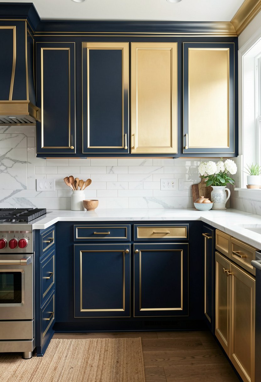
Navy blue is the king of cabinet colors, and I will die on this hill. It is timeless, it is deep, and it looks incredible with brass pulls. For a two tone look, paint the island navy and keep the perimeter cabinets a soft, creamy white. It creates a space that feels like a coastal getaway, even if you are in the city. It is sophisticated, it is dark, and it is incredibly easy to clean. Most people mess this up by picking a navy that is too bright, so go for a midnight shade. The deeper you go, the better it looks. It is a power move for any kitchen. If you want to feel fancy every time you grab a snack, this is the one.
- Navy is a timeless choice.
- Pair with brass for elegance.
- Keep the perimeter cabinets white.
- Go for very dark navy.
Soft Blue and Dark Gray
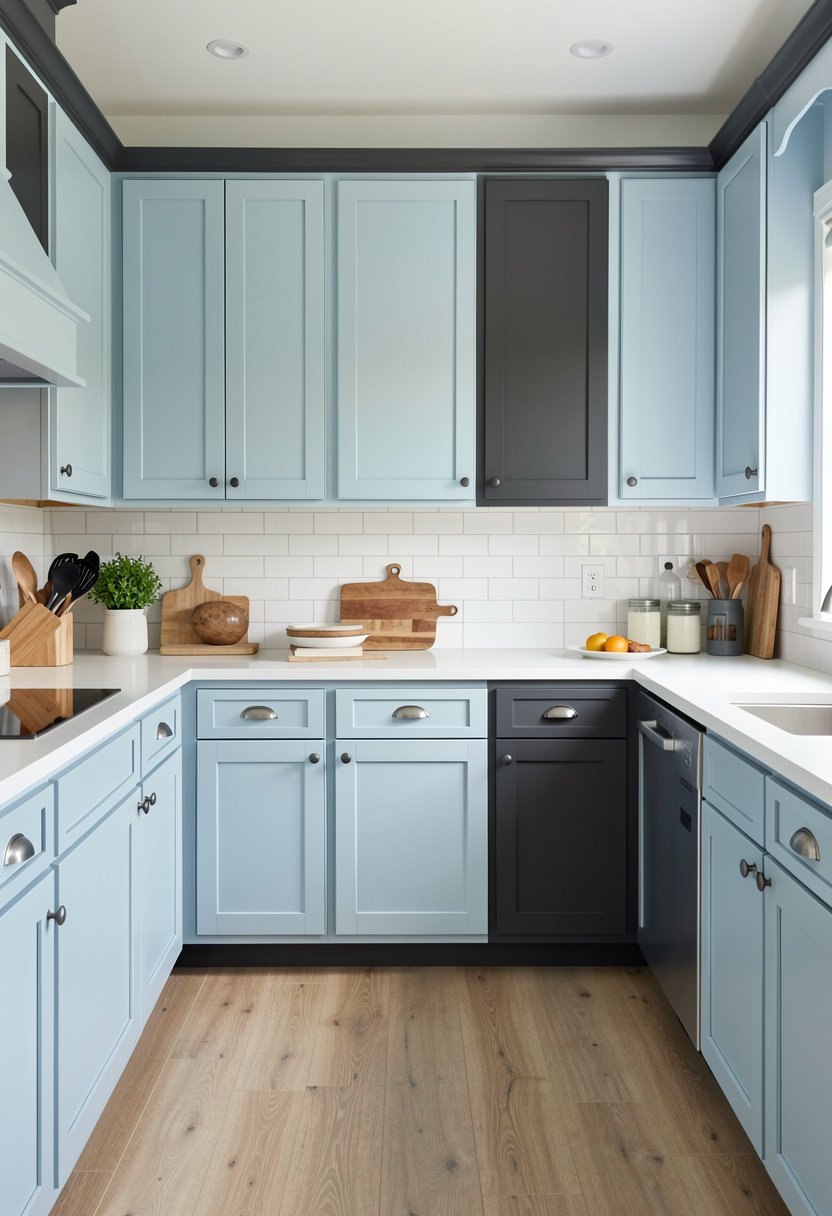
This is a mix I found by mistake, but it is my favorite now. Use a dusty, soft blue on the uppers, and a dark, moody gray on the bases. It is cool, it is unique, and it makes the room feel very grounded. It is a bit moody, but the blue keeps it from feeling too heavy. People usually do the opposite, but flipping it creates a really interesting focal point near the ceiling. It makes the kitchen feel more like a living room. It is a bold way to end our list, but it is worth it. If you want to stand out, try this. It looks custom, it looks smart, and it is definitely the most stylish way to finish your kitchen remodel.
- Blue uppers create interest.
- Gray bases ground the space.
- Very unique and stylish look.
- Great way to be different.
Final Thoughts
I hope you feel ready to pick up a brush and fix your kitchen today. You have seen that two tone cabinets are the best way to add character without a huge budget. Do not let fear stop you from making your space look amazing. You have the tools, the ideas, and the confidence to do this right. Take your time, pick colors you love, and you've got this.
| Idea | Tone | Room Size |
|---|---|---|
| Dark Base | Classic | Large |
| Island Pop | Bold | Any |
| Pastel Mix | Soft | Small |
| Wood Grain | Rustic | Large |
| Bright Island | Playful | Any |
| Tall Units | Modern | Tall |
| Mono Shades | Calm | Any |
| Gray White | Clean | Small |
| Black Wood | Moody | Any |
| Green Gold | Fresh | Large |
| Navy Brass | Elegant | Any |
| Blue Gray | Unique | Medium |
| Two Tone | Modern | Any |
| Bold Trim | Fancy | Any |
| Soft Hue | Light | Small |
Frequently Asked Questions
Is It Hard to Paint Kitchen Cabinets?
It is not hard, but it is time consuming. You need to prep well, sand the surfaces, and use a high quality primer. If you rush the prep work, the paint will chip later. Just be patient, work in sections, and use the right tools.
Can I Mix Colors If My Kitchen Is Small?
Yes, you absolutely can. In a small kitchen, use the darker color on the lower units to keep the floor level grounded. Keep the upper cabinets a lighter shade, which helps the ceiling feel taller and makes the room feel much more open.
Are Two Tone Cabinets Going Out of Style?
No, they are a design staple. People have been using different colors for islands and bases for years. As long as you choose colors that look good together, it will always look like a smart, intentional, and classic choice for your home.
Do I Need to Hire a Pro to Paint Them?
You do not have to, but you must be ready to work hard. Painting cabinets is all about the details and the finish. If you have the time and can follow instructions, you can do it yourself and save a lot of money.
Does the Hardware Matter for Two Tone Looks?
Hardware is the jewelry of your cabinets. If you go with a moody color, like navy or black, brass or gold pulls look stunning. For lighter cabinets, black or silver hardware provides a clean, modern contrast that really pops against the paint.
Should I Paint the Pantry to Match the Island?
That is a great idea. It creates a cohesive look if you want to connect two different areas of the kitchen. Painting the pantry the same color as the island helps tie the room together and makes the whole space feel custom.
Can I Paint Over Laminate Cabinets?
You can, but you must use a special bonding primer first. Laminate is slick, and regular paint will slide right off without the right prep. Sand it lightly, prime it well, and then apply your top coat for a finish that lasts.
Will Dark Colors Make My Room Look Small?
Dark colors actually make a room look bigger. They blur the lines in the corners, which makes the walls seem to recede. Don’t be afraid to use a dark color on your lower cabinets, as it adds depth and a professional feel.