As an Amazon Associate, I earn from qualifying purchases at no extra cost to you.
13 Light Color Kitchen Cabinet Ideas (That Look Costly)
 ByRayan

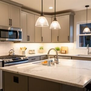
Each of us has stood in a kitchen, looking at dark cabinets, feeling like the room was closing in. I remember my first apartment, it felt like a cave, and I swore I would fix it.
People always try to paint cabinets black or navy, thinking it looks chic. It usually just makes the room feel small, sad, and dingy. You are stuck in a dark trap, and your poor light bulbs are working way too hard.
You will learn how to pick the right whites, grays, and soft tones to open your space. These 13 light color kitchen cabinet ideas will save your sanity, and make your kitchen look like a million bucks.
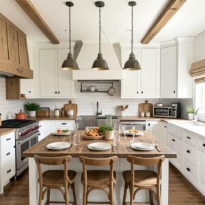
Pure White Glossy Cabinets
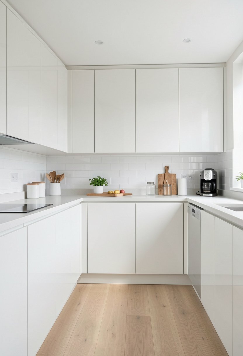
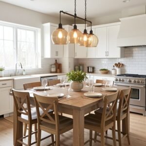
Pure white is the best way to get a bright, clean look. Most people mess this up by choosing a flat paint, which shows every single speck of dust. You need a glossy finish, it bounces light around like a mirror, and wipes clean in seconds.
I have seen so many kitchens ruined by choosing a yellow-white. Do not fall for that trap, it looks like old butter, and nobody wants that vibe. Stick to a crisp, cool white, it looks modern, and gives you a fresh start.
If your kitchen feels cramped, this is your miracle cure. It tricks the eye into seeing more space, and makes the room feel twice as large. Just make sure your hardware is shiny, or gold, to keep things feeling high-end and fun.
- Glossy finishes reflect light well.
- Avoid yellow undertones in white.
- Keep your hardware clean, metallic.
- White makes small rooms bigger.

Soft Cream Cabinet Tones
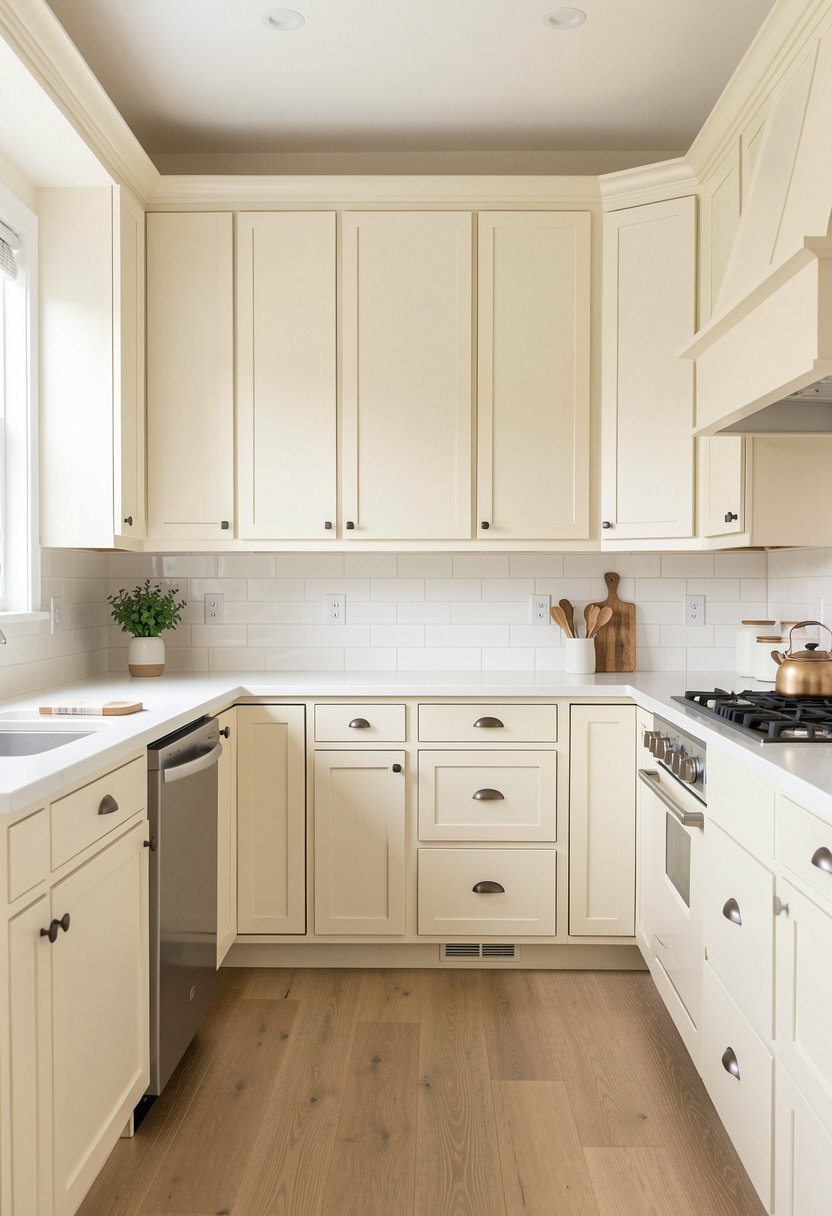
Cream is perfect if you hate the sterile look of pure white. It brings a cozy, warm feeling into your home, without being too loud. I used this in my own house, and it feels like a soft hug every morning, which is great for coffee time.
Stop worrying that cream looks old or outdated. That is just bad advice from people who are afraid of warmth. If you pair cream with natural wood floors, the whole room feels expensive, and very calm, almost like a spa.
You want a shade that leans towards sand, not butter. Keep your walls a lighter shade than the cabinets, this creates depth, and stops the room from feeling flat. It is a classy choice, and it will stay in style for years.
- Cream provides warmth, soft energy.
- Pair it with warm floors.
- Pick sand tones over butter.
- Keep walls lighter than cabinets.

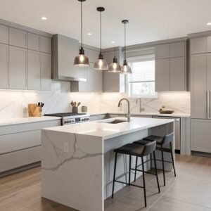
Pale Gray Cabinet Finishes
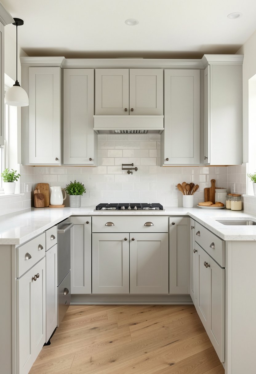
Gray is the king of modern decor, but you have to pick the right shade. If you go too dark, you are back in the cave, and nobody wants to hang out in a cold, gray tomb. Go for a whisper-gray, it is barely there, and very chic.
Some people think gray is boring, but they are just doing it wrong. It is the best backdrop for colorful kitchen decor, like bowls or art. You can change your accents, and the kitchen looks like a totally different space every single season.
This color works in any kitchen, big or small. It looks sharp, clean, and very polished, especially with dark handles. Trust me, it is the safest bet for resale value, and it always looks like a fancy, custom job.
- Choose whisper-gray for light.
- Avoid dark, moody gray tones.
- Use colorful accents for pop.
- Gray offers great resale value.
Misty Blue Cabinet Hues
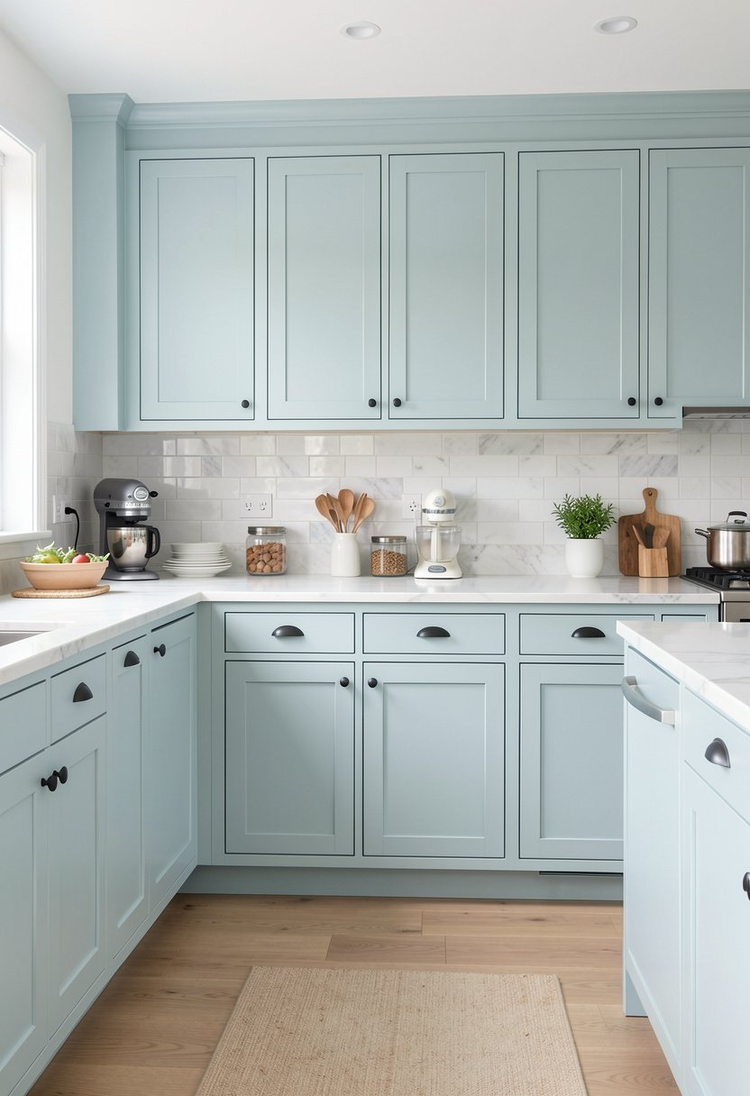
Misty blue is like a breath of fresh air in a stuffy kitchen. It feels coastal, relaxed, and very high-end, provided you pick a light shade. I love how it looks with white marble, it reminds me of the beach, even on a rainy day.
Do not pick a blue that is too bright or primary. That looks like a toy box, and it will drive you crazy within a week. You want a dusty, muted blue, something that looks like the sky on a cloudy afternoon, very peaceful.
This color adds personality, without being overwhelming. You can play with fun lighting fixtures to pull the look together. It makes the kitchen feel like a personal sanctuary, rather than just a place to wash dishes and run away.
- Choose dusty, muted blue shades.
- Avoid bright, primary blue colors.
- Looks great with marble counters.
- Adds personality to any space.

Soft Sage Green Cabinets
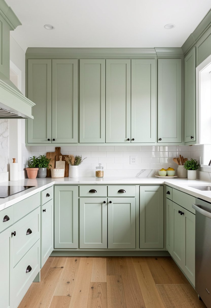
Sage green is earthy, lovely, and honestly the best color for a kitchen that feels too clinical. It brings the outside in, and looks incredible with warm wood accents. I installed this for a friend, and she has never looked back since.
People often fear green because they pick a neon shade. That is a disaster, and you should avoid it like the plague. Stick to desaturated greens, they are calm, and they blend with almost every other color in your home.
This is a very trendy choice, but it has a timeless quality to it. It makes your kitchen feel like a modern farmhouse dream, and it works well with copper or brass hardware. Just try it, you will love the energy.
- Sage green brings earthy tones.
- Stay away from neon greens.
- Desaturated shades are much better.
- Pairs well with brass hardware.

Light Oak Wood Cabinets
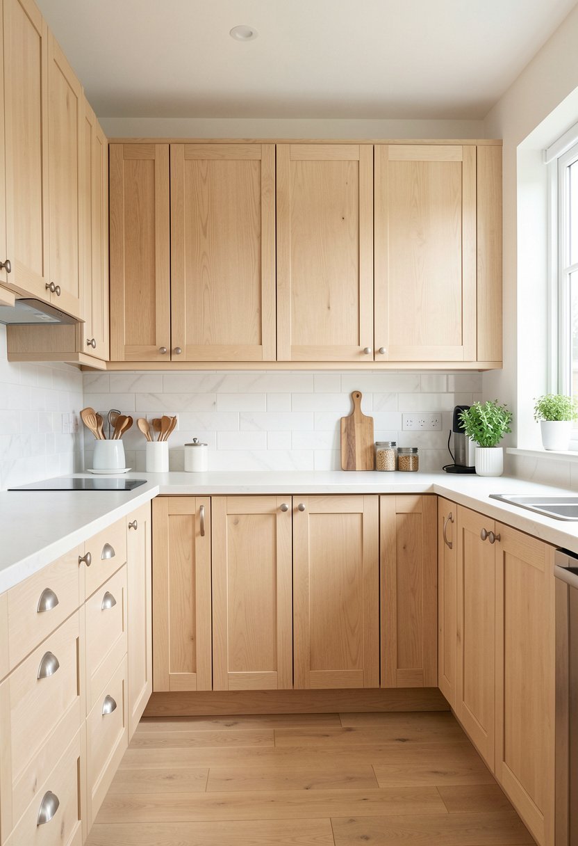
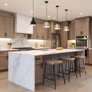
Light oak is back, and it looks nothing like those orange cabinets from the eighties. Modern light oak is matte, raw, and very sophisticated. It shows off the wood grain, and brings a needed layer of texture to a kitchen.
Stop thinking wood is dated. It is only dated if you use heavy, dark stains that hide the beauty. Keep it light, airy, and natural, and your kitchen will feel like a boutique hotel. I love this for a clean, minimalist style.
You need to keep the rest of the kitchen simple to let the wood shine. White counters, maybe some simple kitchen shelving, and you are set. It is a warm, organic look that feels very expensive, and very well planned.
- Modern oak is matte, raw.
- Avoid heavy, orange-tinted stains.
- Keep the room style minimalist.
- Oak adds a nice texture.
Pale Blush Pink Cabinets
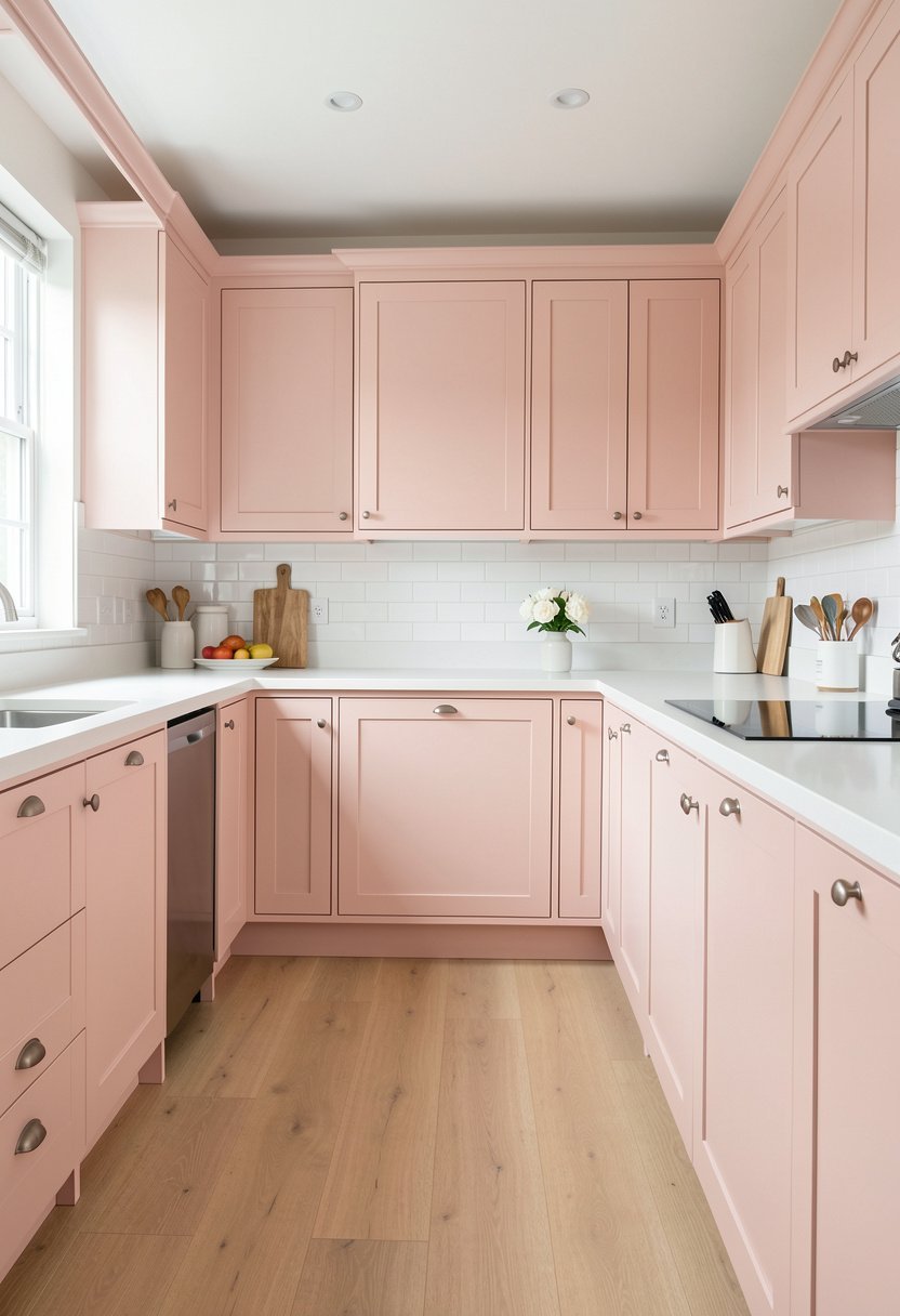
Blush pink is not just for kids rooms, it is actually a very sophisticated kitchen color. When you pick a shade with a gray undertone, it looks like a soft neutral. It feels happy, light, and surprisingly elegant for any adult kitchen.
Most people are too scared to try this. They think it will look tacky, but they are wrong. If you keep the lines of the cabinets simple, it looks like a high-end designer picked it out for you. It is brave, and fun.
Pair it with matte black hardware for a sharp, modern contrast. It stops the room from feeling too sweet, and gives it some edge. This is for people who want a home that shows their personality, and refuses to be boring.
- Use blush with gray undertones.
- Keep cabinet lines very simple.
- Matte black hardware adds edge.
- Pink is elegant, not tacky.

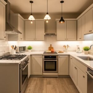
Sandy Beige Cabinet Shades
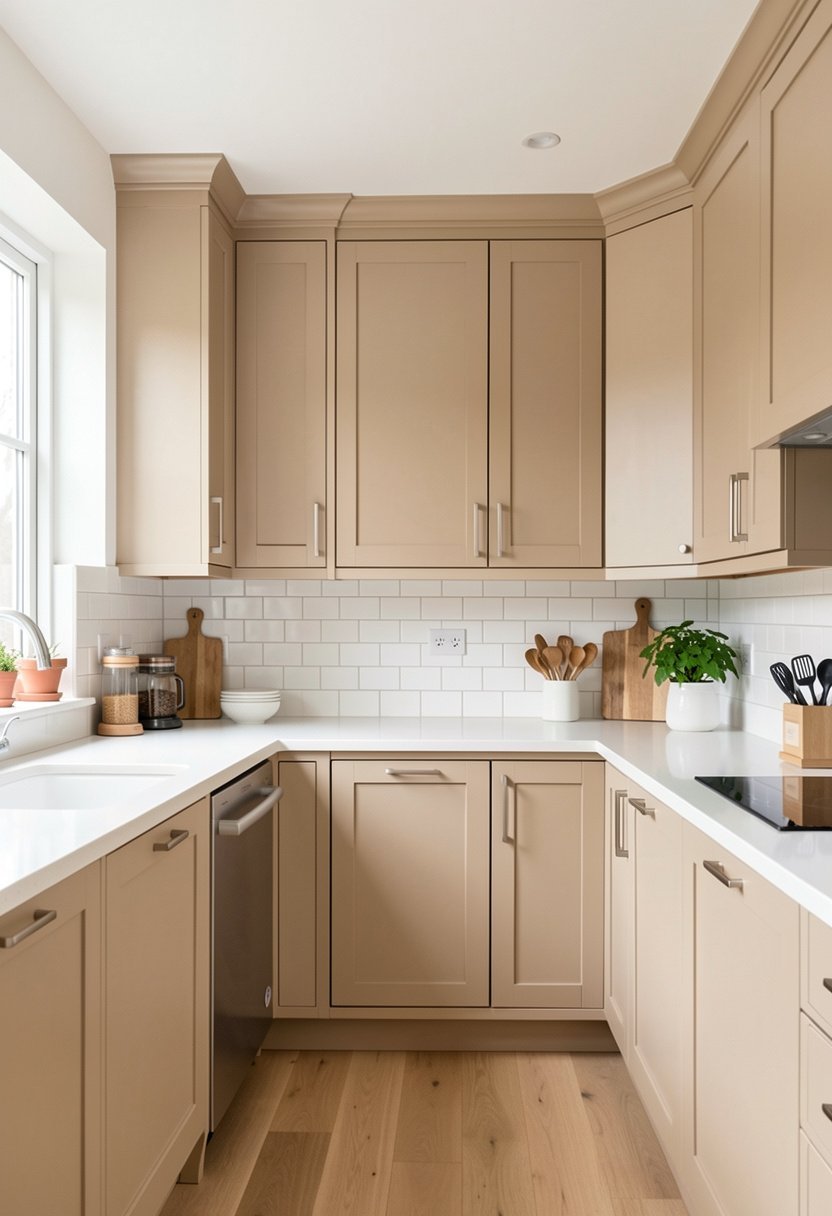
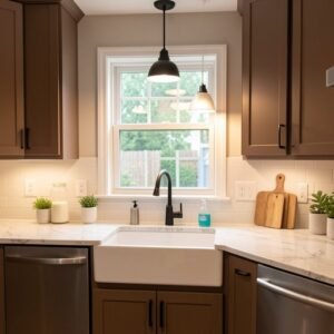
Beige is back because it is warm, grounded, and very easy to live with. It is not the same as the boring tan of the past. Think of soft sand, or sun-bleached linen, it is a very relaxing color for a busy kitchen space.
Many people think beige is plain, but it is actually the perfect base for stone kitchen surfaces. It lets the patterns in your countertops take center stage, while the cabinets just provide a nice, solid, and calm frame.
If you are worried about the room being too brown, add some white tiles. The mix of beige and white is very high-end, and it keeps the room feeling bright. It is a classic look, and you will never get bored.
- Beige provides a grounded base.
- Pairs well with stone counters.
- Add white tiles for brightness.
- It is a timeless, calm choice.
Pale Lavender Cabinet Tones
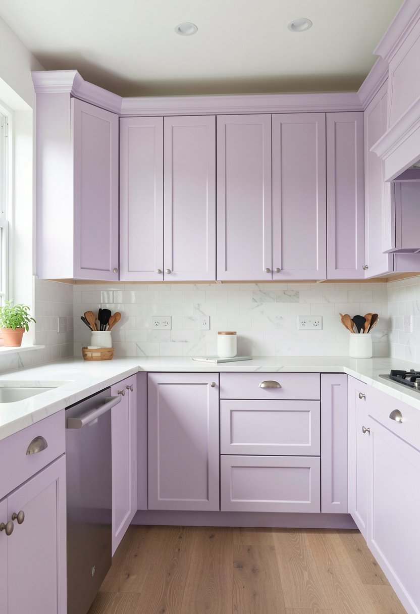
Lavender might sound crazy, but a very pale version acts like a neutral. It is rare, special, and feels like a luxury upgrade. I once did a kitchen in this shade, and the owner said it made her smile every single morning.
You must choose a shade that is almost white. If it is too purple, you are basically living in a crayon box. Stick to a very light, desaturated violet, it will look like a soft shadow against your white kitchen walls.
This color is very calming, which is perfect if you spend a lot of time cooking. It works well with silver kitchen accessories and dark floors. It is a bold move, but if you do it right, it looks like pure art.
- Use a very pale shade.
- Avoid deep, purple crayon tones.
- It works as a neutral.
- Pairs well with silver accents.

Soft Mushroom Cabinet Colors
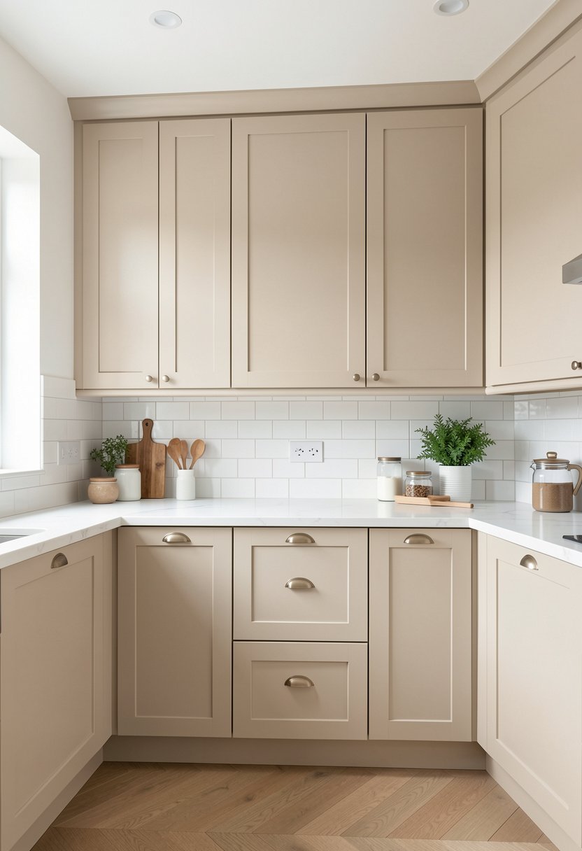
Mushroom is the perfect bridge between gray and brown. It is earthy, warm, and very chic. I tell everyone to look at this color when they want something neutral but don’t want to use white or standard gray. It feels very grounded.
Do not pick a mushroom paint that leans too dark. The goal is to keep the room feeling light, not heavy. A light mushroom keeps your kitchen feeling cozy and inviting, while still being neutral enough to match any decor style.
This color looks incredible with gold hardware. It is a very expensive look, and it feels professional, clean, and quite custom. It is a smart choice for any homeowner who wants to impress guests without trying too hard.
- Mushroom blends gray and brown.
- Pick a light, airy shade.
- It is cozy and inviting.
- Looks amazing with gold hardware.

Pale Yellow Cabinet Hues
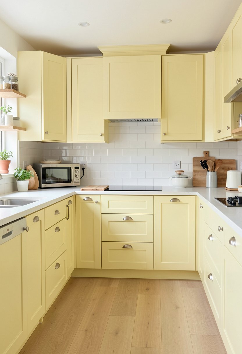
Pale yellow is sunshine in a room. Most people shy away from it because they fear a primary, bright yellow kitchen. That is a shame, because a soft, buttery yellow is actually very vintage, charming, and very welcoming indeed.
You want a yellow that looks like a flower, not a traffic sign. It should be subtle, almost like a tinted white. This color makes a kitchen feel like a country house, and it is perfect for small kitchen layouts that need light.
Pair this with white wood features or light countertops. It creates a space that feels cheerful, and full of life. If you have a dark kitchen, this is the color to choose, it brings the light in like magic.
- Use a soft, buttery yellow.
- Avoid bright, primary yellow shades.
- Great for small, dark kitchens.
- Creates a cheerful, country feel.
Soft Peach Cabinet Shades
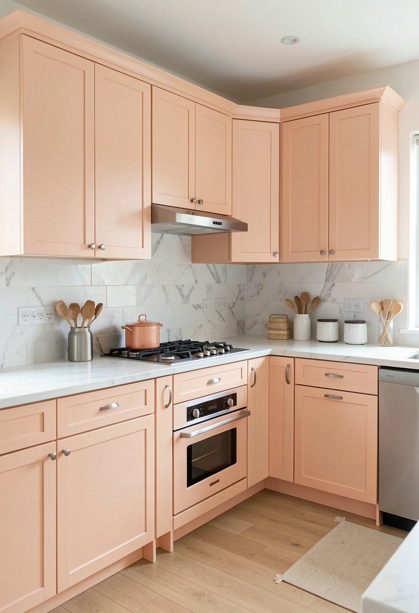
Peach is a secret weapon for a bright, energetic kitchen. It is not orange, and it is not pink, it is a perfect mix. A pale, sunset-inspired peach feels very organic, and it is a fresh change from the usual white.
Stop thinking of peach as retro or outdated. The new versions are muted and dusty, making them look very modern. It adds warmth that you just cannot get from gray or blue, and it looks beautiful in the morning sunlight.
Try pairing this with natural stone or wood. It looks like a high-end design, and it is very unique. You won’t see this in every house on the block, which is exactly why it is such a fun, smart move.
- Peach is a warm, unique.
- Pick muted, dusty peach shades.
- Feels very fresh and organic.
- Looks great with natural wood.

Warm Greige Cabinet Finishes
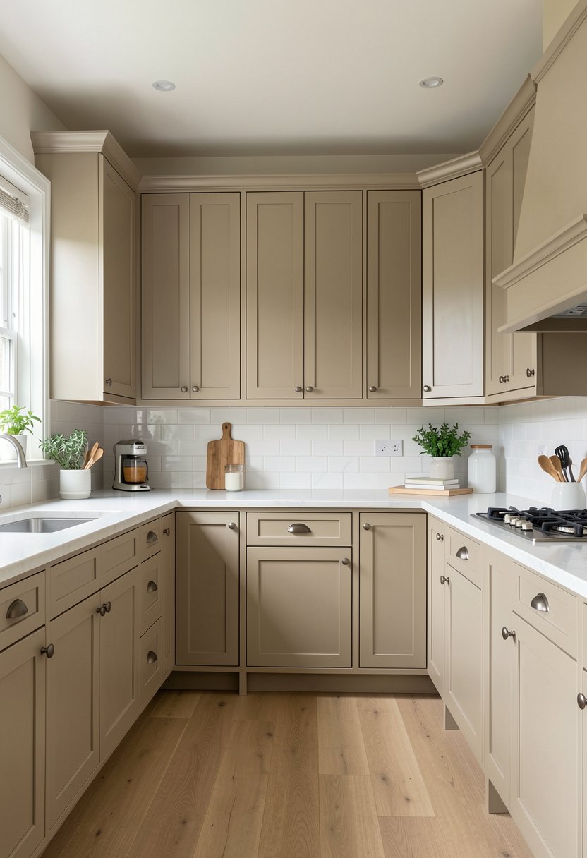
Greige is the ultimate neutral. It is the perfect blend of gray and beige, which means it works with everything. If you are indecisive, or you just want a kitchen that looks good forever, this is your answer. It is reliable.
People get confused and pick a greige that is too dark, which makes it look muddy. You need to test it on your walls first. Make sure it stays on the lighter side of the scale, or you will lose your light.
It looks expensive, especially if you use high-quality kitchen paint that has a nice finish. This color is the darling of designers for a reason, it just works in every home, with every floor, and with every light.
- Greige is the perfect neutral.
- Test light levels before painting.
- Avoid shades that look muddy.
- It is a favorite for designers.
Final Thoughts
I hope these ideas help you transform your kitchen into a place you actually enjoy. You do not need to settle for a dark, cramped room when light colors can do all the work for you. Remember to keep the tones soft, avoid the bright stuff, and focus on the light. You have the vision, you have the options, and you have definitely got this.
| Cabinet Color | Style Vibe | Hardware Match |
|---|---|---|
| Pure White | Modern | Chrome |
| Soft Cream | Cozy | Brass |
| Pale Gray | Sleek | Matte Black |
| Misty Blue | Coastal | Brushed Nickel |
| Sage Green | Organic | Copper |
| Light Oak | Minimalist | Minimal Black |
| Blush Pink | Bold | Gold |
| Sandy Beige | Timeless | Satin Nickel |
| Pale Lavender | Artistic | Silver |
| Mushroom | Earthy | Bronze |
| Pale Yellow | Cheerful | White Knobs |
| Soft Peach | Energetic | Champagne Gold |
| Warm Greige | Balanced | Polished Nickel |
| White Gloss | Spacious | Stainless Steel |
| Custom Tint | Unique | Mixed Metals |
Frequently Asked Questions
Is White Paint the Only Way to Make a Kitchen Feel Larger?
No, white is great, but any light, pale color works wonders. Soft grays, creamy beiges, and even pale greens reflect light well. The secret is the finish, you want a satin or semi-gloss, which bounces light around the room, making it look much bigger.
Can I Paint My Dark Cabinets a Light Color Without Priming?
Do not even think about it. You must use a high-quality primer, or the dark color will bleed through your new paint. You will end up doing way more work, and the finish will look patchy and thin. Always prime, it is the only way to win.
Are Glossy Cabinets Hard to Keep Clean?
Glossy cabinets are actually easier to clean than flat ones. Dirt wipes right off the surface because it is sealed tight. Flat paint absorbs grease and stains, which is a nightmare to scrub. Glossy is the smart choice for anyone who actually cooks food.
Do Light Cabinets Show More Dirt Than Dark Ones?
They do show crumbs and dust, but dark cabinets show every single fingerprint, grease smudge, and water spot. Dark cabinets look dirty even when they are clean. Light cabinets look crisp and fresh, and a quick wipe keeps them looking perfect every single day.
Should I Choose Warm or Cool Light Colors?
It depends on your kitchen light. If you have no windows, go with cool tones to feel airy. If you have plenty of natural sun, warm tones feel cozy. Do not guess, buy samples, and watch them change throughout the day before you buy the paint.
Will Light Colors Stay in Style for a Long Time?
Yes, neutral light colors are timeless. While trends change, a light, bright kitchen is always wanted by buyers. It is the best way to keep your home value high. If you want to be safe, stick to white, gray, or soft beige.
Does the Wall Color Need to Match the Cabinets?
They should complement, not match. If you pick a white cabinet, go for a slightly different white or a soft color on the walls. If you match them exactly, the room looks like a hospital room. You want some depth between the walls and doors.
Can I Mix Two Light Colors in the Kitchen?
Yes, it looks very high-end if done right. Try light cabinets on the bottom and a slightly lighter shade on the top. It keeps the room from looking like one big block of color. It is a designer trick that always looks very expensive.