As an Amazon Associate, I earn from qualifying purchases at no extra cost to you.
14 Kitchen Cabinet Color Ideas with Black and White Floors (That Feel New Again)
 ByRayan

Many people think black and white floors are too loud, too busy, or just impossible to style. I hear this all the time, honestly, and it drives me crazy because those floors are a total dream. You just need to be brave with your colors.
The real problem is that people get scared. They play it safe with boring white cabinets, or they pick grey, and then they wonder why their room feels like a hospital. You need a bit of soul in there, and that starts with the right paint.
In this guide, I will walk you through 14 kitchen cabinet color ideas with black and white floors that actually work. I have tried most of these, seen the messes others made, and I am here to make sure you get it right.
1. Deep Navy for a Bold Look
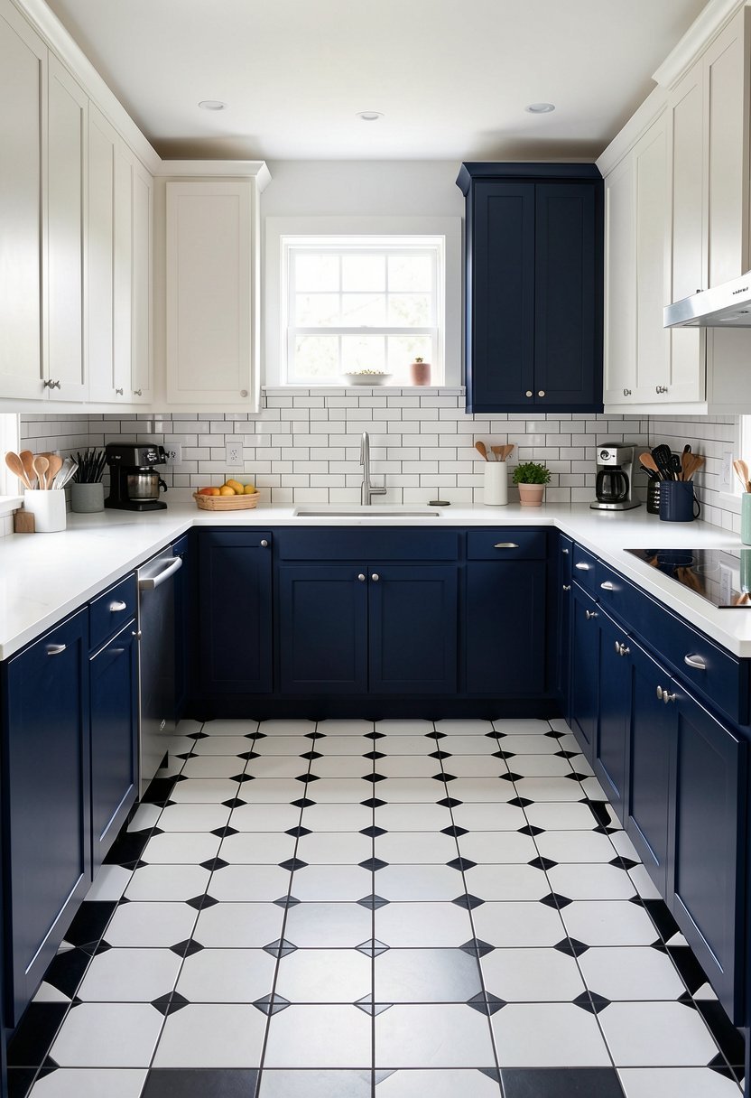
Navy blue is honestly the best friend of a checkered floor. It brings a level of class that white simply cannot match, and it makes the room feel expensive. Stop picking basic white, just trust me on this, and go dark for a change.
Most people worry that dark blue will shrink their room, but that is a myth. When you have high contrast from the floor, a dark cabinet color grounds the whole space. It pulls the eye down, creates a cozy mood, and hides all those kitchen scuffs.
Pairing deep navy with brass hardware is my favorite trick. The warmth of the metal cuts through the cold blue, making everything pop in the best way. Do not be afraid to lean into the drama here, because the floor can handle it.
- Navy creates a sophisticated, high-end kitchen aesthetic.
- Use brass hardware to warm up the blue tones.
- Dark cabinets actually anchor a space with bold floors.
- Avoid basic white if you want a designer look.
2. Crisp White for a Clean Style
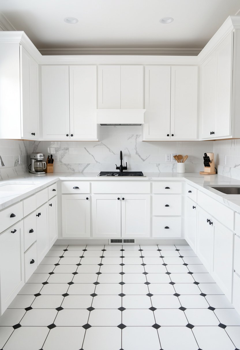
If you want a bright kitchen, white cabinets are the classic choice, but do it right. People often use a flat, cheap white that looks dull next to a sharp floor. Pick a creamy, warm white to keep things feeling like a home.
A clean white cabinet lets your floor do the heavy lifting. If you have a busy tile pattern, keep the walls and cabinets simple. This balance is key, otherwise, your kitchen will feel like a funhouse mirror that makes you dizzy.
I suggest adding texture with your backsplash if you go all white. Maybe a subway tile or a glossy finish, because flat on flat is boring. It is a safe bet, sure, but make sure it has depth so it feels intentional.
- Choose a warm white rather than a flat, stark tone.
- Let the floor be the star of the show.
- Keep the design simple to avoid a dizzying effect.
- Add texture to the walls to prevent a sterile feel.

3. Soft Sage Green for Calm
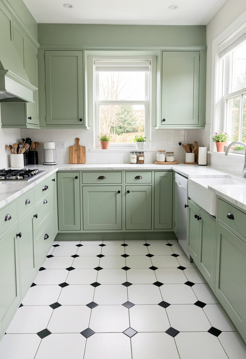
Sage green is having a massive moment, and I love it. It brings a touch of nature into your kitchen, which feels so fresh against the starkness of a black and white floor. It is calming, soft, and never goes out of style.
You might think green and black don’t mix, but you are wrong. The green acts like a neutral here, bridging the gap between the high contrast floor and the rest of the home. It feels organic, earthy, and totally inviting for guests.
Try using matte black hardware with your sage cabinets. It ties in the black from the floor tiles, making the whole room feel connected. It is a look that feels curated, not like you just grabbed the first paint you found.
- Sage green acts as a beautiful, calming neutral color.
- Connect the room with matte black hardware accents.
- Green bridges the gap between high contrast floor tiles.
- This color choice feels organic, earthy, and very inviting.

4. Charcoal Grey for Moody Vibes
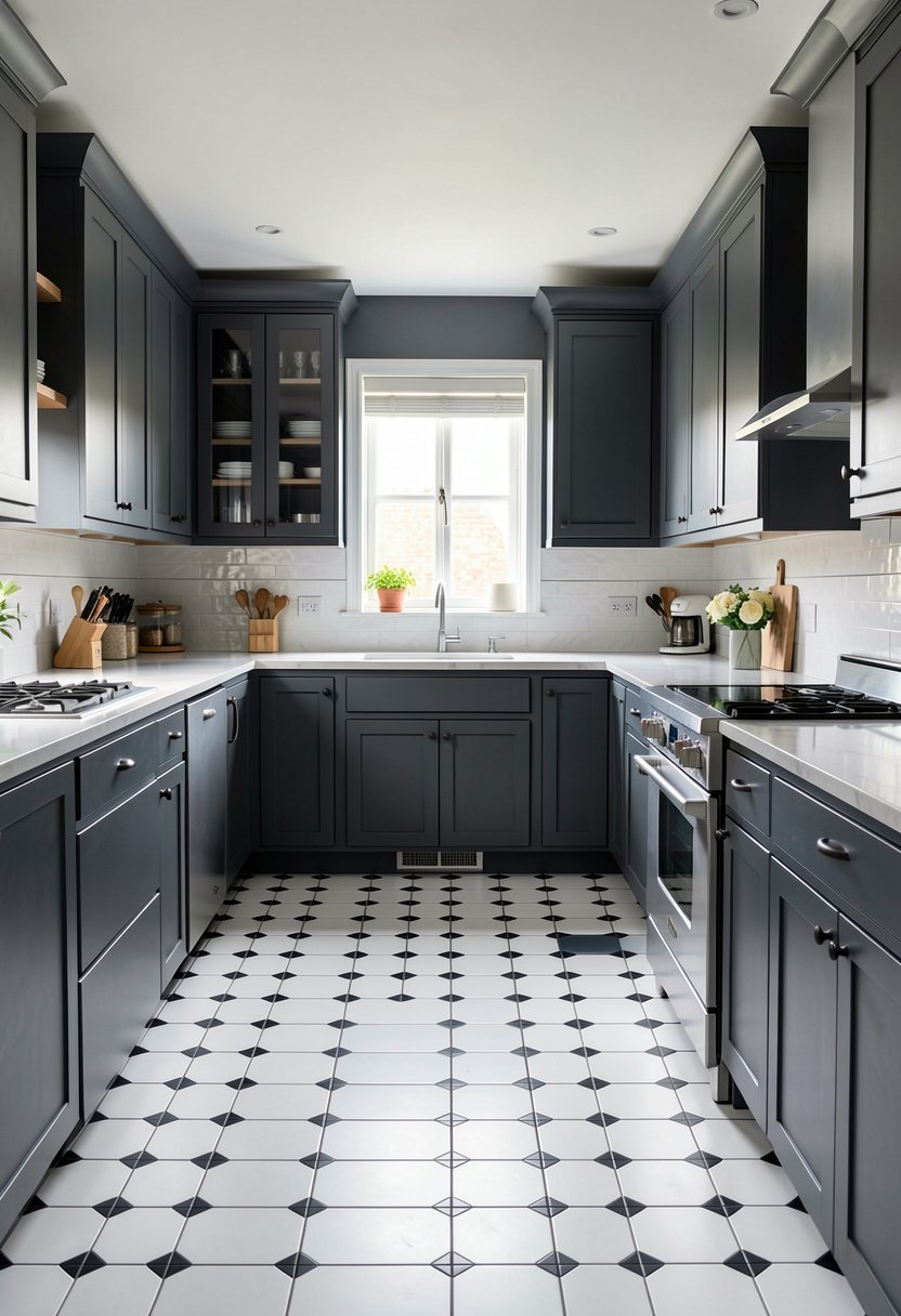
Charcoal is for those who are not afraid of a little moodiness. It is bolder than light grey and feels much more intentional. If you have a large kitchen, this is the perfect way to make it feel super intimate.
Many people make the mistake of choosing a grey that is too blue. Avoid those cool tones, they look like a storm cloud in a bad way. Go for a true, deep charcoal that has warmth buried underneath. It changes throughout the day.
Light countertops are a must if you choose this dark look. You need that bounce of light, or the kitchen will disappear into the shadows. Use quartz or white marble to break up the dark, heavy weight of the charcoal.
- Charcoal grey offers a dramatic and moody kitchen feel.
- Avoid blue-toned greys that feel cold and uninviting.
- Light countertops are essential to bounce light around.
- True charcoal adds warmth and depth to any space.

5. Rich Forest Green for Drama
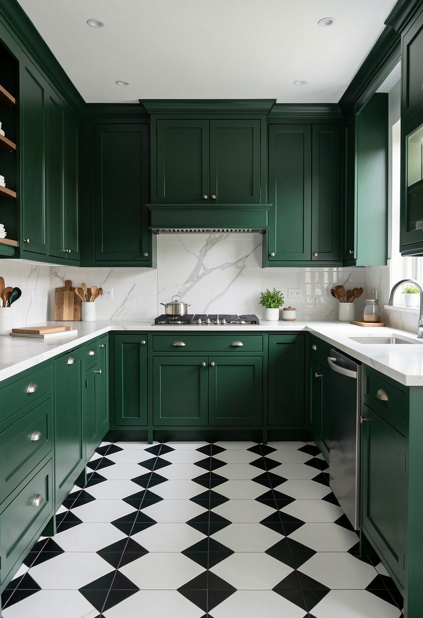
Forest green is basically the cooler cousin of sage. It is deeper, darker, and packs a massive punch of personality. I have seen this in several homes, and it always stops people in their tracks because it looks so bold.
You need to have good lighting if you go with a color this dark. Do not try this in a basement with one bulb. You need natural light, or a lot of good fixtures, to keep the space from feeling like a cave.
This color works perfectly with vintage gold accents. It creates a classic, almost library-like feel in your cooking area. It is sophisticated, rare, and proves you actually have style. Most people are too scared to try this, which is their loss.
- Forest green is a bold, high-impact cabinet choice.
- Good lighting is mandatory for such a dark color.
- Vintage gold accents bring out the rich undertones.
- This daring choice creates a sophisticated, library-like vibe.

6. Warm Cream for Vintage Charm
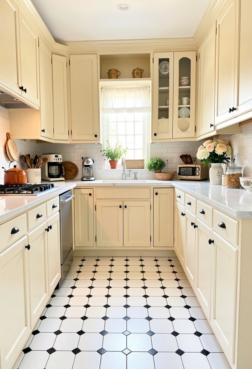
Cream is not yellow, so don’t get them mixed up. A soft, buttery cream color is perfect if you want a kitchen that feels like a cozy cottage. It softens the hard edges of a black and white tile floor instantly.
People often treat cream like a boring choice, but it is actually the secret to a classic farmhouse style. It feels aged and loved, which is a great contrast to a brand-new, perfectly straight tile floor. It brings balance.
Use copper or bronze hardware to lean into that vintage charm. It makes the kitchen feel like it has been there for fifty years in the best way possible. It is a timeless look that never goes out of style.
- Cream creates a soft, cozy, and classic cottage feel.
- Use this color to balance sharp tile floor edges.
- Copper or bronze hardware enhances the vintage charm.
- Avoid yellow-tinted paints that look like a mistake.
7. Soft Blush Pink for Fun
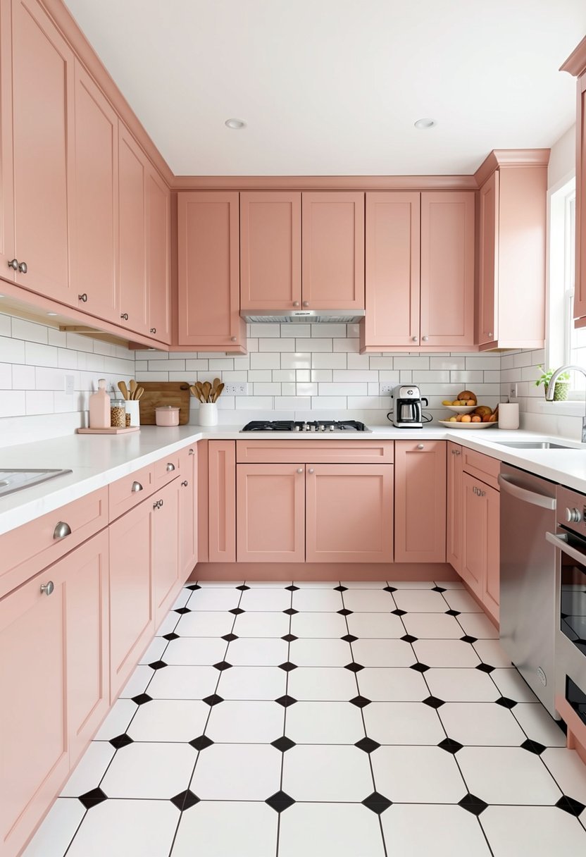
Yes, I am serious, blush pink is a fantastic cabinet color. If you have a black and white floor, the pink keeps the room from feeling too serious. It adds a touch of whimsy that makes cooking feel way more fun.
Don’t go for hot pink, just keep it dusty and light. It acts like a neutral, honestly. It is muted enough that it doesn’t scream at you, but it definitely says you have a sense of humor about your home decor.
Keep your hardware simple with this color. Brushed nickel or even white handles work best so you don’t overwhelm the pink. It is a gutsy move, but it pays off when your kitchen is the most talked about room in your house.
- Dusty blush pink acts as a surprisingly good neutral.
- Muted pink tones avoid looking like a child’s room.
- Keep hardware simple to let the pink color shine.
- This adds a playful, unique touch to a kitchen.
8. Classic Black for Elegance
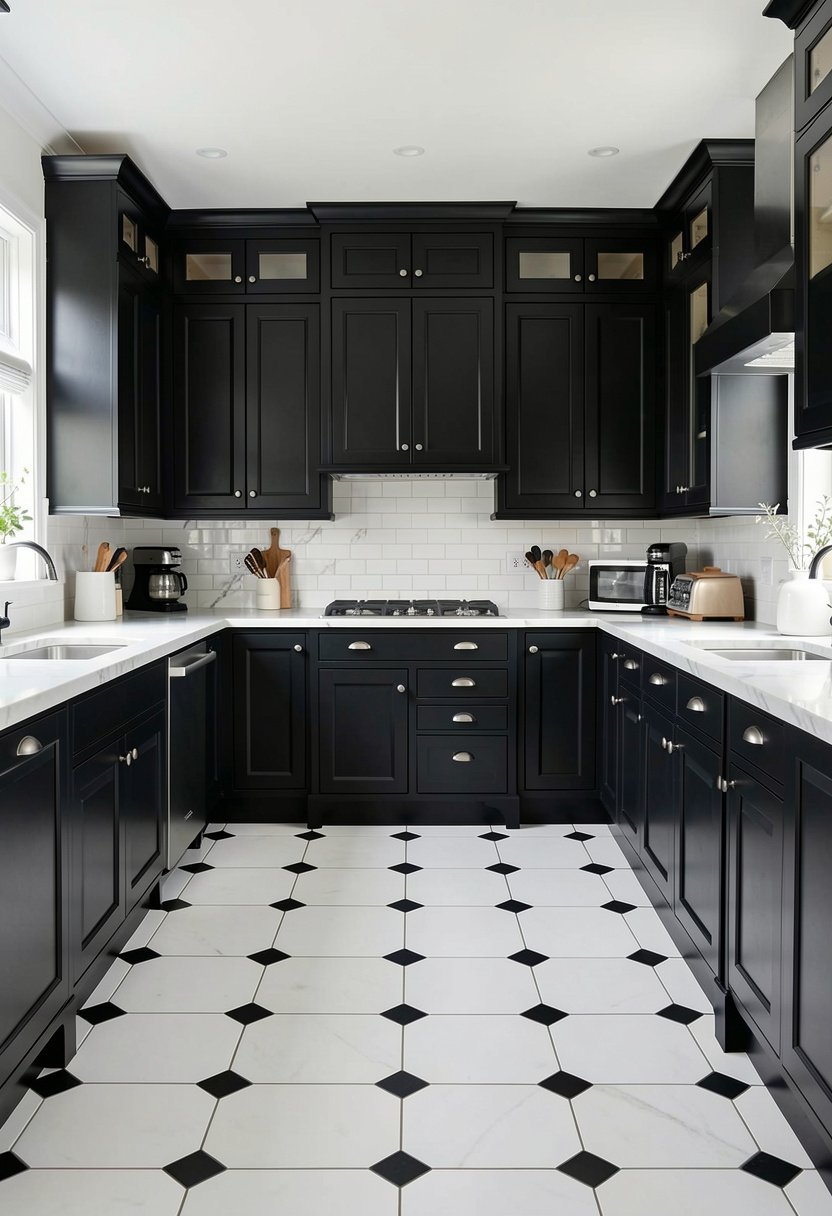
Some people say black cabinets with a black and white floor is too much. I say they are just boring. Black on black looks incredible if you have the space and the guts to pull it off. It is sleek, modern, and very chic.
The trick here is to mix your finishes. If the floor is matte, use a satin or semi-gloss paint for the cabinets. You need that subtle light reflection, otherwise, the whole room will just feel like a flat, dark void.
Add a wood countertop, like butcher block, to bring in some warmth. The organic texture of wood against the high-end black paint is a match made in heaven. It keeps the room from feeling like a sterile, cold office space.
- Black cabinets offer a sleek, modern, and chic look.
- Mix your finishes to add depth and visual interest.
- Use wood countertops to warm up the dark aesthetic.
- A black-on-black approach is perfect for bold homeowners.
9. Soft Butter Yellow for Joy
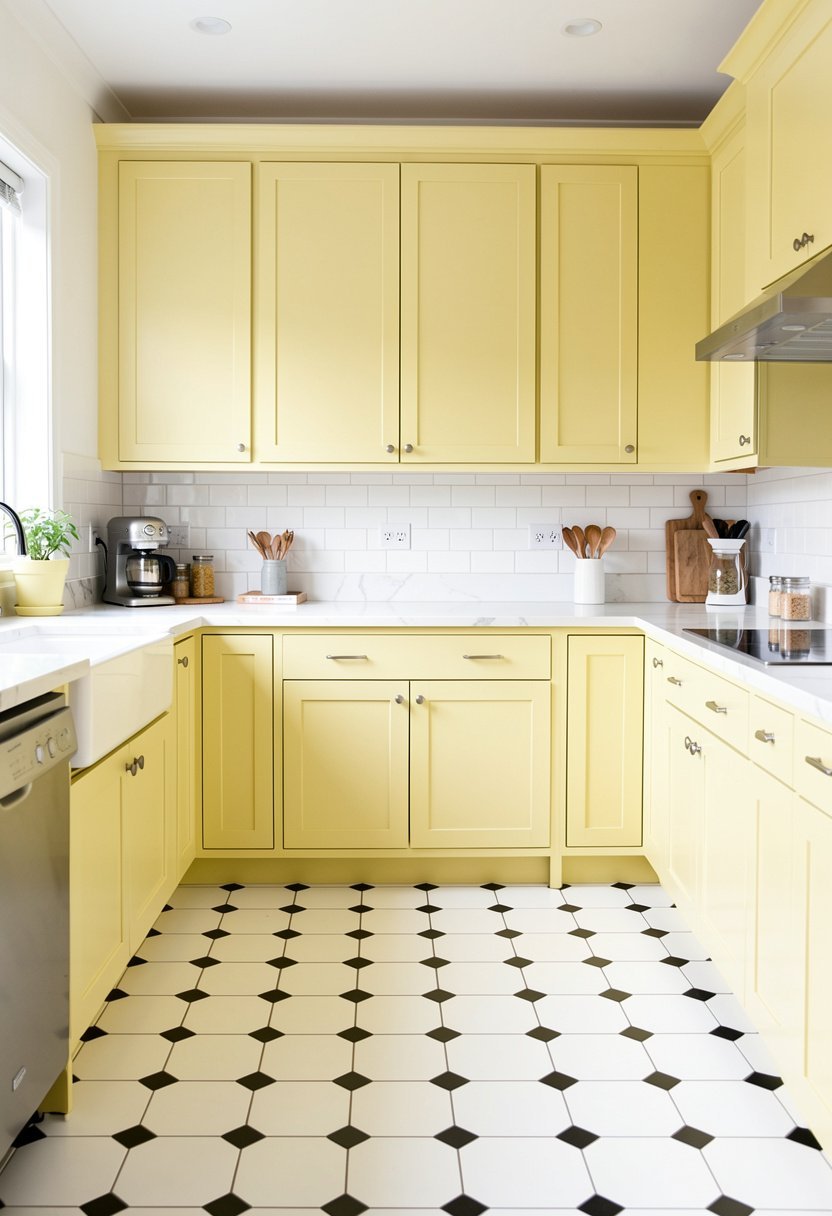
Yellow is a happy color, and it looks lovely with a classic grid floor. It brings a brightness that makes you want to wake up and have coffee. Stay away from neon shades, always go for a pale, soft butter hue.
This color is great if your kitchen doesn’t get a ton of sun. It fakes that golden hour glow all day long. It pairs beautifully with white, which helps it feel fresh rather than dated or country-kitschy in a bad way.
Use glass front cabinets to display your pretty dishes. It breaks up the color and makes the kitchen feel more open. It is a lighthearted choice that makes a small room feel like a cheerful, welcoming sunny spot.
- Pale butter yellow adds instant joy to any kitchen.
- This color mimics a beautiful, natural golden hour glow.
- Avoid neon shades to keep the room looking fresh.
- Glass front cabinets help lighten up the visual weight.
10. Dusty Blue for Coastal Vibes
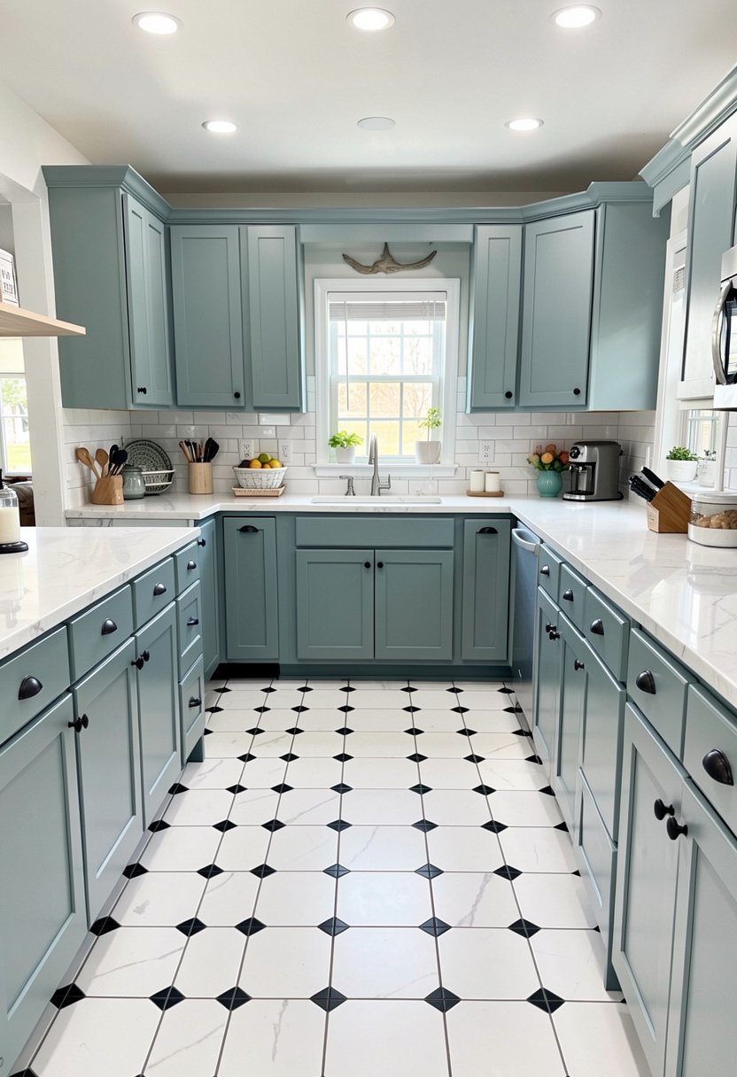
Dusty blue is the color of a calm sea. It works so well with black and white floors because it is cool-toned but soft. It takes the edge off the high contrast of the floor, creating a very relaxing atmosphere.
Many designers use this in beach houses, but it works in a city apartment, too. It feels airy, light, and very clean. If you want a space that helps you decompress after a long day, this is the color for you.
Pair this with white marble counters to keep the breezy look going. It is a sophisticated way to do color without it becoming the main event. Your floors will still look great, but the cabinets will hold their own, too.
- Dusty blue offers a calm, coastal, and airy vibe.
- This color helps soften the contrast of the floor.
- Pair with white marble for a sophisticated, clean look.
- Ideal for creating a relaxing, low-stress cooking space.
11. Warm Terracotta for Earthiness
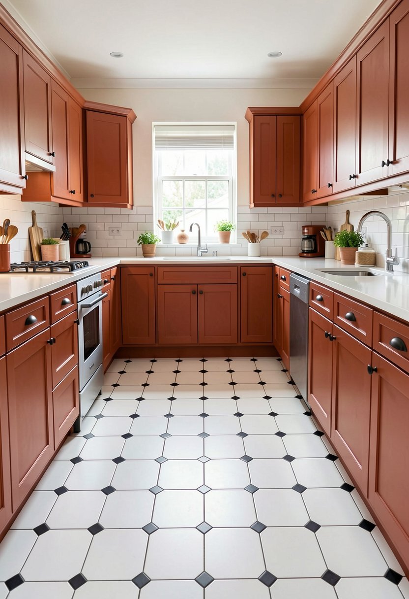
Terracotta cabinets are a bold, earthy choice. They bring a heat to the kitchen that balances the cold, clinical feel of black and white tiles. It is a very trendy look right now, and for good reason, because it feels rich.
Don’t go too bright orange. Think of a clay pot or a sunset in the desert. That muted, brownish-orange tone is where the magic happens. It makes a kitchen feel like it has some history and real character.
Keep your walls neutral to let the cabinets talk. A warm off-white on the walls is all you need. It is a unique, daring choice that shows you aren’t just following the herd, you are setting your own path.
- Terracotta brings warmth to cold tile floor patterns.
- Choose muted, clay-like tones for an earthy appearance.
- Keep surrounding walls neutral to ground the space.
- This daring, trendy color choice adds loads of character.
12. Soft Lavender for Mystery
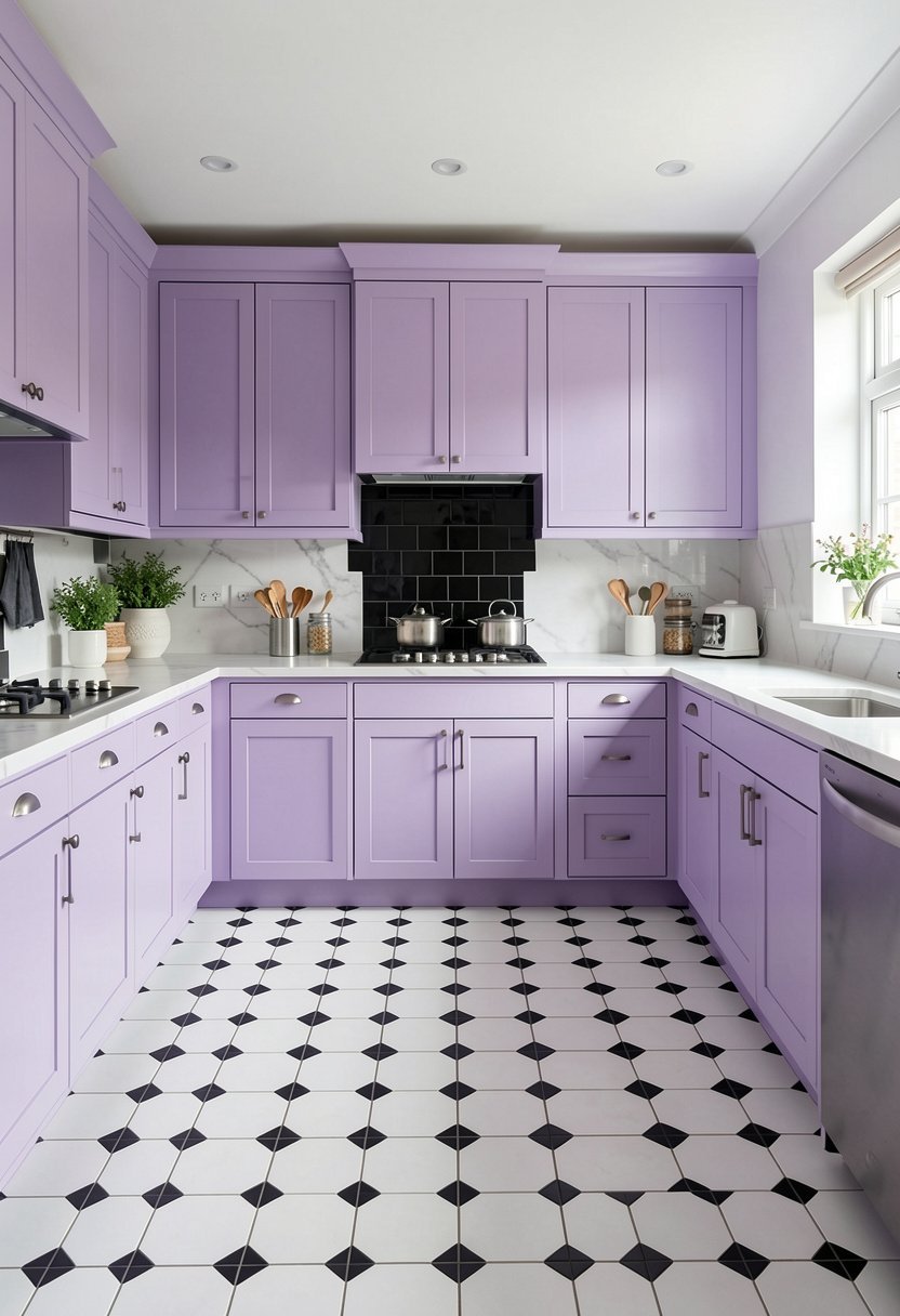
Lavender is a sleeper hit. Most people ignore it, but it is gorgeous with black and white floors. It adds a layer of mystery and softness that you won’t find with standard grey or white cabinets. It is truly special.
Use a grey-toned lavender, not a bright floral purple. You want it to feel sophisticated, not like a preschool classroom. When it is muted, it reads as a neutral that just happens to be a lovely shade of soft violet.
Stick to cool-toned hardware like chrome or silver. It complements the purple undertones perfectly. It is a brave design choice, but if you want your home to feel like a curated, artistic space, this is your winner.
- Lavender adds a unique, soft, and artistic feeling.
- Choose grey-toned purples to keep the look sophisticated.
- Cool-toned hardware works best with this specific shade.
- This unexpected choice creates a beautiful, memorable room.
13. Deep Olive for Luxury
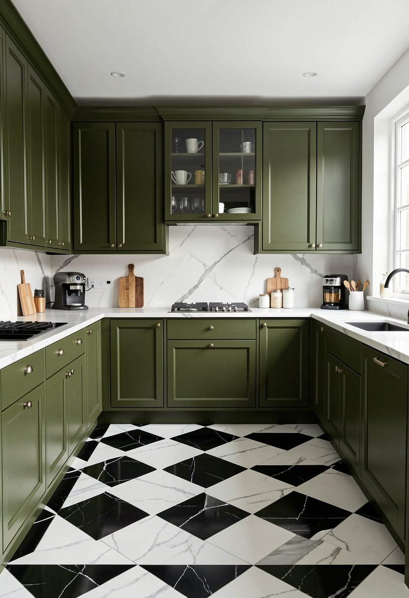
Olive green is rich, mature, and undeniably fancy. It has a yellow undertone that makes it feel much warmer than hunter green. Against a black and white floor, it looks like something out of a high-end design magazine.
You should use this color if you love plants or have a lot of kitchen greenery. The leaves will match the cabinets, creating a seamless, lush look. It is the best way to make a kitchen feel like a sanctuary.
Add dark stone countertops to really lean into the luxury. It is a heavy look, yes, but that is the point. It feels grounded, permanent, and incredibly stylish. It is a top-tier choice for a serious home cook.
- Deep olive creates a luxurious, high-end kitchen aesthetic.
- Warm yellow undertones make the color feel approachable.
- Pair with plenty of plants for a seamless look.
- Dark stone counters enhance the overall sophisticated feel.
14. Taupe for Timeless Style
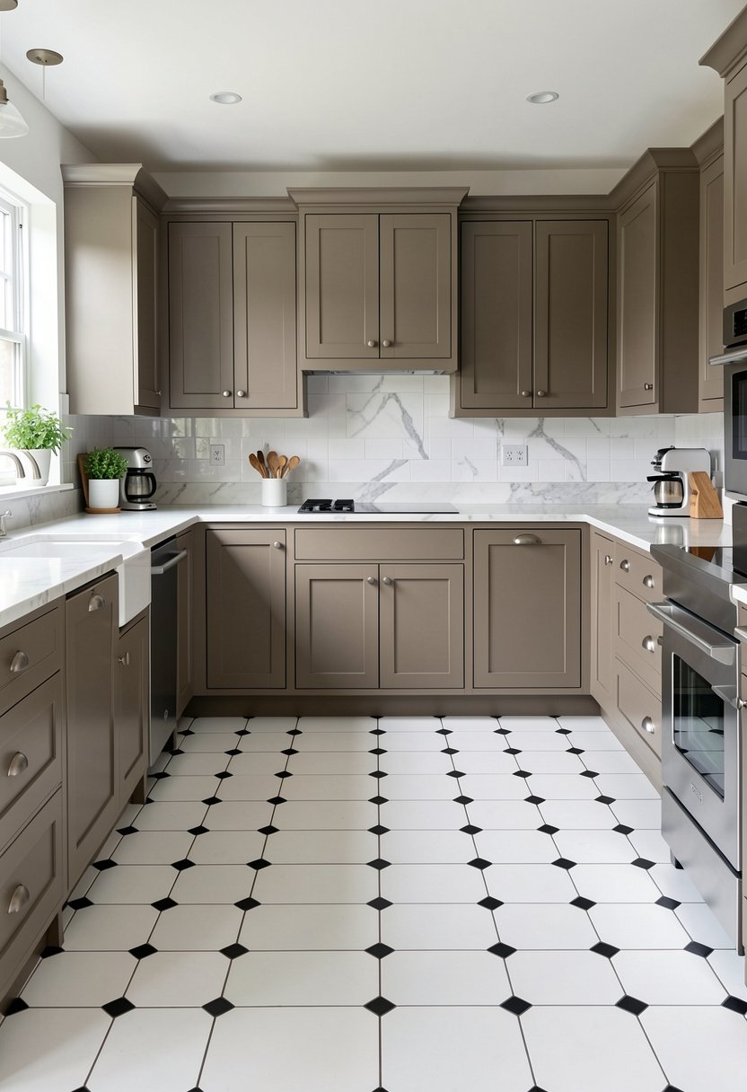
Taupe is the ultimate safe choice that never, ever looks boring. It is the perfect mix of grey and brown, making it a true neutral. It plays so nicely with black and white floors because it doesn’t fight for attention.
Many people struggle with this color because they pick one that looks too muddy. Test your paint first, always. You want a clean, warm taupe that looks great in both morning light and evening lamp light.
This color is the backbone of a modern kitchen design. It is classy, muted, and very elegant. You can change your rugs, your towels, or your art, and the taupe cabinets will match every single time. It is a winner.
- Taupe is a versatile, timeless, and elegant neutral color.
- It complements black and white floors without clashing.
- Always test paint samples to avoid muddy-looking tones.
- This color allows for easy seasonal decor updates.
Final Thoughts
I hope you realize now that your floor isn’t a limitation, it is a starting point. Stop staring at paint chips and pick a color that makes you actually want to spend time in your kitchen. Whether you go with bold navy or soft sage, just commit to the vision fully. You have the tools, the ideas, and the floor to make it happen, you’ve got this.
| Cabinet Color | Style Vibe | Hardware Match |
|---|---|---|
| Navy | Bold | Brass |
| White | Clean | Chrome |
| Sage | Calm | Black |
| Charcoal | Moody | Gold |
| Forest Green | Dramatic | Bronze |
| Cream | Vintage | Copper |
| Blush | Playful | Silver |
| Black | Chic | Satin |
| Yellow | Joyful | White |
| Dusty Blue | Coastal | Nickel |
| Terracotta | Earthy | Iron |
| Lavender | Artistic | Chrome |
| Olive | Luxury | Gold |
| Taupe | Timeless | Matte Black |
| Grey | Modern | Brushed Nickel |
Frequently Asked Questions
Is It Hard to Keep Black and White Floors Clean?
Black and white floors definitely show dust and crumbs more than a busy pattern. You will be sweeping more often, that is just the truth. However, that keeps your kitchen cleaner overall. Think of it as a forced habit that benefits your home hygiene.
Can I Mix Cabinet Colors in the Kitchen?
You absolutely can, and it often looks amazing. Try painting the lower cabinets a dark color like navy and keeping the upper cabinets white. It anchors the kitchen and makes the ceilings feel higher. It is a pro move that works every single time.
Are White Cabinets Still in Style?
White cabinets are a timeless kitchen trend that will never truly go out of style. However, flat, boring white is a bit tired. If you go white, make sure the finish has personality, or use interesting hardware to keep it from looking like a showroom.
Do Black Cabinets Make a Kitchen Look Small?
They only make a room feel small if you have no lighting. If you have windows or good lights, black cabinets make the walls recede. It creates depth and makes the room feel much larger, more sophisticated, and way more interesting than white.
Should I Choose Matte or Glossy Cabinets?
Matte cabinets are much easier to keep looking clean because they don’t show fingerprints as much as glossy ones. If you have kids or pets, stay away from high gloss. Matte looks more modern, expensive, and grounded, especially with high-contrast floors.
Does the Floor Pattern Affect the Cabinet Color?
It totally does. A tiny, tight tile pattern is very busy, so stick to solid, simpler cabinet colors. A large, oversized checkerboard pattern can handle bolder, deeper cabinet colors much better. Always hold a sample of the tile against the paint color.
Will Dark Cabinets Hurt My Home Value?
They will not hurt your value if the design is well-executed. Most buyers appreciate a well-thought-out, high-contrast kitchen. As long as the work is professional and the colors make sense with the floors, it is a selling point, not a problem.
Can I Paint My Existing Cabinets Myself?
You can, but be prepared for a ton of work. You need to sand, prime, and use a high-quality paint. If you rush the prep, the paint will chip in a month. If you are not a patient person, hire a pro for this.