As an Amazon Associate, I earn from qualifying purchases at no extra cost to you.
11 Kitchen Cabinet Color Ideas with Stainless Steel Appliances (Everyone Is Copying)
 ByRayan

Someone told me the other day that picking colors for a kitchen with stainless steel feels like choosing a tie for a gray suit. They were wrong. Stainless steel is actually a neutral base, so you have way more freedom than the internet lets on. I have seen so many people settle for boring white cabinets because they were scared, and honestly, it is a huge mistake.
Most people treat their kitchen like a laboratory, but you should treat it like a home. The metal finish on your stove and fridge is not a bossy color, it is just a background note. If you ignore this fact, you end up with a room that feels cold, lifeless, and way too much like a hospital hallway.
In this post, I am going to show you 11 kitchen cabinet color ideas with stainless steel appliances that actually work. I will tell you which ones look high-end, which ones feel cozy, and which ones you should probably avoid unless you love cleaning. Grab a coffee, let us fix this mess.
1. Crisp Matte Black
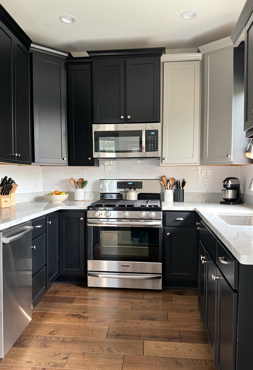
Matte black cabinets with steel appliances look expensive, sharp, and very bold. Most folks worry that black makes a room feel small, but that is total nonsense if you have decent lights. The dark surface creates a moody frame, and the shiny metal pops against it like jewelry. Forget the fear, embrace the drama.
I once did a kitchen in deep coal, and the owner was shaking, but she loved it after one day. The contrast is magnetic, honestly. You need to pick a matte finish, though, because gloss reflects too much light and makes things look cheap. Keep the hardware simple, maybe brushed gold or plain matte black to match.
This look is for the brave, the bold, and the people who want a kitchen that looks like it belongs in a magazine. If you are playing it safe, stay away, but if you want style, this is the winner.
- Black needs good lighting.
- Use matte for the finish.
- Keep hardware very simple.
- Avoid using glossy black.
2. Rich Navy Blue
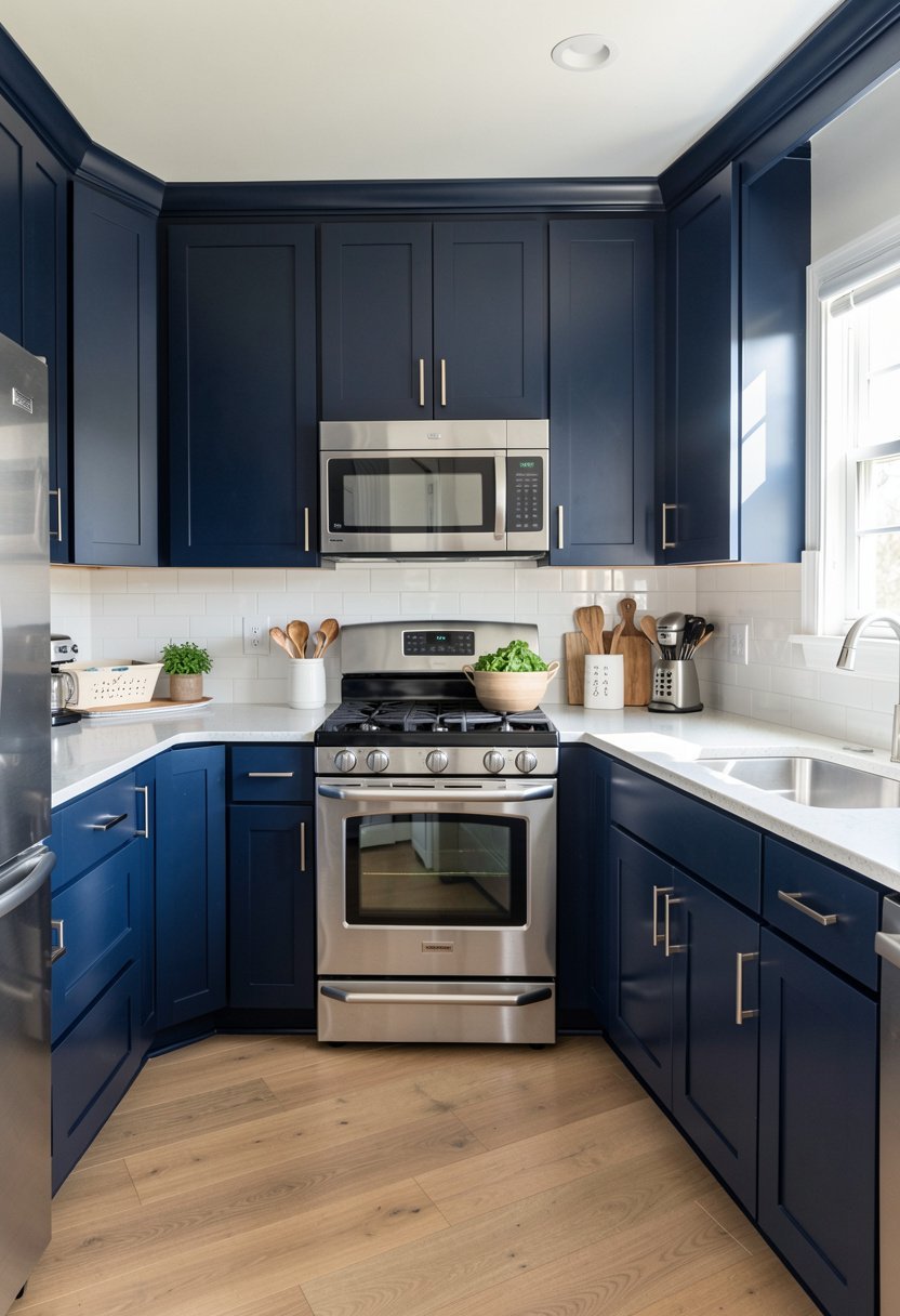
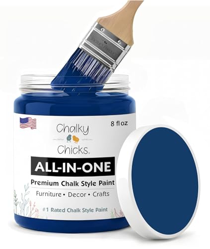
Navy blue is the new neutral, and it loves stainless steel. While everyone else is doing plain gray, you can bring in some deep, soulful color that feels grounded and calm. The cool tones in the navy match the cool silver of the metal perfectly. It makes the kitchen feel like a high-end restaurant.
I have seen navy kitchens that feel sad, but those usually have bad lighting or clashing floors. You need a warm wood floor or a bright rug to balance the blue. Do not pair it with cold white tile, or you will freeze yourself out of the room. A soft brass pull on the cabinet door changes everything.
This look is timeless, which is a rare thing to find in design. It will not look dated in five years, and it makes the stainless steel look intentional.
- Pair navy with wood.
- Avoid cold white tile.
- Use warm metal hardware.
- Great for open spaces.
3. Warm Charcoal Gray
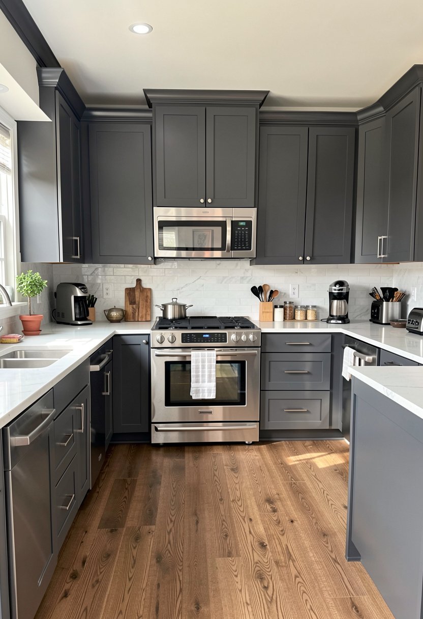
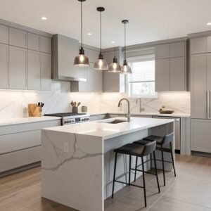
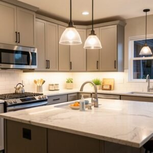
Charcoal gray is the safe choice for people who hate white but fear black. It sits right in the middle, providing enough depth to make the appliances shine without making the whole room feel like a cave. It looks very sophisticated, especially when you bring in some textural elements like stone or slate.
Most people pick a gray that is too light, and it just looks like dusty old paper. You need a deep, rich charcoal with a hint of warmth in the base. If you go too blue with the gray, you will clash with the steel. Stick to a neutral or slightly warm base to keep it cozy.
Charcoal is forgiving with grease and dust, which is a huge win for a working kitchen. It hides the mess, looks expensive, and handles the steel finish with total grace.
- Pick a deep shade.
- Avoid blue-toned grays.
- It hides kitchen messes.
- Use stone for texture.

4. Soft Sage Green
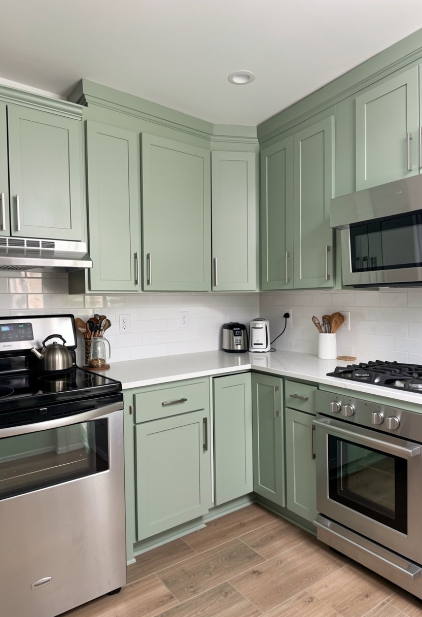
Sage green brings a bit of nature inside, and it looks surprisingly fresh next to modern metal appliances. It sounds like a strange mix, but the organic feel of the green softens the industrial vibe of the steel. It is a very calming kitchen environment that feels friendly and inviting to every guest.
People keep trying to pair green with dark granite, which is a mistake. Keep the counters light, maybe a creamy quartz or white marble. This lets the sage shine as the star of the show. If you use a dark counter, you lose the airy magic of the green, so keep things light and bright.
This color is perfect for a cottage or a farmhouse style kitchen. It is hard to dislike, easy to live with, and looks great every single morning when the sun hits.
- Use light stone counters.
- Keep the walls white.
- Best for cottage styles.
- Avoid dark heavy stone.

5. Creamy Off White
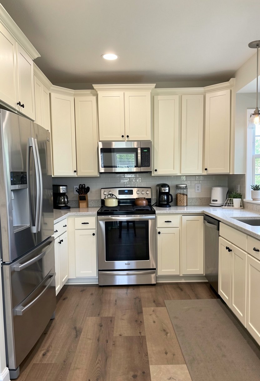
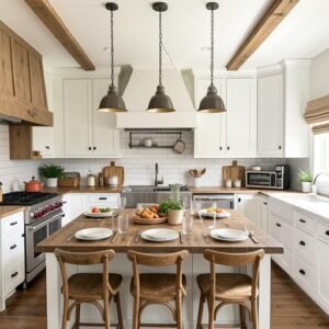
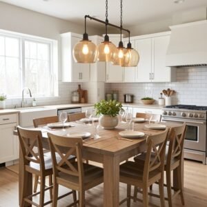
If you absolutely must do a light color, please stop picking stark, cold white. It looks like a dentist office. Pick a warm, creamy off-white instead. It keeps the space feeling big and clean, but it adds a layer of warmth that makes the stainless steel appliances feel like they belong there.
Most people struggle because they pick a white that matches their paper printer. That is a fail. You want a creamy white with yellow or beige undertones. This tiny shift creates a welcoming home atmosphere that does not feel sterile. It creates a soft bounce for the light to dance around the metal parts.
I promise your kitchen will feel like a hug, not a cold box. If you want a classic look that never fails, this is the one. Just get the undertones right.
- Avoid stark hospital white.
- Look for yellow undertones.
- Makes rooms feel bigger.
- Perfect for small spaces.

6. Deep Forest Green
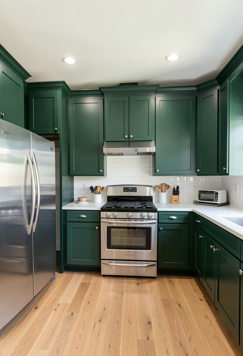
Forest green is for people who want a bold kitchen that feels earthy and grounded. It looks incredible with stainless steel because the metal brings a modern edge to the traditional vibe of the green. It is a very sophisticated design choice that makes your neighbors jealous, but in a very classy, subtle way.
Do not be afraid of the dark. Just make sure your hardware is not lost in the shadows. Use a brushed nickel or even a chrome handle to tie the cabinets into the appliances. If you use gold, keep it bright and polished. This kitchen is a statement, so be ready to show it off.
It is a brave choice, but it pays off with massive style points. Just ensure your lighting is layered and bright enough to handle the intensity of the color.
- Use bright metal hardware.
- Keep the ceiling white.
- Great for tall cabinets.
- Needs very good lighting.

7. Natural Walnut Wood
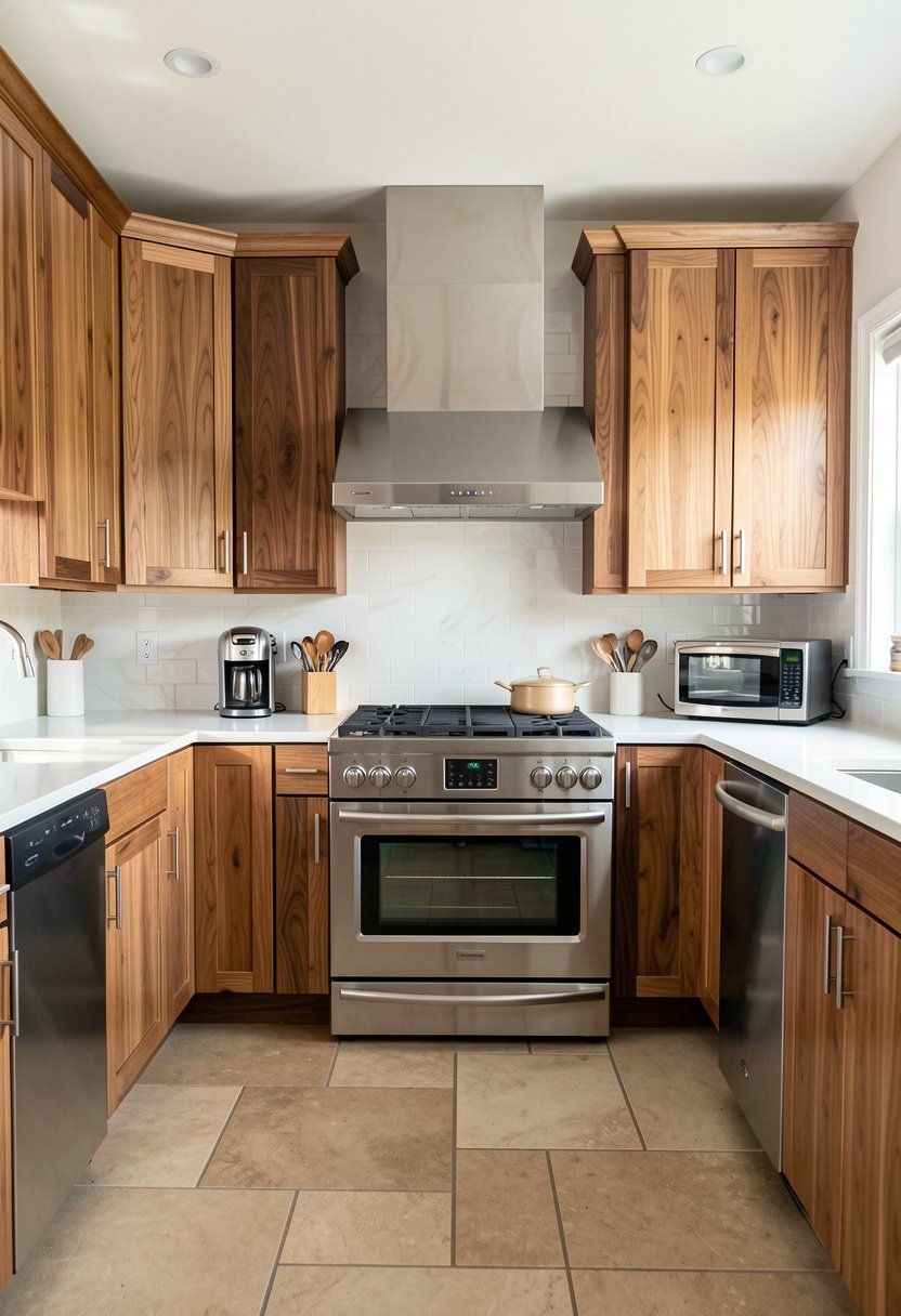
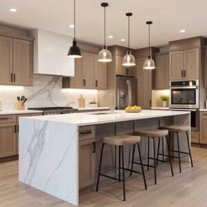
Wood is a color, even if people forget that. A rich walnut stain looks stunning with stainless steel. The warmth of the wood grain cuts through the cold, flat look of the metal. It is a timeless kitchen trend that will look good until the end of time. Most people fear wood, but they are just missing out.
You need to make sure the wood grain is visible and beautiful. Do not hide it under a thick, muddy stain. The contrast between the organic lines of the wood and the perfect, smooth lines of the steel creates a very high-end look. It makes a house feel like an actual home.
Walnut is expensive, sure, but you can get the look with quality veneers. It adds depth that paint simply cannot match, no matter how much you try.
- Showcase the wood grain.
- Avoid muddy dark stains.
- Adds instant luxury feel.
- Looks better with age.

8. Muted Dusty Blue
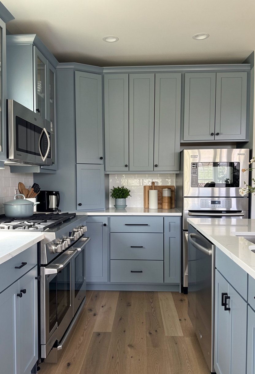
Dusty blue is subtle, gentle, and very easy on the eyes. It is much softer than navy and works well in kitchens that get a lot of natural light. It looks great with the silver of the appliances, creating a balanced color palette that feels serene. People keep picking bright blue, and it usually ends up looking like a nursery.
You want a blue that has a lot of gray mixed in. That muddiness is what makes it look expensive and high-end. If it is too bright, it screams for attention in the wrong way. Keep the rest of the room simple, maybe some open shelves, to let the blue do the heavy lifting.
This is a very safe color that feels special. It is hard to mess up, provided you pick a shade with enough gray.
- Needs lots of gray.
- Avoid bright primary blues.
- Perfect for sunny kitchens.
- Keep shelving very simple.

9. Soft Mushroom Taupe
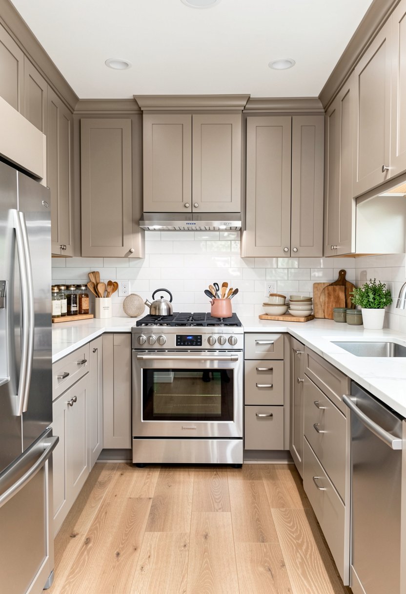
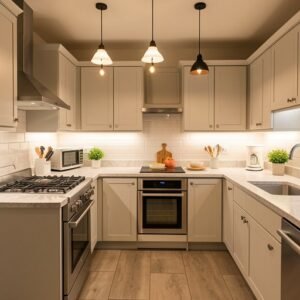
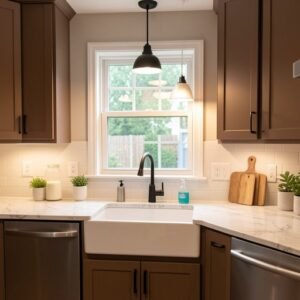
Taupe is the color for people who are tired of gray but scared of color. It is a perfect blend of beige and gray, and it acts as a neutral backdrop for stainless steel appliances. It warms up the kitchen without being too orange or yellow. It feels modern, clean, and very fancy.
I once saw a kitchen in taupe with black hardware, and it was stunning. It felt like a high-end spa. Most people go too light and end up with a beige mess. Go for a mid-tone taupe that has some weight to it. This provides a nice bridge between the steel and the floor.
Taupe is a chameleon color. It changes based on the light, which makes the room feel alive and not just static. It is a total win.
- Pick a mid-tone shade.
- Use black cabinet pulls.
- Avoid very light beige.
- Changes with the light.

10. Moody Aubergine
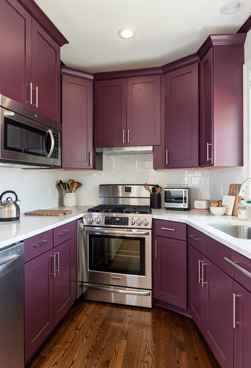
Aubergine is for the person who wants to be different. It is a deep, dark purple that looks elegant and unique when paired with modern stainless steel. Most people think purple is crazy, but when it is this dark, it acts like a black with a secret. It is a bold interior statement that really shines.
You have to commit to this one. It is not for the faint of heart. Pair it with crisp white walls to keep the contrast high, or go dark on dark for a dramatic vibe. The metal appliances will sparkle against the deep purple tones, creating a look that is truly one of a kind.
If you are tired of the same old kitchen designs, take a risk here. It is dark, sexy, and very, very stylish if you do it right.
- Pair with white walls.
- Use for a bold look.
- Not for timid designers.
- Looks great with steel.

11. Sleek Charcoal Blue
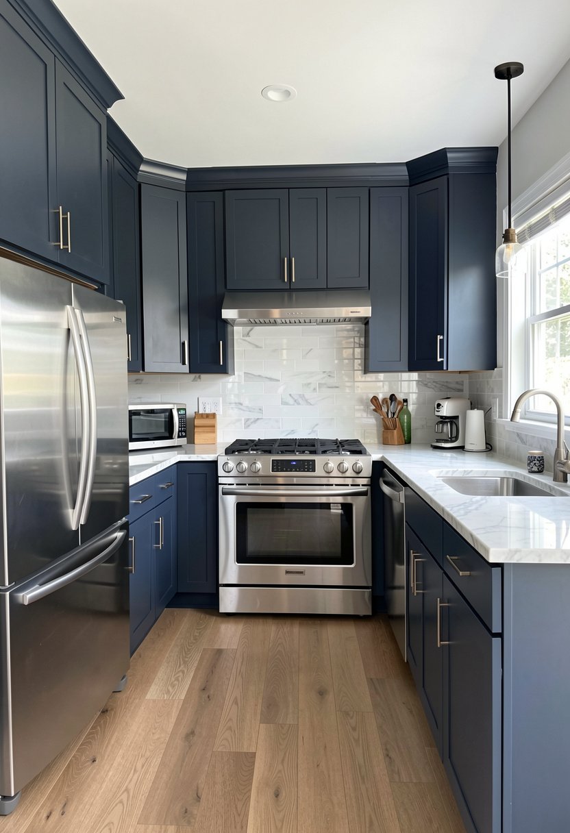
This is the hidden gem of kitchen colors. It is a mix of charcoal and navy that looks different every single time you look at it. It is very dark, very modern, and makes stainless steel appliances look like they cost double what you paid. It is a high-end kitchen finish that is worth every penny of the paint.
Many people mix their own colors to get this look, but you can find it in high-end lines. It bridges the gap between the sharpness of the appliances and the warmth of the home. It feels professional but not cold. This is the color for someone who takes their kitchen seriously but still wants style.
It works with almost any floor, from light wood to dark stone. It is a total powerhouse color that does not get enough credit in stores.
- Looks like a chameleon.
- Works with many floors.
- Provides a professional vibe.
- Very modern and sleek.

Final Thoughts
I hope these ideas help you stop staring at your blank walls and start painting. Stainless steel is not the enemy, it is your secret weapon for a modern look. You have got the knowledge now, so skip the boring white and try something that actually shows your personality. Put on your apron, grab a brush, and make it happen. Seriously, you have got this.
| Kitchen Color | Best Metal Hardware | Kitchen Vibe |
|---|---|---|
| Matte Black | Brushed Gold | Dramatic |
| Navy Blue | Brushed Brass | Timeless |
| Charcoal Gray | Matte Black | Sophisticated |
| Sage Green | Antique Brass | Organic |
| Creamy White | Polished Nickel | Classic |
| Forest Green | Champagne Gold | Earthy |
| Walnut Wood | Matte Black | Luxury |
| Dusty Blue | Brushed Nickel | Serene |
| Mushroom Taupe | Oil Rubbed Bronze | Calm |
| Aubergine | Polished Chrome | Unique |
| Charcoal Blue | Satin Brass | Modern |
| Light Gray | Brushed Nickel | Clean |
| Soft Teal | Matte Black | Fun |
| Terracotta | Antique Brass | Warm |
| Deep Plum | Brushed Gold | Bold |
Frequently Asked Questions
Is Stainless Steel Considered a Neutral Color?
Yes, it is effectively a neutral gray. Because it is metallic, it reflects the colors around it. This is why you can pair almost any cabinet color with it. If you treat it like a base, you will never go wrong with your design.
Can I Mix Gold Hardware with Stainless Steel?
Absolutely, and you should. Mixing metals is a great way to make a kitchen feel layered and expensive. It breaks up the monotony of the silver appliances. Just make sure the gold finish is consistent throughout the entire room to keep it looking tied together.
Are White Cabinets Still a Good Choice?
White is classic, but it is often done poorly. If you use a stark, cold white, your kitchen will feel like a hospital. Always choose a creamy or warm white. This adds life and makes the stainless steel pop in a much more pleasant, inviting way.
Do Dark Cabinets Make a Small Kitchen Look Smaller?
This is a myth. Dark cabinets can actually add depth and make the walls feel like they are receding. If your kitchen has good lighting, the dark color will look rich and high-end. Poor lighting is the real killer of small kitchens, not the dark paint.
Should I Match My Faucet to the Appliances?
You do not have to, but it is the easiest path. Matching the faucet to your appliances keeps the design cohesive. However, if you want to be adventurous, you can choose a different finish. Just ensure the rest of your hardware matches that new faucet finish.
Does Gray Paint Clash with Stainless Steel?
It only clashes if the undertones are wrong. If your gray paint has a strong blue tint, it might fight with the silver. Always test your paint samples in your specific kitchen lighting before you commit. Look for neutral or warm-toned grays to be safe.
Will Matte Cabinets Show Too Many Fingerprints?
Higher quality matte finishes are designed to resist smudges. However, if you have young children, you might want to consider a semi-matte or a slightly textured finish. Matte is beautiful and hides dust well, but it does require a quick wipe down occasionally.
Will These Colors Look Outdated in a Few Years?
Classic colors like navy, charcoal, and warm white will never go out of style. Trends like bold greens or aubergine might feel fresher now, but they still hold up if you choose the right shade. Focus on quality over following every passing trend.