As an Amazon Associate, I earn from qualifying purchases at no extra cost to you.
14 Pastel Kitchen Decor Ideas (That Look Pro Made)
 ByRayan

With pastel colors, you can turn a boring kitchen into a happy space, that feels like a warm hug. Most people think soft colors look like a nursery, but they are so wrong. You just need to know how to style them, so they look grown up and very chic.
I see so many people ruin their homes, by picking colors that look like melted chalk. It is sad, really. If you want 14 pastel kitchen decor ideas that actually work, you are in the right spot. I have tried every color, and I know which ones stay beautiful, and which ones look like cheap plastic.
Stop guessing, and start painting. We are going to fix your kitchen, one soft shade at a time. I will show you how to use paint, cabinets, and small items, to make the room look like a dream. Forget the rules, let us make your space feel like you, with these pro tips.
1. Paint Your Lower Cabinets a Soft Mint
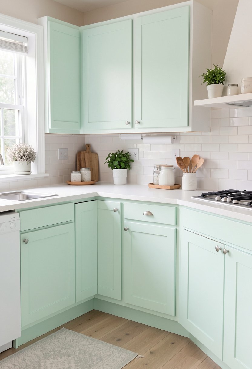
Painting the lower cabinets a soft mint, is the best way to anchor your room. Most people paint everything one color, which makes the kitchen look like a big box. By focusing on the bottom, you add weight, and charm, to the space. It looks grounded, and very expensive, when done right.
I always tell my friends to pick a mint that has a lot of gray in it. If you choose a bright, neon green, you will hate it by next week. Trust me, the gray keeps it neutral, and classy. You want your kitchen to feel fresh, not like a cartoon show. It works best with white walls, and warm wood floors.
Do not worry about it being too bold. You are only painting the bottom half, so the top stays light, and airy. It is the perfect balance, for a modern home. If you want to upgrade your cabinets, this is the place to start. It changes the mood, instantly.
- Choose a mint with gray undertones.
- Paint only the lower cabinet set.
- Keep walls white for balance.
- Use matte paint for finish.
2. Bring in Dusty Pink Bar Stools
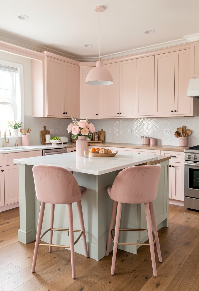
Nothing says luxury like a velvet bar stool, in a dusty pink shade. People think pink is too girly, but they are just afraid of color. A dusty pink is sophisticated, and looks amazing against dark stone counters. It gives your kitchen a soft edge, that feels very fancy, and fun to use.
When you buy these, look for gold legs, or brass accents. The mix of pink and gold is timeless, and it makes the stools look like a designer piece. Avoid plastic stools, at all costs. They cheapen the look, and they feel sticky in the summer. Spend a little more, and you will have them for years.
I have these in my own home, and people always ask where I found them. They pop, without being loud. If you need a quick kitchen update, this is it. These stools invite people to sit, and stay a while. Your guests will love the comfort, and the style, of this simple change.
- Select a velvet fabric texture.
- Look for gold or brass.
- Avoid cheap plastic materials.
- Pick a muted dusty pink.
3. Hang Pale Yellow Pendant Lights
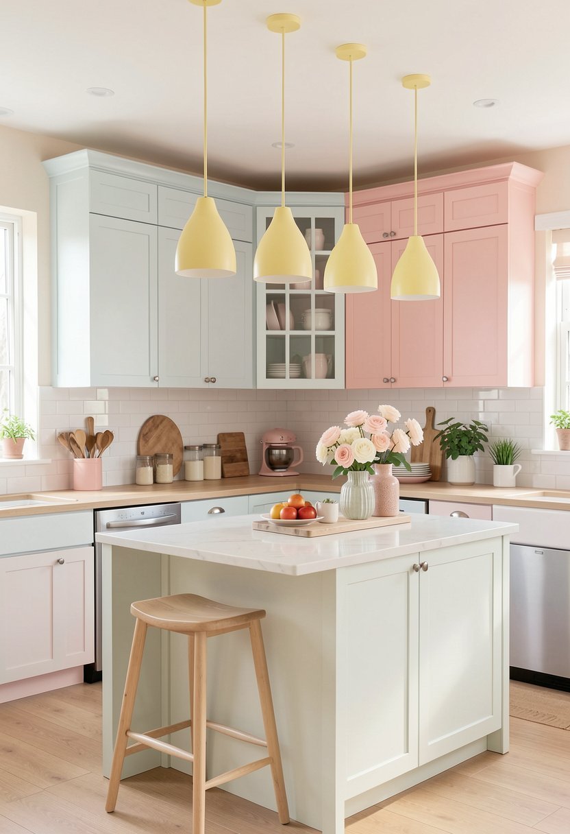
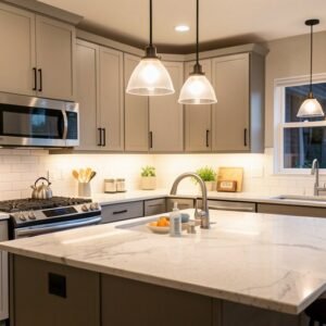
Pale yellow lights are the sunshine, your kitchen is missing. Most kitchens are dark, and sad, because people pick boring metal lamps. By swapping them for yellow, you bring in light, and joy. It is such a small change, but it makes a massive impact, on how the room feels at night.
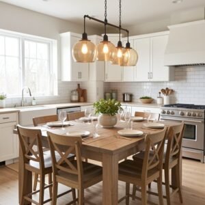
Do not get a yellow that is too bright. You want it to look like butter, or cream. If the color is too loud, it will clash with your other decor. A soft, buttery yellow looks like gold, when the sun hits it. It is a subtle nod to color, that feels very high end, and clean.
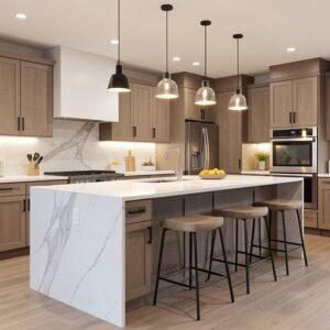
I love using these over a kitchen island. They become the focal point, without trying too hard. You can also change your light fixtures to match. It is a simple swap, that makes your house feel like a home. Keep the shade shape simple, like a globe, to keep it feeling very modern.
- Aim for a buttery shade.
- Use globes for simplicity.
- Hang them over islands.
- Avoid neon yellow tones.
4. Add Lavender Towels for Texture
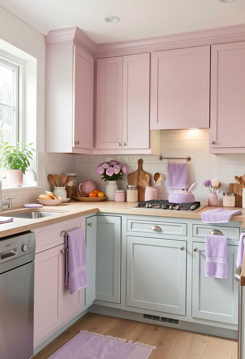
Lavender is a tough color to get right, but it looks stunning in a kitchen. You do not need to paint your walls purple. Just buy some nice, linen towels in a soft lavender shade. Hang them on your oven handle, and watch the room transform. It is cheap, easy, and very effective.
People usually mess this up by choosing patterns. Stick to solid colors, and high quality linen fabric. The texture of the linen makes the lavender look earthy, and natural. If you pick a shiny polyester, it will look like a mistake. Linen is always the better choice, for a kitchen that looks like a pro designed it.
This is a great way to test a color, before you commit to more. If you love it, you can add a rug, or a vase. If you hate it, you just move the towel. It is the ultimate decorating on a budget trick. You can change your look, every single season, with almost zero effort.
- Use linen for natural texture.
- Stick to solid colors only.
- Drape over oven handles.
- Use as a low-risk test.
5. Use Sky Blue Open Shelving
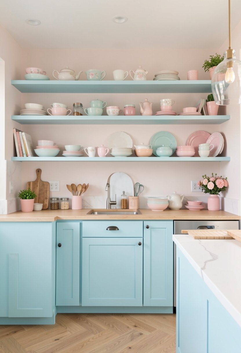
Open shelves are the perfect place to show off, your sky blue collection. If you have white walls, blue shelves will stand out. It makes the kitchen look like a cozy cafe, in the south of France. It is bright, and cheerful, and makes every white plate look like art.
I see people cluttering these shelves, with junk. Do not do that. Only put your pretty things on display. A stack of white bowls, and one blue glass pitcher, is plenty. If you crowd the shelves, you lose the clean, pastel vibe. Less is always more, especially when you are using color to make a statement.
Make sure your brackets are nice. Use wood, or brass, to hold the shelves up. It keeps the sky blue from feeling too cold. If you need to organize your pantry, this is a lovely way to do it. It forces you to keep things tidy, and it looks beautiful, every single day.
- Keep your shelves uncluttered.
- Select wood or brass brackets.
- Pair with simple white dishes.
- Avoid dark or busy items.
✅ See Also: 12 Pink Kitchen Decor Ideas (That Still Impress)
6. Display a Peach Ceramic Vase
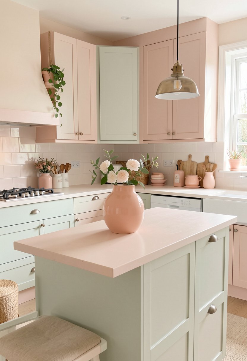
Peach is a warm pastel, that makes a kitchen feel alive. A ceramic vase on your counter, is all you need to start. Look for one that has a bumpy, or handmade texture. It adds personality, and it feels like you found it at a cool market. It is much better than a generic, glass jar.
Fill it with simple white flowers, or dried branches. The peach color will pop against the greenery. Do not buy a vase that is perfectly round, and smooth. You want something that looks like it has a story. It breaks up the hard lines, of your cabinets, and counters.
This piece is a great kitchen centerpiece idea, for any dining table. It brings warmth, to the whole space. If your kitchen feels a bit sterile, this is the fix. It is the easiest way to soften a room, without buying furniture. It is just a small touch, but it works every single time.
- Choose a handmade ceramic texture.
- Fill with white or green.
- Avoid mass produced glass.
- Place in a focal spot.
7. Lay Down a Soft Cream Rug
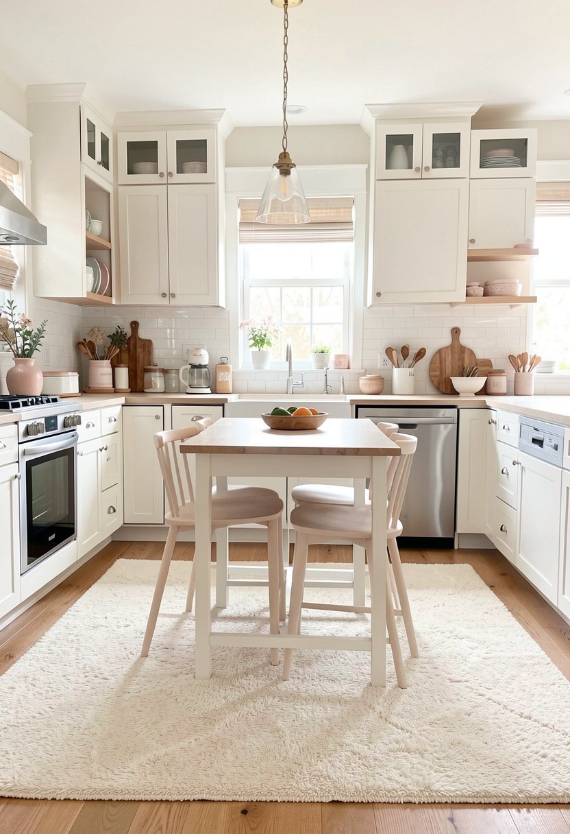
A soft cream rug hides ugly floors, and brings texture to your kitchen. People avoid rugs in the kitchen, because they think they are hard to clean. That is just bad advice. Use a washable runner, and you will be fine. It makes the space feel like a room, instead of just a workspace.
Cream is the ultimate neutral, so it works with any other pastel you choose. It softens the sound, of clicking heels on tile. It makes the kitchen feel cozy, and inviting. When you have a hard floor, the room feels cold. A rug changes that, by adding warmth, and style, to your feet.
I always suggest a low pile rug, so you do not trip. It should be easy to toss in the wash, after a spill. You can update your flooring without new tiles. It is a smart move, for anyone who wants a kitchen that feels finished. It pulls all your other colors together, like magic.
- Pick a washable rug runner.
- Choose a low pile style.
- Use cream as a neutral.
- Keep it away from spills.
8. Choose Blush Pink Hardware
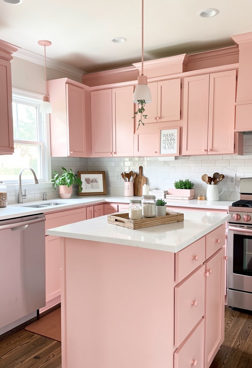
Changing your hardware is a tiny change, but it makes a massive difference. Blush pink handles look so chic, on white or gray cabinets. It is a subtle detail, that shows you pay attention to the little things. It feels very custom, and very expensive, without the high cost.
Stay away from pink plastic hardware. Look for metal that has been coated in a matte, blush finish. It feels solid, and it looks like it belongs in a high end store. You can swap these out in an afternoon. It is the perfect DIY kitchen project, that anyone can finish.
I love how it makes a plain kitchen feel special. If you have boring builder cabinets, this is your secret weapon. You do not need to replace the cabinets, just the pulls. It is a fast, and smart way to get that pro look. Your friends will be so jealous, of your new style.
- Use matte blush metal pulls.
- Avoid cheap plastic handles.
- Swap them for a quick fix.
- Works great on white doors.
9. Hang Sage Green Curtains
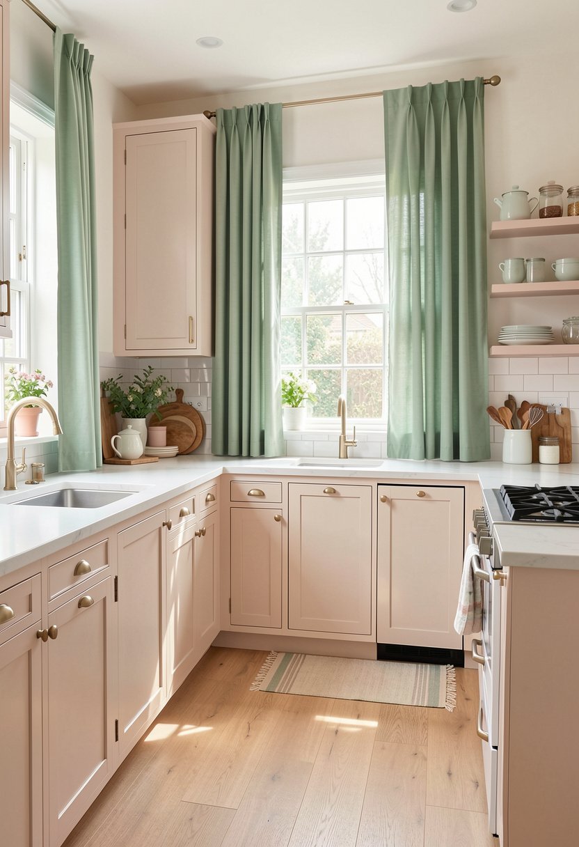
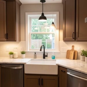
Sage green is a pastel, that feels like nature. If you have a window over your sink, put up some sage curtains. It connects your kitchen to the yard, and makes the whole space feel bigger. It is a calming color, that makes cooking feel less like a chore.
Don’t buy heavy, dark drapes. You want light linen, or cotton, that lets the sun shine through. It should feel like a breeze, when the window is open. Sage green goes with everything, so you do not have to worry about clashing. It is a very safe, and very stylish choice.
I think every kitchen window needs a little softness. Curtains add that, and they give you privacy too. If you are looking to style your windows, start here. It is a classic look, that never goes out of style. It brings a peaceful vibe, to the busiest room in your house.
- Choose light linen or cotton.
- Let the sunlight shine through.
- Use a simple rod system.
- Pick a soft, muted sage.
10. Get a Cream Enamel Bread Box
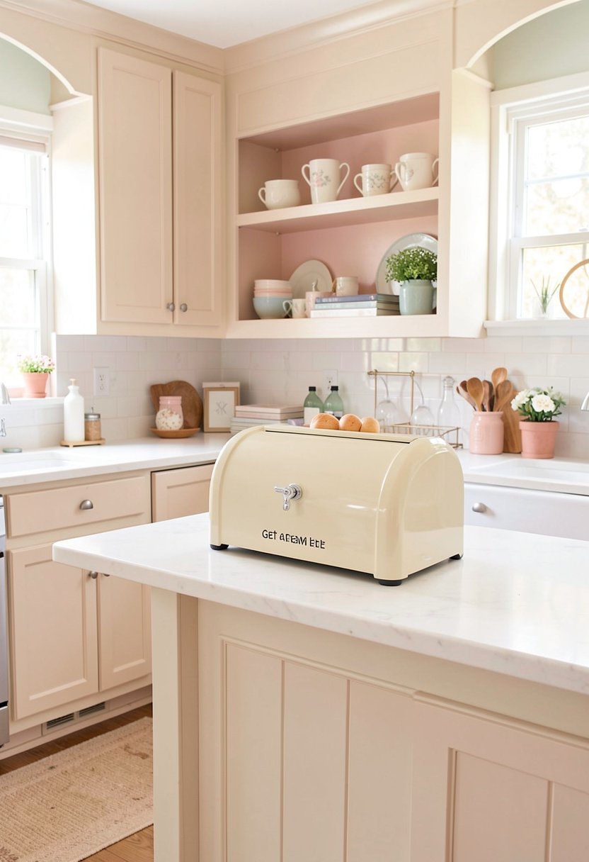
A cream enamel bread box is both useful, and very pretty. It hides your messy bread bags, and adds a vintage touch to the counter. Cream is a soft pastel, that fits perfectly in any kitchen style. It is way better than leaving plastic bags, lying all over the place.
Enamel lasts forever, and it is very easy to clean. Just wipe it down, and it looks brand new. It is the best kitchen storage solution, for your daily loaves. It looks like it belongs in a bakery, from a movie. It is functional decor, which is my favorite kind of item to own.
Do not settle for a bread box that is too busy. Keep it clean, and simple. The shape should be classic, maybe a little rounded. You will love having it on your counter. It makes your morning toast feel like a special event. Plus, it hides the clutter, which makes everything look neater.
- Use enamel for easy cleaning.
- Choose a simple, classic shape.
- Keep your counters very tidy.
- Look for a soft cream tone.
11. Add Aqua Kitchen Bowls
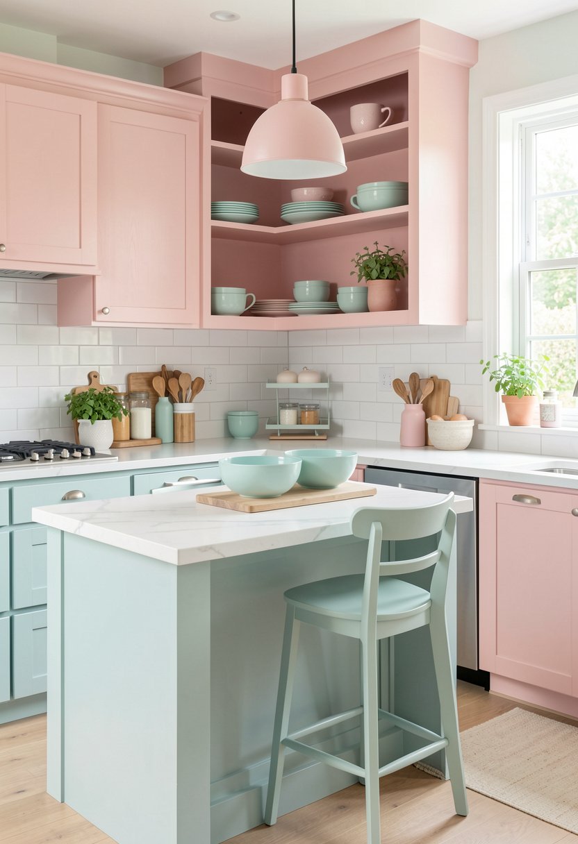
Aqua is such a happy color. Having a few aqua mixing bowls, makes even a bad cook look like a pro. You do not need to hide these in a cupboard. Stack them on your counter, so they can be seen. The color is bright, and fun, and it adds life to the room.
Quality matters here. Get ceramic, or heavy glass. Cheap plastic bowls are for campers, not for a nice kitchen. When you have beautiful tools, you will actually want to use them. It turns a boring task, like baking, into a fun experience. It is a small investment, that pays off every time.
I have a set of these, and they make me smile. They look great against wood, or white marble. If you want to brighten your kitchen, start with your bowls. It is a subtle change, that makes a big visual impact. Just make sure they are within reach, so you actually use them.
- Buy heavy ceramic or glass.
- Stack for display on counters.
- Avoid cheap plastic versions.
- Choose a bright aqua hue.
12. Mix in Soft Gray Accents
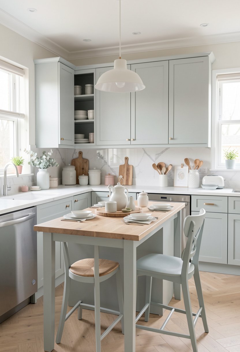
If you want to keep your pastels from looking too sweet, add some soft gray. It is the perfect anchor, for all your other colors. A gray tray, or a gray tea kettle, makes everything else look sophisticated. It is the secret ingredient, that keeps the pastel look from being too much.
People often forget to use neutrals. You need a mix, of soft and hard, to make a room look balanced. Gray does exactly that. It is cool, and steady, and it makes your pastels pop. It is the perfect way to tone down a room, that has gotten a little too bright.
I love a gray stone board, for serving cheese. It brings a natural texture, that looks very expensive. If you need to decorate your counters, this is the move. It is practical, and it adds a serious tone, to all your pastel fun. Keep it simple, and you will always have a great room.
- Use gray as a neutral anchor.
- Add gray stone or slate boards.
- Balance your bright pastel items.
- Keep accents simple and clean.
13. Use Lilac Herb Pots
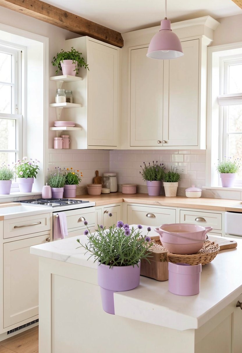
Growing herbs in lilac pots, is a dream. You get fresh food, and you get a pretty, pastel pop. It makes your kitchen smell great, and look like a dream. It is a cheap project, that makes you look like a master gardener. Plus, it is so easy to keep them alive.
Get small, clay pots, and paint them yourself. You can get the perfect shade, of lilac. It is a fun weekend task, that anyone can do. If you have a sunny spot, use it. It adds life to your space, and makes the room feel cozy. It is a classic indoor herb garden move.
Don’t overcomplicate it. Just pick three herbs, like basil, mint, and parsley. It is enough to make a difference. The lilac color is unique, and it makes your herbs look like art. You will love having fresh flavor, right at your fingertips. It is the perfect touch, for a happy, pastel kitchen.
- Paint your own clay pots.
- Choose three simple herbs.
- Use a sunny kitchen window.
- Keep the lilac shade muted.
14. Hang a Pastel Art Print
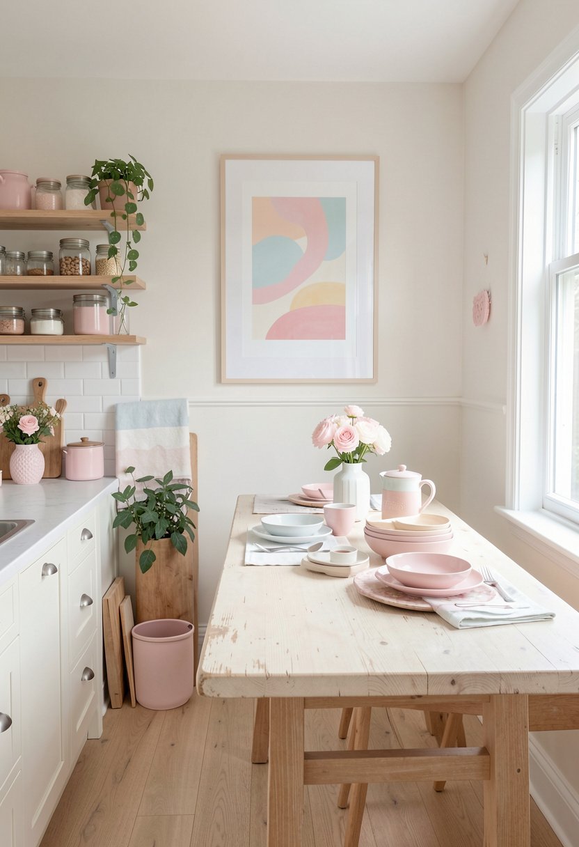
Art is the final step, to making your kitchen feel like a room. A simple, pastel print on the wall, ties everything together. Look for something abstract, with soft brush strokes. It should feel like it belongs, with the other colors in your space. It is the ultimate finish.
Don’t overspend on this. You can find beautiful, digital art online. Print it, and put it in a nice frame. It looks just as good as a gallery piece, but for pennies. The frame is important, so choose something simple, like light oak, to finish the look, and make it feel professional.
This is your chance to show off, your own style. You don’t have to follow trends, just pick what you love. It turns your kitchen into a home, rather than just a place to cook. If you need kitchen wall decor, this is the best way to go. It makes every meal, feel a little nicer.
- Print art from online files.
- Use simple wood frames only.
- Match colors to your scheme.
- Keep the frame modern style.
Final Thoughts
I hope you feel ready to paint, buy, and style your way to the kitchen of your dreams. Pastel colors are not just for kids. They are for anyone who wants a home that feels light, happy, and truly beautiful. Trust your taste, stop worrying about what everyone else thinks, and just go for it. You have all the tools you need, and you have got this.
| Idea | Style | Best For |
|---|---|---|
| Mint Paint | Cabinets | Lower storage |
| Pink Stools | Velvet | Island seating |
| Yellow Lights | Pendant | Task lighting |
| Lavender Towels | Linen | Oven handles |
| Blue Shelves | Open | Display storage |
| Peach Vase | Ceramic | Centerpiece |
| Cream Rug | Washable | Floor comfort |
| Pink Hardware | Matte | Cabinet doors |
| Sage Curtains | Light | Kitchen window |
| Cream Box | Enamel | Bread storage |
| Aqua Bowls | Ceramic | Mixing tasks |
| Gray Board | Stone | Serving food |
| Lilac Pots | Clay | Growing herbs |
| Pastel Art | Framed | Wall decor |
| Soft Decor | Various | Room finish |
Frequently Asked Questions
Is It Hard to Keep Pastel Cabinets Clean?
It is not hard, but you must choose a good paint finish. Always use a satin or semi-gloss paint. These are much easier to wipe down, than a flat finish. A quick wipe with a damp cloth, will keep them looking fresh, and beautiful, for years.
Can I Mix Too Many Pastel Colors Together?
You can, if you are not careful. Pick one main pastel, and use two others, as your accents. If you use every color at once, it will look like a toy store. Keep it simple, and use white or gray, to break up the color.
Are Pastel Colors Going Out of Style?
Pastels are classic, especially in kitchens. People have used soft colors for decades, because they make a room feel calm, and airy. If you stick to muted, dusty shades, they will never look dated. Avoid the bright, neon versions, to keep things timeless.
Do I Need to Paint My Whole Kitchen?
You absolutely do not. Start small. A few pastel bowls, or some new hardware, can change the whole vibe. See how you like it, before you commit to painting cabinets or walls. Decor is all about what makes you feel good.
Does Pastel Decor Look Good with Dark Floors?
Yes, it looks amazing. The contrast between light, soft colors, and dark floors, makes the room feel very custom. The darkness of the floor, grounds the airy pastels, and makes the whole space feel sophisticated, and very intentional.
Should I Use Pastel Colors in a Small Kitchen?
Pastels are actually perfect for small kitchens. Because they are light, they help the room feel bigger, and more open. Avoid using too much dark decor, which can make a small room feel tight. Keep it bright, and keep it clean.
Will Pastel Hardware Chip Over Time?
If you buy high quality metal hardware, it will be very durable. The finish is usually baked on, so it resists chipping. Avoid the cheapest options you find online. If you spend a little more, you get a much better product.
Can I Mix Pastel with Wood Tones?
Wood and pastel look wonderful together. The natural texture of the wood, warms up the soft colors. It makes the room feel like a home, instead of a sterile shop. Think of light oak, or pine, paired with mint or sage.