As an Amazon Associate, I earn from qualifying purchases at no extra cost to you.
14 Greige Kitchen Cabinet Ideas (Nobody Talks About)
 ByRayan

During my last renovation, I realized that picking a color for kitchen cabinets is a total nightmare. Most people stare at paint chips until they go blind, and honestly, they usually pick something that looks like a sad hospital room.
You are probably tired of seeing pure white or dark charcoal everywhere you look. It is exhausting, and quite frankly, it lacks any real personality or warmth. Greige is the secret weapon you need to fix this mess right now.
We are going to explore 14 greige kitchen cabinet ideas that actually work in real houses. These picks will change your space, save your sanity, and stop you from making a huge, expensive mistake that you will regret forever.
Use Warm Greige with Brass Hardware
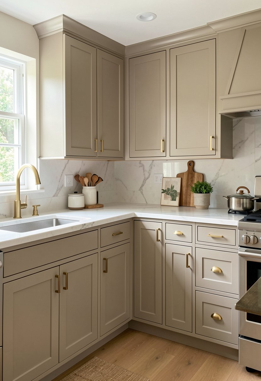
Everyone acts like brushed nickel is the only choice for cabinets, but that is just plain boring. Warm greige needs a bit of gold or brass to really wake it up, and honestly, the contrast looks expensive.
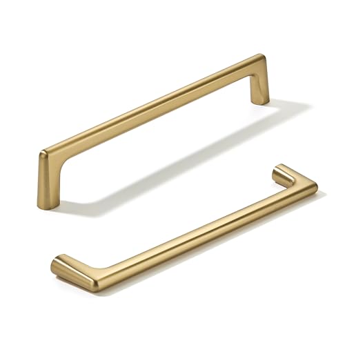
I tried this in my own kitchen, and the difference was night and day. The brass pulls pull out the yellow undertones, while the cabinet paint keeps everything feeling calm and very grounded. It is a classic look, but people often get the finish wrong.
Go for a brushed brass, not that shiny, fake gold stuff from the eighties. You want it to look aged and soft, not like a cheap trophy on a shelf. It makes the whole kitchen feel like a high-end designer space, even if you did the painting yourself on a random Saturday afternoon.
- Choose a warm greige base.
- Pick brushed brass for hardware.
- Avoid shiny fake gold finishes.
- Focus on soft, aged metal looks.
Mix Greige with Dark Wood Accents
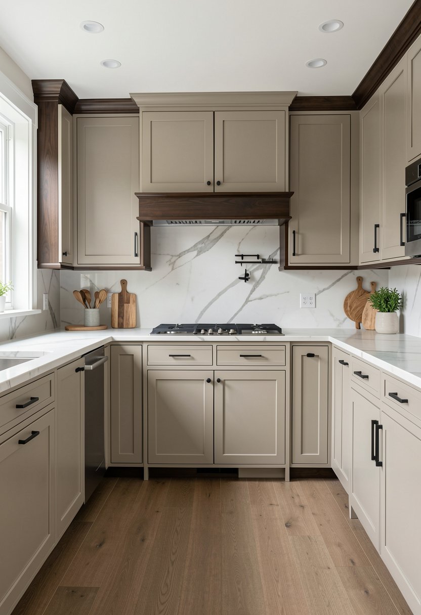
People love to paint everything one color, but that is a rookie mistake. Adding a wood element to your greige setup brings in texture, and honestly, it prevents the room from feeling like a dull, flat box.
I once saw a kitchen where the island was a rich walnut, and the cabinets were a soft greige. It was magic, and it felt like a hug the moment you walked in. You need that natural grain to ground the paint color.
If you have a pantry, try a wood door, or maybe add some open shelves made of real oak. Just stay away from that orange, fake wood laminate stuff. It looks awful against greige, and you will hate it within a week. Real wood, even just a little bit, makes the gray and beige look intentional, sophisticated, and perfectly styled.
- Add real wood for texture.
- Avoid cheap orange faux wood.
- Use wood for open shelves.
- Balance paint with natural grain.

Go with Matte Finishes for Depth
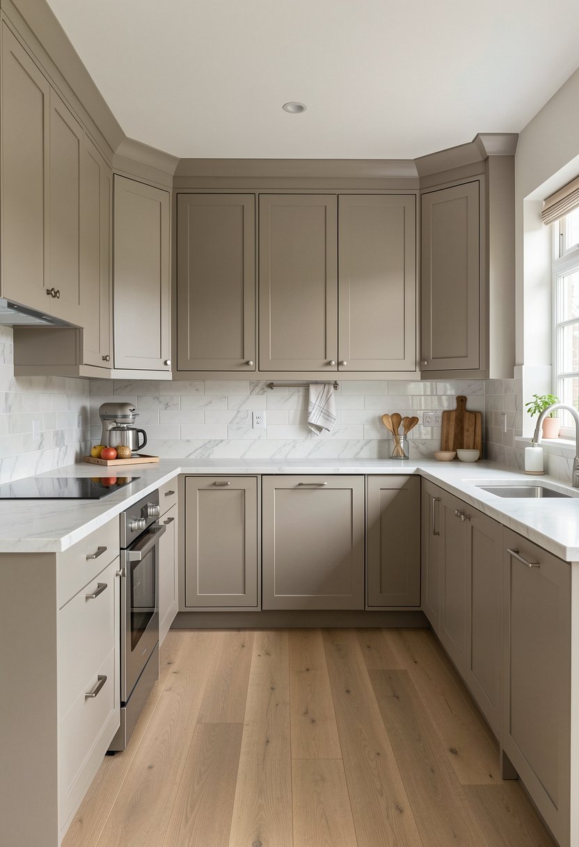
Shiny cabinets are a disaster waiting to happen. You can see every single fingerprint, splash, and smudge from a mile away. I switched to a flat, matte finish years ago, and I have never looked back since that day.
Matte greige feels soft, smooth, and very modern, without being cold or sterile. It hides imperfections in the cabinet doors, which is a lifesaver if you are painting old, beat-up cupboards. It is the best way to get a clean look.
Some people worry about cleaning matte paint, but honestly, it is not that hard. Just use a soft cloth and a little bit of mild soap, and you are good to go. Stop worrying about the shine, and start focusing on how the light hits that beautiful, velvety surface.
- Choose a flat, matte finish.
- Hide cabinet flaws with paint.
- Ignore the fear of cleaning.
- Use a damp cloth, gently.

Pair Greige with Dark Slate Floors
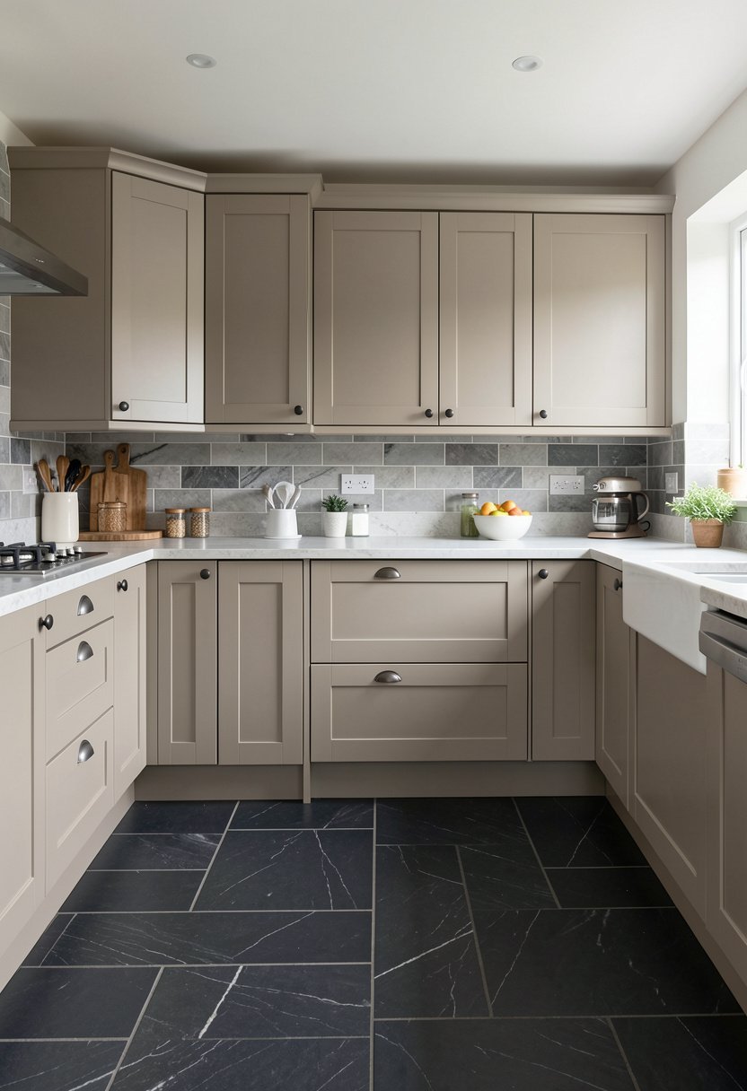
If your cabinets are greige, you need to be careful with the floor. Many people match the floor color to the cabinets, and the whole room ends up looking like a giant, blurry cloud. It is a big design fail.
I suggest a dark slate or a deep charcoal tile floor to anchor the room. The dark floor makes the greige cabinets pop, and it creates a nice contrast that feels balanced. It is grounded, simple, and very easy to live with every day.
You do not want a busy pattern on the floor either. Keep it solid or very subtle, so the kitchen stays calm. A dark floor handles dirt better than a light one, which is just practical life advice from someone who cooks way too much.
- Anchor rooms with dark floors.
- Avoid matching floors to cabinets.
- Keep patterns simple and subtle.
- Choose slate for easy cleaning.

Add Glass Fronts to Break Things Up
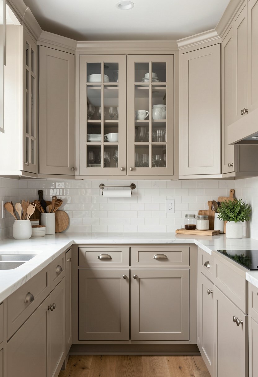
Rows of solid doors can look really heavy, especially in a smaller kitchen. I tell everyone to swap a few panels for glass, because it adds lightness and a spot to display your favorite dishes. It changes the mood instantly.
Glass fronts allow you to see the color inside, which adds depth to the greige palette. You can even add small lights inside to make it feel fancy. It is a small trick, but it makes a massive impact on the room.
Just remember to keep the inside tidy if you use clear glass. If you are a messy person, like me sometimes, use frosted or reeded glass. It hides the chaos, keeps the look clean, and still gives you that open, airy feel without any of the stress.
- Swap panels for clear glass.
- Use light to add depth.
- Try reeded glass for mess.
- Keep your dish display clean.

Highlight Greige with Black Accents
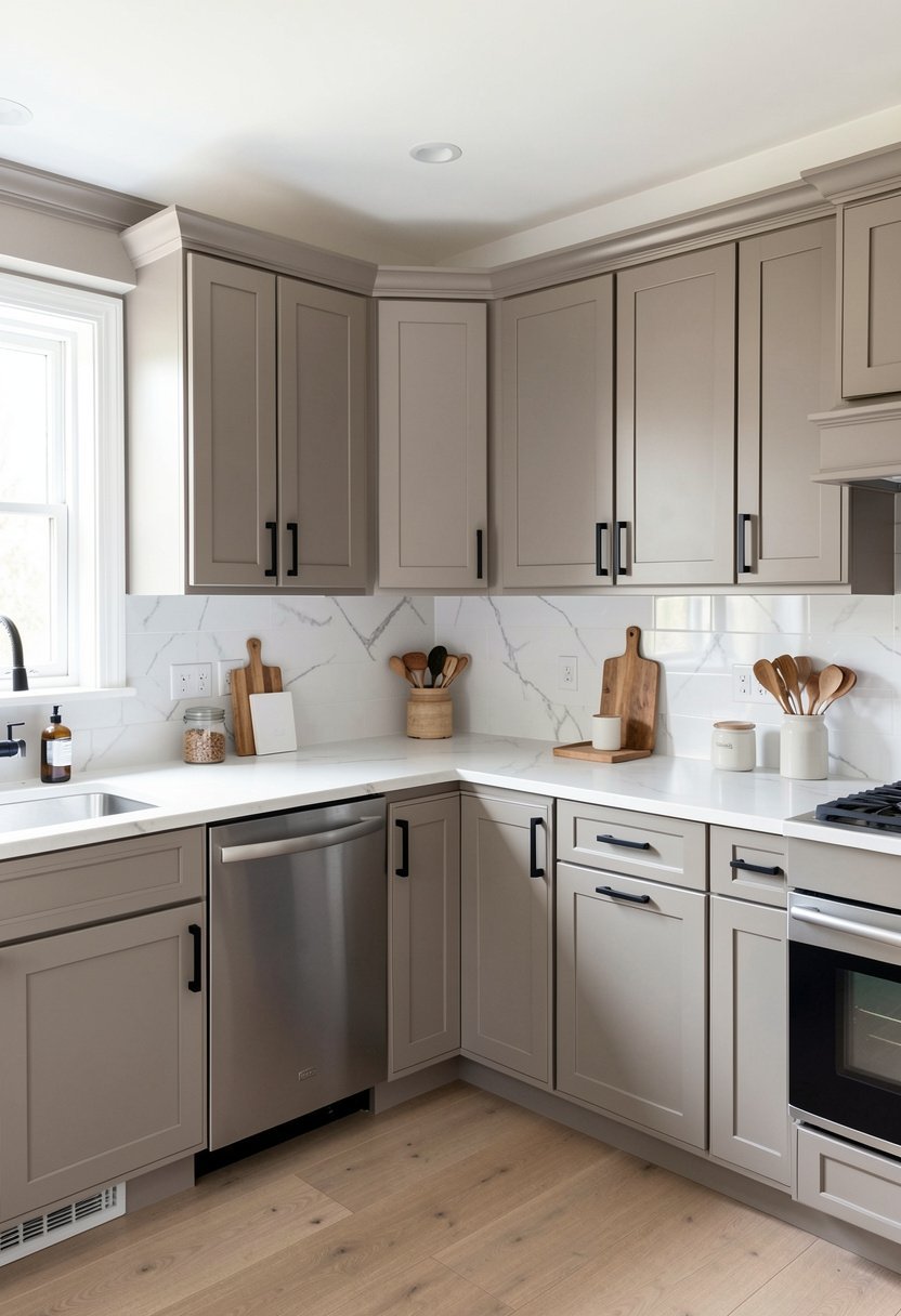
Black and greige are like best friends who never argue. A little touch of black, maybe in the faucet or the light fixtures, makes the greige look crisp and very intentional. It gives the space a nice, sharp edge.
I love a black metal faucet against a greige backsplash. It is a tiny detail, but it catches the eye and pulls the whole design together. You do not need much, just a few well-placed hits of black throughout the room.
Avoid putting black everywhere, or it will look too moody and dark. You want just enough to define the edges of your kitchen. Think of it like eyeliner for your room, just enough to make things look defined, clean, and totally finished.
- Use black for sharp edges.
- Choose black metal faucets.
- Don’t overdo the dark tones.
- Balance greige with black accents.

Choose a Greige with Green Undertones
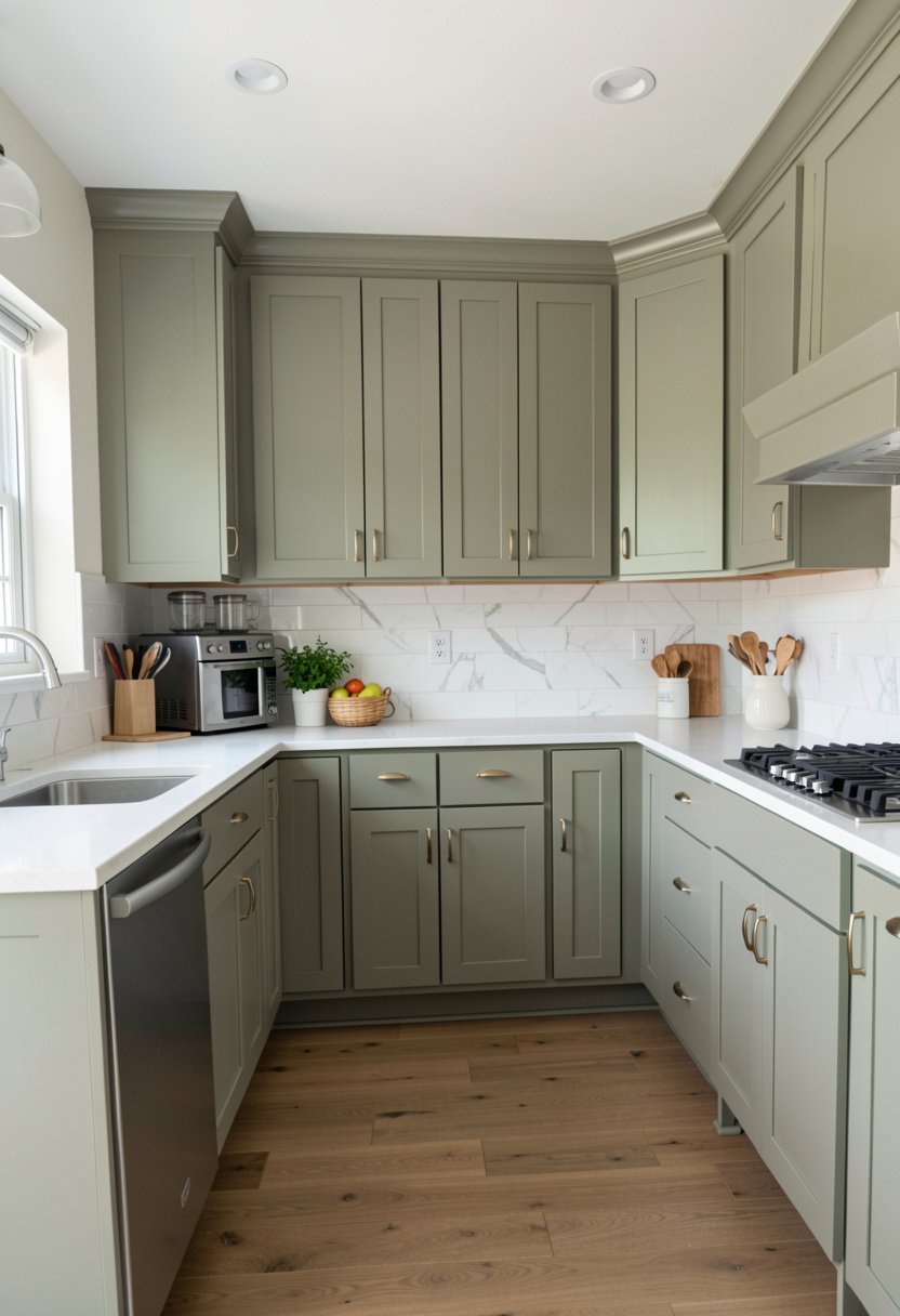
Not all greige is the same, and that is where most people get tripped up. Some look like straight-up purple in the morning light, which is just gross. I always look for a greige that has a slight green tint.
That green hint makes the color feel earthy, organic, and very calm. It works beautifully with plants, natural light, and wood tones. It feels like you brought a bit of the outside into your home, which is never a bad thing.
Always, and I mean always, paint a sample on your wall first. Watch how it changes throughout the day. If it starts looking like a bruise, throw that sample away and pick another one. Trust your eyes, not the marketing photo on the can.
- Test for green undertones first.
- Avoid purple-tinted gray colors.
- Look for earthy, organic vibes.
- Paint samples before committing fully.

Keep Backsplashes Simple and Clean
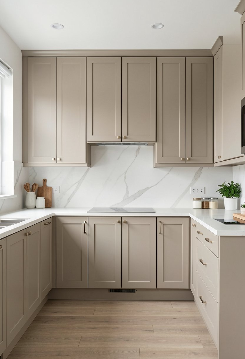
Your cabinets are the star, so do not clutter them with a crazy, busy backsplash. I see people putting in loud mosaic tiles all the time, and it makes my brain hurt. Keep it simple and let the greige shine.
A plain white subway tile or a large format slab of quartz works perfectly. It keeps the kitchen feeling bright and open. You want the backsplash to support the design, not scream for attention from across the room.
If you must add some interest, use a textured tile in a neutral color. It adds character without being too much. Save your personality for the art or the rugs. Your walls should be the quiet background that lets your life happen.
- Avoid loud, busy tile patterns.
- Use white for classic looks.
- Choose large quartz slab backsplashes.
- Focus on textures over patterns.

Use Lighting to Change the Mood
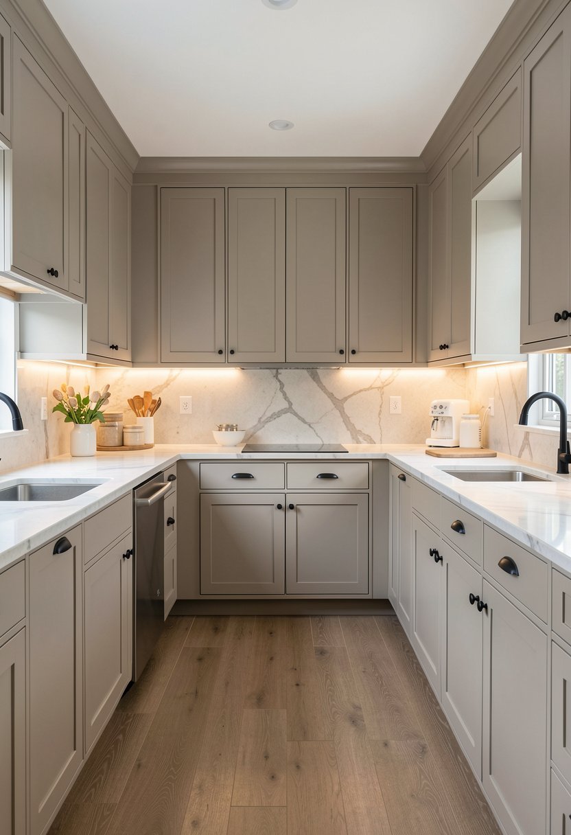
Greige can look a bit dull at night if your lighting is bad. You need layers of light to make your cabinets look warm and inviting after the sun goes down. Do not just rely on one overhead light.
I installed under-cabinet lights, and it was the best money I ever spent. It makes the greige look soft and high-end, and it gives me enough light to actually see what I am chopping. It is a total game changer.
Also, think about your pendant lights over the island. Go for something with a bit of texture or a fun shape. If the room is neutral, your lights are the perfect place to show off your style and add a punch.
- Layer light for evening warmth.
- Install under-cabinet light strips.
- Choose statement pendant light fixtures.
- Avoid only using overhead lights.

Add a Custom Range Hood Cover
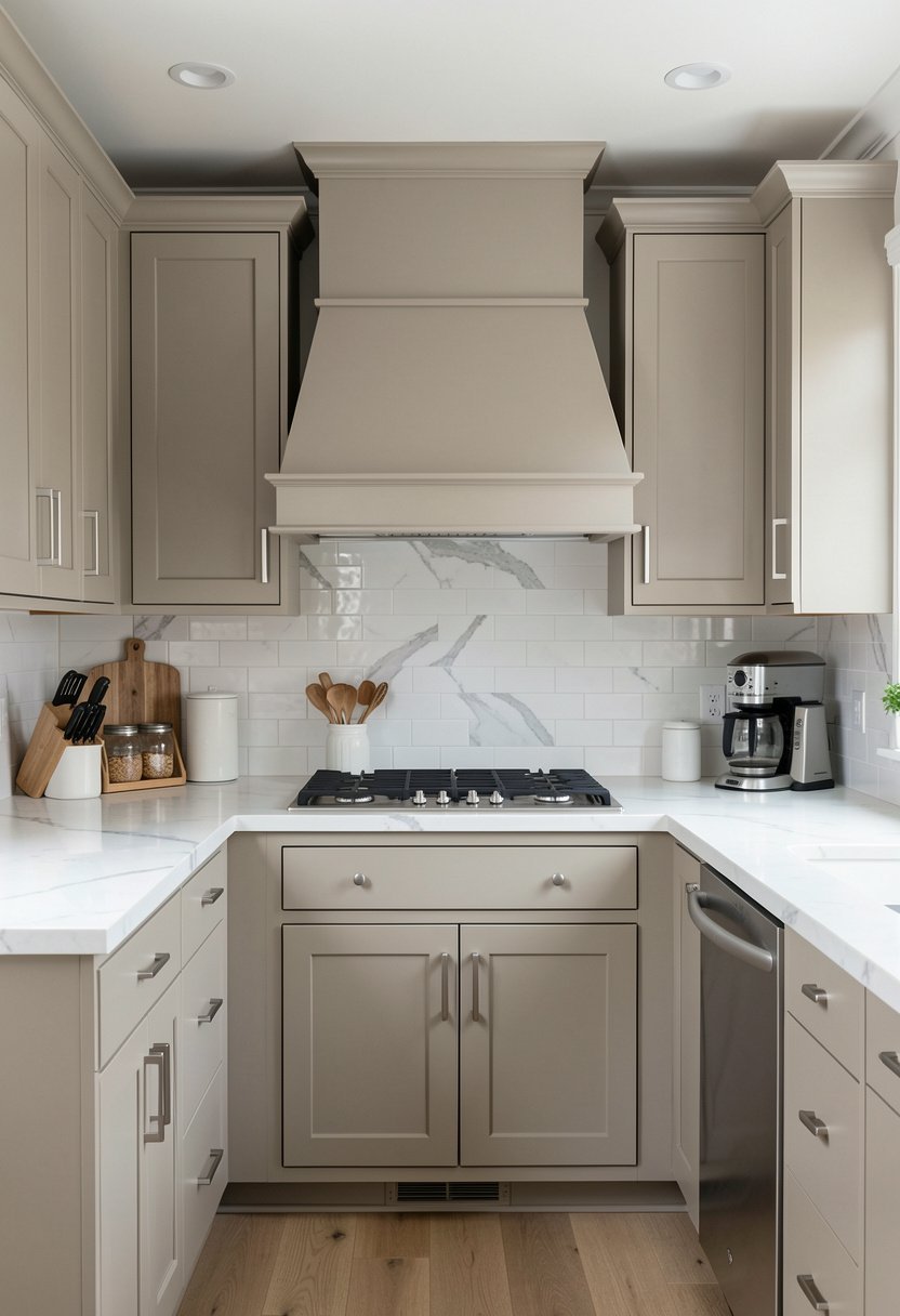
Most range hoods are just big metal boxes that stick out like a sore thumb. Why not wrap it in wood or paint it to match your greige cabinets? It hides the eyesore and makes the kitchen look custom built.
I did this in my last house, and it instantly made the room look like it cost twice as much. It creates a focal point that feels seamless and very professional. It pulls the design together in a way you just cannot ignore.
You can do a simple shape or something more dramatic. Just make sure it does not block the airflow too much. It is a high-impact project that makes a massive difference for very little effort and money.
- Match hood covers to cabinets.
- Hide ugly metal hood boxes.
- Create a smooth visual focal.
- Focus on clean, custom lines.

Paint the Trim to Match
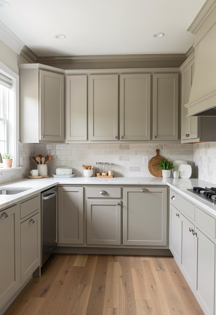
People get obsessed with white trim, but it can make your greige cabinets look dirty if the colors clash. Try painting the baseboards and trim the same greige as the cabinets. It creates a sleek, modern, and very seamless look.
It makes the kitchen feel bigger, too. When you take away the contrast of the white trim, the room feels like one continuous, cozy space. It is a bold move that most people are scared to try, but it works every time.
If you have crown molding, paint that too. It creates a really sophisticated finish that feels like a high-end designer did the work. It is a small detail, but it takes your kitchen from basic to truly special.
- Use same color for trim.
- Avoid clashing white trim colors.
- Create seamless, modern space vibes.
- Paint molding for finish quality.

Install Open Shelving Above Counters
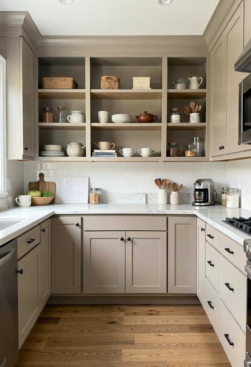
Upper cabinets can feel claustrophobic, especially if you have a smaller kitchen layout. I love ditching a section of uppers and putting up some thick, sturdy open shelves instead. It makes the greige feel airy and very accessible.
You can paint the walls behind the shelves the same greige for a uniform look. It makes your dishes look like decor, which is great if you have pretty plates. It forces you to keep things organized, which is a nice bonus.
Just be realistic about your habits. If you hate dusting, maybe keep the glass cabinets instead. But for the look alone, nothing beats the open feel of shelves. It breaks up the wall of color perfectly.
- Ditch upper cabinets for shelves.
- Keep the look very airy.
- Organize dishes as home decor.
- Check your dusting habits first.

Use Leather Pulls for Softness
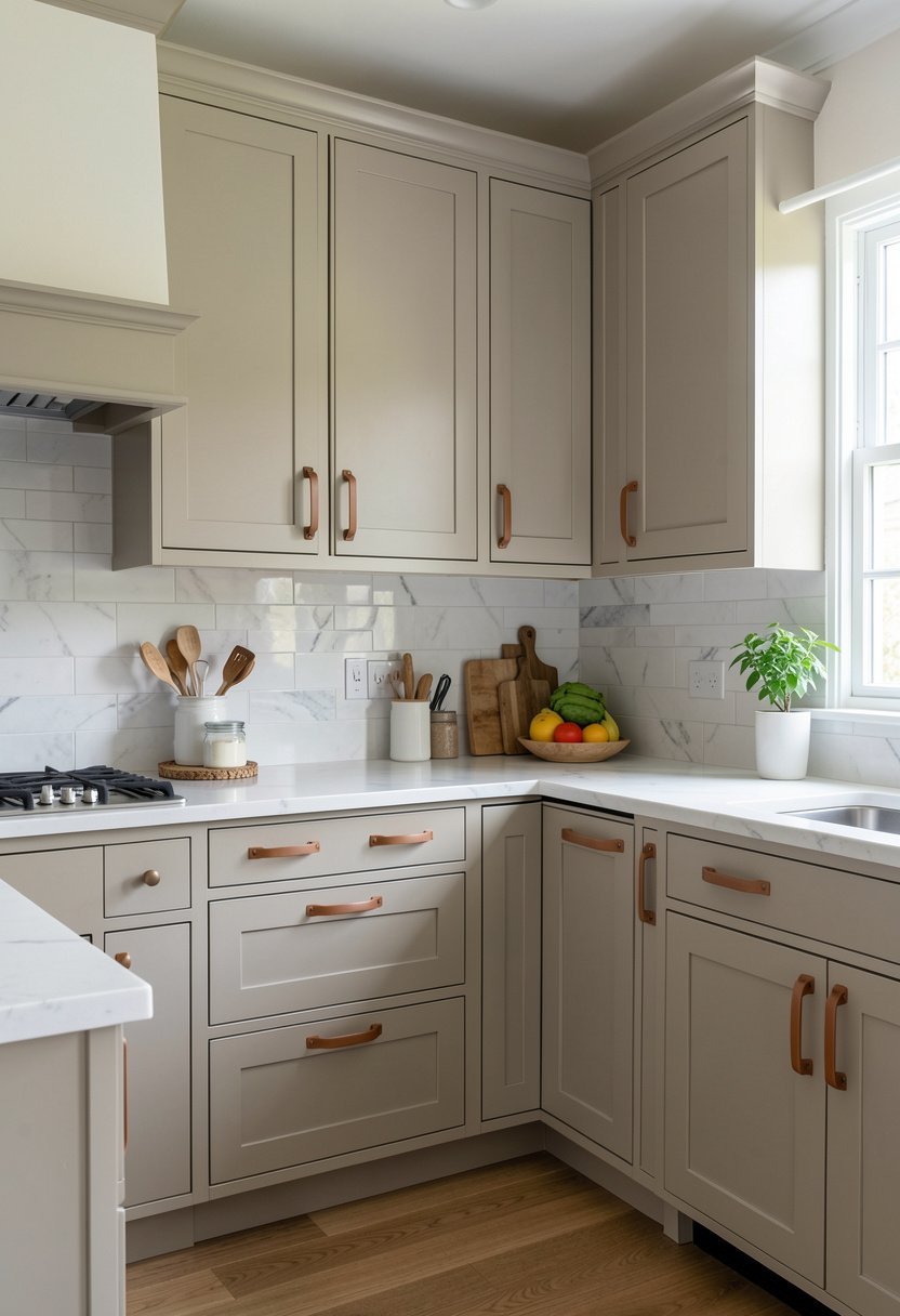
If metal hardware feels too hard, try leather pulls. They feel soft to the touch, and they age beautifully over time. Against greige cabinets, they look rustic, warm, and very unique. It is a texture that people rarely think of.
I used tan leather pulls, and they added just the right amount of warmth to my kitchen. They look great with the greige paint, and they are super easy to change if you ever decide you want a new look later.
Make sure to get good quality leather that will not stretch out too much. Cheap stuff will just look like a sad, floppy mess in a month. Invest in the good stuff, and it will last you for years.
- Try leather for soft texture.
- Age adds to the charm.
- Choose quality for long wear.
- Keep style rustic and warm.

Add a Large Island in Contrast
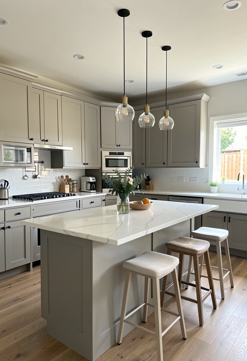
Since you are going with greige cabinets, use the island as a place for a darker, bolder color. A deep blue or a dark forest green island looks stunning against a kitchen full of greige. It is a fantastic way to add life.
The greige keeps the kitchen from feeling too heavy, while the island gives it a heartbeat. It makes the whole space feel like a designer project that was carefully thought out. It is better than doing the whole kitchen in one color.
Don’t go too crazy with the island shape. Keep it functional and clean. The color is the statement, so let the lines stay simple. It is a balancing act, but when you get it right, it looks totally amazing.
- Use bold island paint colors.
- Contrast blue with greige tones.
- Keep island shapes very functional.
- Balance color with neutral cabinets.

Final Thoughts
I hope you feel ready to tackle your kitchen now. Picking the right shade of greige is a game changer for any home. Just remember to test your colors, avoid the shiny finishes, and trust your gut when you pick your hardware. Do not be afraid to break those boring design rules you see online. Your kitchen should feel like you, so keep it simple, stay confident, and you’ve got this.
| Area | Best Choice | Why It Works |
|---|---|---|
| Cabinet Paint | Matte Greige | Hides flaws and smudges |
| Hardware | Brushed Brass | Adds needed warmth |
| Flooring | Dark Slate | Grounds the entire look |
| Lighting | Under Cabinet | Adds depth and mood |
| Trim | Matching Greige | Makes room look larger |
| Island | Dark Accent | Creates a focal point |
| Shelving | Open Wood | Adds natural texture |
| Faucet | Matte Black | Provides sharp contrast |
| Hood | Custom Cover | Hides metal eyesores |
| Backsplash | Quartz Slab | Clean and very simple |
| Glass | Reeded Glass | Hides kitchen clutter |
| Pulls | Leather | Adds soft, rustic touch |
| Walls | Light Greige | Keeps everything airy |
| Ceiling | Bright White | Opens up the space |
| Decor | Green Plants | Refreshes the color palette |
Frequently Asked Questions
Is Greige a Warm or a Cool Color?
Greige is a perfect mix of gray and beige. It is usually considered a warm neutral because it avoids the icy, harsh feeling of pure gray. However, the tone depends heavily on the specific paint you choose. Always test it at home.
Can I Paint My Own Kitchen Cabinets Successfully?
You can, but you must be patient. Preparation is the secret. You have to clean, sand, and prime properly. If you skip these steps, the paint will peel off in a month. Use high-quality paint made for cabinets to get the best finish.
Are Greige Cabinets Going to Go Out of Style?
Greige is a classic choice that will stay around for a long time. Unlike trendy bright colors, it acts as a neutral background for your life. It is safe, sophisticated, and easy to update with just new hardware or different decor accents.
Do Greige Cabinets Look Good with White Countertops?
They look amazing together. The contrast between the soft greige and crisp white quartz or marble is stunning. It makes the space feel bright and clean while still keeping that cozy, warm feeling that pure white kitchens sometimes lack in design.
Should I Choose a Glossy Finish for Cabinets?
I advise against it. Glossy paint highlights every single bump, scratch, and fingerprint on your doors. Matte or satin finishes are much better at hiding daily wear. They also look more modern and provide a high-end, velvety texture to your cabinets.
Does Lighting Affect the Way Greige Looks?
Lighting changes everything. In morning sun, a greige might look cool and gray. By evening with artificial light, it might look very beige and warm. You must observe your sample paint color in your specific kitchen before buying a big bucket.
Will Dark Hardware Look Too Heavy On Greige?
Not at all. Dark hardware, like matte black, creates a nice frame for your cabinets. It adds a modern edge that keeps the greige from feeling too soft or washed out. Just balance it with other dark accents in the kitchen space.
Can I Mix Wood Tones with My Greige Cabinets?
Mixing wood with greige is one of the best ways to make a kitchen feel homey. The natural grain adds warmth and character that paint alone cannot provide. Just avoid orange-toned woods, as they can make the greige look dirty or dated.