As an Amazon Associate, I earn from qualifying purchases at no extra cost to you.
10 Green Painted Kitchen Cabinet Ideas (That Look Cozy and Nice)
 ByRayan

Someone told me once that kitchen cabinets have to be white, and I honestly laughed in their face. It is such a boring, tired rule that everyone just blindly follows, like sheep. If you want a home that actually feels like you live there, you need color, and green is the king of kitchen colors.
People struggle so much with this because they fear the dark, or they pick a shade that looks like a hospital room. It is a shame, really, because a good green can change your whole life. You do not need to be a pro to get this right, you just need to listen to someone who has spilled enough paint to know better.
In this guide, I will show you exactly how to pull off 10 green painted kitchen cabinet ideas that will make your neighbors jealous. We are going to talk about shades, finishes, and the little secrets that keep a kitchen from looking like a sad, messy forest project. Get ready to finally ditch that plain white paint.
1. Deep Forest Green with Gold Hardware
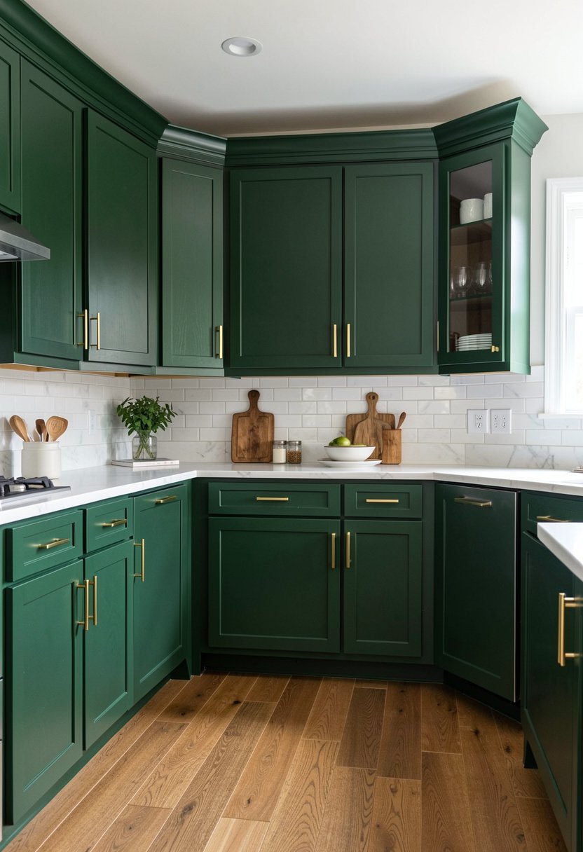
Dark greens are bold, but they are also incredibly cozy if you balance them right. I love a deep forest green because it feels like a warm hug, especially when the sun hits it in the morning. People often paint their cabinets this dark shade and then pair it with silver, which is a massive mistake. Silver just dies against the richness of the green, and it makes everything feel cold, sterile, and sad.
You need gold, or at least a warm brass, to make those cabinets pop. The gold reflects the light, and it gives the room a fancy, expensive vibe, even if you bought your paint at the local hardware store. Just be sure to pick a finish that is not too shiny, as a flat or satin look is always better for high traffic areas.
If you have a small kitchen, do not be scared of the dark color. It actually creates depth, and it makes the walls feel like they are receding, which is a neat trick to keep the room from feeling tiny. Just keep your ceiling white, add some under cabinet lighting, and you will have the most luxurious kitchen on the block. Stop playing it safe, and just go for the drama.
- Forest green adds serious luxury.
- Gold hardware provides essential warmth.
- Avoid cold silver metal finishes.
- Keep ceilings bright for contrast.

2. Sage Green with White Countertops
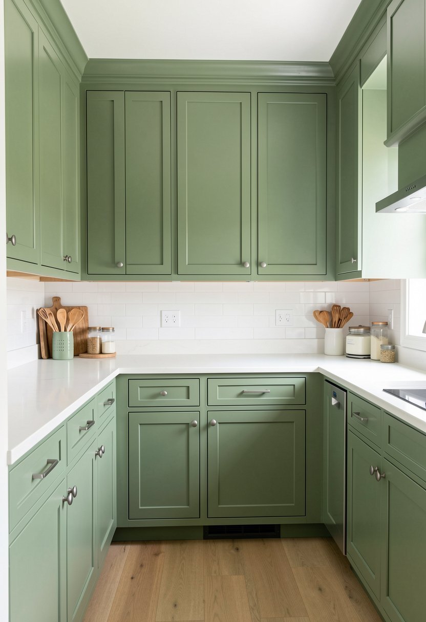
Sage is the entry drug for people who are scared of bold colors, but it is still a fantastic choice. It is soft, it is light, and it is almost impossible to mess up. I have seen people pick greens that look like literal swamp water, but sage is different because it has that beautiful grey undertone. It calms the room down, and it makes you want to hang out with a cup of tea.
When you use a soft sage, you need to pair it with something clean like a white or light grey countertop. If you go with a busy, dark granite, the sage gets lost, and the whole kitchen looks like a chaotic mess. You want the cabinets to be the star, so let the counters be the quiet background dancers. It is a simple balance, but it works every single time.
This look is perfect if you like farmhouse style decor because it feels airy, natural, and incredibly welcoming. You can go with a matte finish here, and it will hide fingerprints better than a glossy one ever could. It is a low stress color, and it stays looking fresh for years, unlike those trendy, bright colors that you will end up hating after three months.
- Sage offers a soft, calm look.
- White counters keep things bright.
- Grey undertones make color matching easier.
- Matte finishes hide daily kitchen messes.
3. Olive Green with Open Shelving
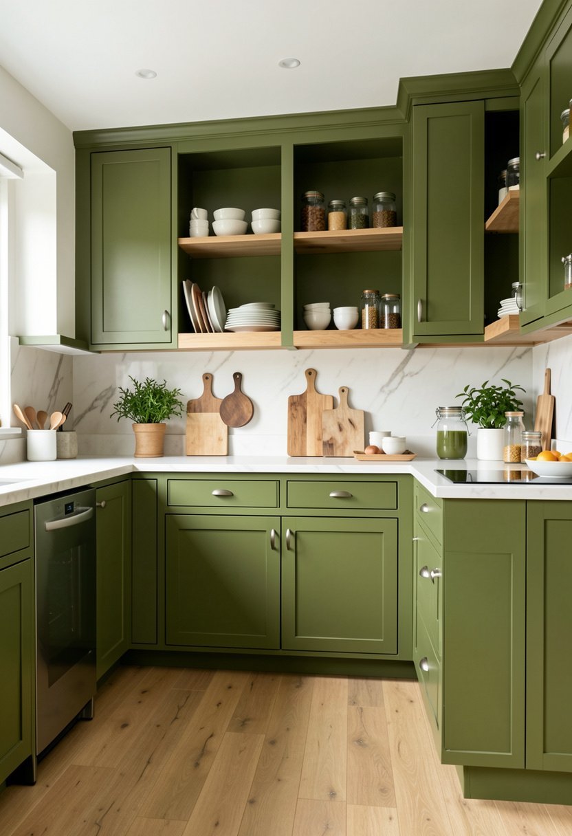
Olive green is the color of nature, and it brings a bit of the outside into your house. Most people think olive looks dusty or old, but they are clearly picking the wrong shade. You want an olive that leans more towards a rich, earthy yellow base rather than a murky, brown sludge. It is sophisticated, it is grounded, and it feels like a kitchen that actually gets used for cooking.
Pairing olive cabinets with open shelving is a total game changer for the room. The shelves break up the heavy green, and they let you show off your favorite plates or mugs. If you have solid upper cabinets everywhere, it can feel like a heavy wall of green is closing in on you. The shelves fix that problem by adding air and space to the layout.
You should try to use light wood for those shelves, as the natural grain looks incredible against the olive paint. It is a warm, organic mix that makes a kitchen feel like a custom job. Do not go overboard with the decor on the shelves, though, because clutter will kill the cozy vibe instantly. Keep it clean, keep it simple, and enjoy the beautiful result.
- Olive green feels very earthy.
- Open shelving prevents visual heaviness.
- Light wood grains complement olive tones.
- Avoid cluttering your display shelves.

4. Mint Green with Retro Handles
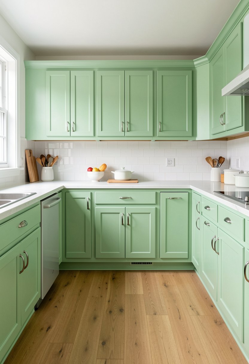
If you want a fun kitchen, mint green is the way to go. It feels like a throwback to the fifties, and it always puts a smile on my face. People get nervous about mint because they think it looks like a baby nursery, but that only happens if you pair it with the wrong stuff. You need some edge to keep it from feeling like a kindergarten classroom.
Throw on some chrome or polished nickel retro handles to give the cabinets some real personality. These handles are usually heavy, and they have that classic curve that looks amazing on a flat cabinet door. It is a sharp, clean look that makes the green feel like a intentional design choice rather than a random paint job. It is cheerful, it is bright, and it is very hard to stay grumpy in a mint kitchen.
This color works best in a space that gets a lot of natural light, as it can look a bit washed out in a dark corner. If your kitchen is dim, add a backsplash design with some pearly tiles to bounce the light around. It is a bold move, but it is one that pays off if you want a kitchen that feels full of life, energy, and joy.
- Mint green offers retro flair.
- Use chrome handles for contrast.
- Needs bright light to shine.
- Pair with pearly tile backsplash.

5. Emerald Green with Walnut Wood
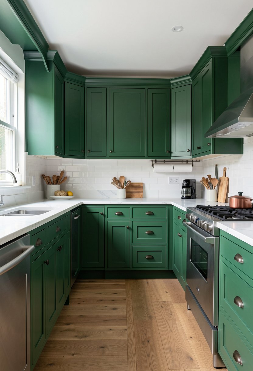
Emerald is the boldest choice you can make, and I absolutely love it for that reason. It is deep, it is moody, and it looks like it belongs in a high end mansion. Most people are too chicken to paint their cabinets such a bright, saturated green, but they are missing out. Emerald green looks so expensive, and it makes every other color in your house look dull by comparison.
The secret to making emerald work is to bring in some dark, rich wood tones like walnut. The warmth of the walnut perfectly balances the cool, sharp intensity of the emerald. If you use white counters, it can look a bit like a sports team logo, which is not the vibe you want. Go with a dark, veined stone or a wood top, and watch the whole room transform into a luxury den.
Since the color is so powerful, keep your walls neutral. You do not want to fight with the green, so pick a warm white or a very pale grey for the rest of the space. Add some pendant lighting ideas above the island to really draw the eye up. It is a high-fashion look that will make your kitchen the highlight of your entire house.
- Emerald is bold and moody.
- Walnut wood warms up green.
- Avoid overly bright white countertops.
- Keep walls neutral for balance.

6. Moss Green with Butcher Block
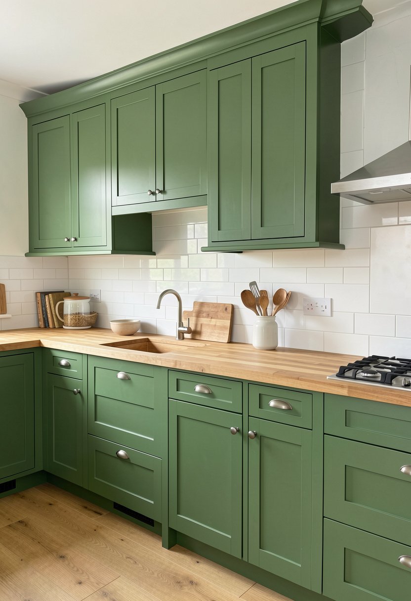
Moss green is a bit more muted than emerald, and it has this lovely, organic feel to it. It is the color of a quiet forest, and it is perfect for anyone who wants a kitchen that feels calm and grounded. I see people make the mistake of using a high gloss finish on moss, which is a disaster because it makes the color look like plastic. Use a flat or eggshell finish instead.
You should definitely pair moss cabinets with a thick, wooden butcher block countertop. The wood and the green are a match made in heaven because they both come from nature. The texture of the wood makes the green feel softer, and it adds a bit of rustic charm that is hard to find with modern stone tops. It is durable, it is warm, and it makes you want to start baking bread immediately.
Since this look is so natural, keep your hardware simple. A matte black pull works wonders here because it blends in without stealing the show. It is a humble, beautiful style that feels like it has been there forever. If you want a kitchen that feels like a quiet escape from the busy world, this is the winning combination every single time.
- Moss is calm and organic.
- Flat finishes suit this shade.
- Butcher block creates natural warmth.
- Matte black hardware stays subtle.

7. Seafoam Green with Shaker Doors
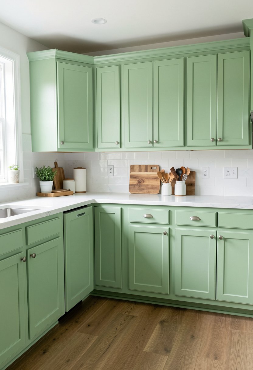
Seafoam is a lighter, blue-tinted green that feels like a vacation. It is incredibly refreshing, and it works so well if you have a kitchen that flows into a living area. Some people think it is too summery, but I think a little bit of summer is exactly what we need in the middle of winter. It keeps the space feeling light, airy, and very clean, which is what we all want.
You have to use shaker style cabinet doors if you pick seafoam. The simple, clean lines of the shaker style prevent the color from looking too busy or fussy. It keeps everything neat, and it lets the soft color do all the talking. If you have arched doors or lots of carving, the seafoam will just look like a messy, dated choice from the nineties. Keep the doors flat.
This is a great chance to use some brass kitchen faucets to add a touch of warmth. The gold and the seafoam look like a classic mix of sun and water. It is a very friendly, approachable look that makes guests feel welcome the second they walk through the door. If you want a kitchen that feels like a happy, breezy day, then this is your best bet.
- Seafoam offers a refreshing feel.
- Shaker doors keep lines clean.
- Avoid busy cabinet door designs.
- Brass faucets add warm contrast.

8. Teal Green with Modern Accents
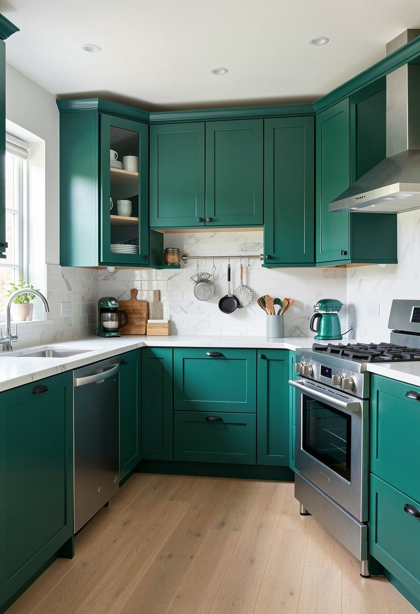
Teal is that perfect middle ground between blue and green, and it is a powerhouse of a color. It is sophisticated, it is energetic, and it looks amazing in a modern home. Many people get scared of teal because they think it will make the room feel like a nightclub. That only happens if you use the wrong lighting or too many bright accent colors, so keep it focused.
To keep it modern, go with flat panel doors and hidden hinges. You want a seamless look that highlights the intensity of the teal. Do not add busy patterns or crazy tile work, because the cabinets are already the main event. A plain, white quartz countertop works perfectly here because it acts as a neutral frame for the teal, and it stops the room from feeling like a dark cave.
Try adding some pendant lights with a clean, industrial look to emphasize the modern vibe. Since teal is so strong, it does not need a lot of extra decor, so you can actually save money by keeping the accessories to a minimum. It is a brave choice, but when you get it right, it looks like a million bucks. Trust the color, and keep the rest simple.
- Teal is energetic and modern.
- Use flat panel cabinet doors.
- White quartz keeps it balanced.
- Minimize accessories for better impact.

9. Celadon Green with Brass Knobs
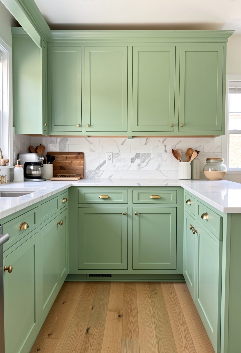
Celadon is a pale, delicate green that feels like it belongs in a high end spa. It is very soft, almost ethereal, and it brings a sense of peace to a busy kitchen. A lot of people ignore this shade because they think it is too light, and it will just fade into the background. But that is exactly why it is so good for small spaces or kitchens with low light.
You absolutely need brass knobs here. The bright, shiny metal makes the celadon look intentional and chic, rather than just a pale, boring paint. A little brass adds a pop of warmth that keeps the room from feeling chilly. I have seen this paired with marble counters, and it is honestly one of the prettiest looks I have ever seen. It feels timeless, elegant, and very easy to live with.
If you are worried about making a mistake, start here. Celadon is very forgiving, and it is easy to coordinate with almost any flooring or wall color. It does not demand attention, but it rewards you with a kitchen that feels soft, clean, and incredibly inviting. You do not need a massive budget to pull this off, just a good eye for color and a bit of patience.
- Celadon feels soft and elegant.
- Brass knobs provide necessary warmth.
- Pairs perfectly with marble counters.
- Very forgiving for beginners.

10. Sage and Dark Green Two-Tone
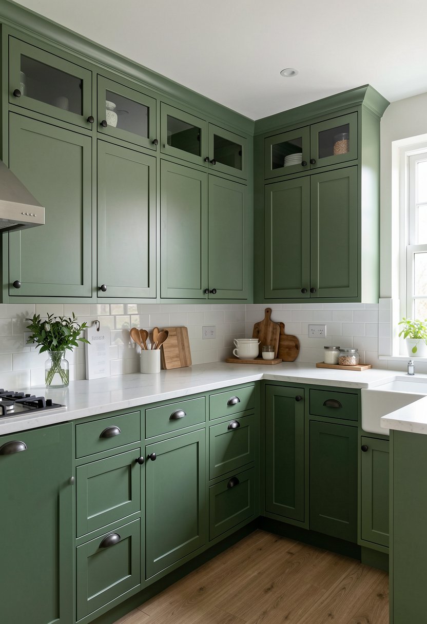
If you cannot decide between a light green and a dark green, why not just use both? I have done this in a few projects, and it is a fantastic way to add dimension to a flat wall of cabinets. Paint your lower cabinets the darker forest green, and use the lighter sage for the upper cabinets. It keeps the heavy color grounded at the bottom and leaves the top feeling light.
It is a clever trick because it makes the room feel taller and more open. Most people make the mistake of using the same color everywhere, which can flatten a room, but a two-tone layout adds depth and style. Just make sure the undertones of the greens are similar, so they look like they belong in the same family. If one is too blue and one is too yellow, the whole thing will look messy.
Add some kitchen organization ideas like hidden spice racks to keep the look clean, because a two-tone kitchen is already doing a lot of work visually. You do not want extra junk sitting on the counters to ruin the effect. It is a professional move that shows you know what you are doing, and it turns your kitchen into a real design feature of your house. You have got this.
- Two-tone adds great depth.
- Dark lowers ground the space.
- Lighter uppers keep it airy.
- Match your undertones for consistency.

Final Thoughts
I hope you feel ready to grab a brush and change your kitchen for the better. Green is a bold move, but it is one that makes a home feel like a real home. Stop waiting for the perfect moment, and just start with a small sample of paint. You have got the skills to make this happen, and I promise you will love the change, you have got this.
| Green Idea | Best Hardware | Best Countertop |
|---|---|---|
| Forest Green | Gold Brass | White Quartz |
| Sage Green | Matte Black | Light Grey |
| Olive Green | Antique Brass | Wood Block |
| Mint Green | Chrome Retro | White Tile |
| Emerald Green | Polished Gold | Dark Stone |
| Moss Green | Matte Black | Butcher Block |
| Seafoam Green | Brushed Brass | White Quartz |
| Teal Green | Brushed Nickel | White Quartz |
| Celadon Green | Polished Brass | Marble |
| Two-Tone Green | Brass Knobs | Neutral Solid |
| Dark Green | Gold Brass | White Marble |
| Sage Green | Brushed Steel | Light Granite |
| Olive Green | Copper | Butcher Block |
| Mint Green | Silver Retro | White Quartz |
| Emerald Green | Gold Brass | Dark Granite |
Frequently Asked Questions
Is It Hard to Paint Kitchen Cabinets Green?
It is not hard, but it does take time and patience. You have to prep the surfaces perfectly by sanding and priming, or the paint will peel off in a month. Many people skip the prep work and blame the paint, but they are the ones who made the mistake.
Can I Mix Two Green Shades in My Kitchen?
You can absolutely mix them, and it actually looks very professional if you do it right. Use a darker shade for the base cabinets and a lighter shade for the top. This trick adds height to the room and keeps the space from feeling too dark.
Are Green Cabinets Going Out of Style Soon?
Green is a classic, earthy color that has been around for centuries, so it is not a passing trend. Unlike neon colors or weird patterns, green works with almost any style. If you pick a natural, muted shade, your kitchen will look great for many years.
Do Green Cabinets Make a Kitchen Look Small?
They do not make it look small if you balance the color with the right light. If you have a small room, use a lighter green like sage or celadon. Pair it with white counters and plenty of light to keep the area feeling open and very airy.
Does Green Paint Look Good with Dark Wood Floors?
Green and wood are a perfect match because they are both natural elements. A deep forest green looks incredible against a dark walnut floor, while a lighter sage looks great with oak. It is a timeless combination that feels very cozy and very welcoming.
Should I Choose a Glossy Finish for Green Cabinets?
I would avoid a high gloss finish because it can look like plastic. A satin or eggshell finish is much better for kitchen cabinets. It hides small imperfections and fingerprints while still being easy to clean when things get a bit messy in the kitchen.
Will Dark Green Cabinets Show Too Much Dust?
Any dark color will show dust more than a light color would. If you are worried about cleaning, stick to a medium shade like sage or moss. If you love the dark look, just plan to wipe the cabinets down with a damp cloth every now and then.
Does Green Paint Work Well for Small Kitchens?
Green is fantastic for small kitchens if you choose the right shade. Avoid the very dark colors unless you have a ton of natural light. Use a pale, soft green to reflect light and make the walls feel like they are moving further away from you.