As an Amazon Associate, I earn from qualifying purchases at no extra cost to you.
10 Beige Kitchen Cabinet Ideas (That Feel Calm Fast)
 ByRayan

As we start talking about kitchens, I need to tell you something. Most people pick white because they are scared to mess up. That is a mistake, because white is cold and boring, like a hospital room. You need soul in your home.
I have seen so many kitchens that feel empty, or sad, because of bad color choices. You want a space that holds you, not one that ignores you. Beige is the answer, but people always get the tone wrong. They pick yellow, or orange, and it looks like cheap plastic from a dusty attic.
You are going to learn how to pick the right shade, how to style your wood, and how to make 10 beige kitchen cabinet ideas work for you. Let us get your kitchen right, finally, without all the usual headache.
1. the Warm Sand Tone
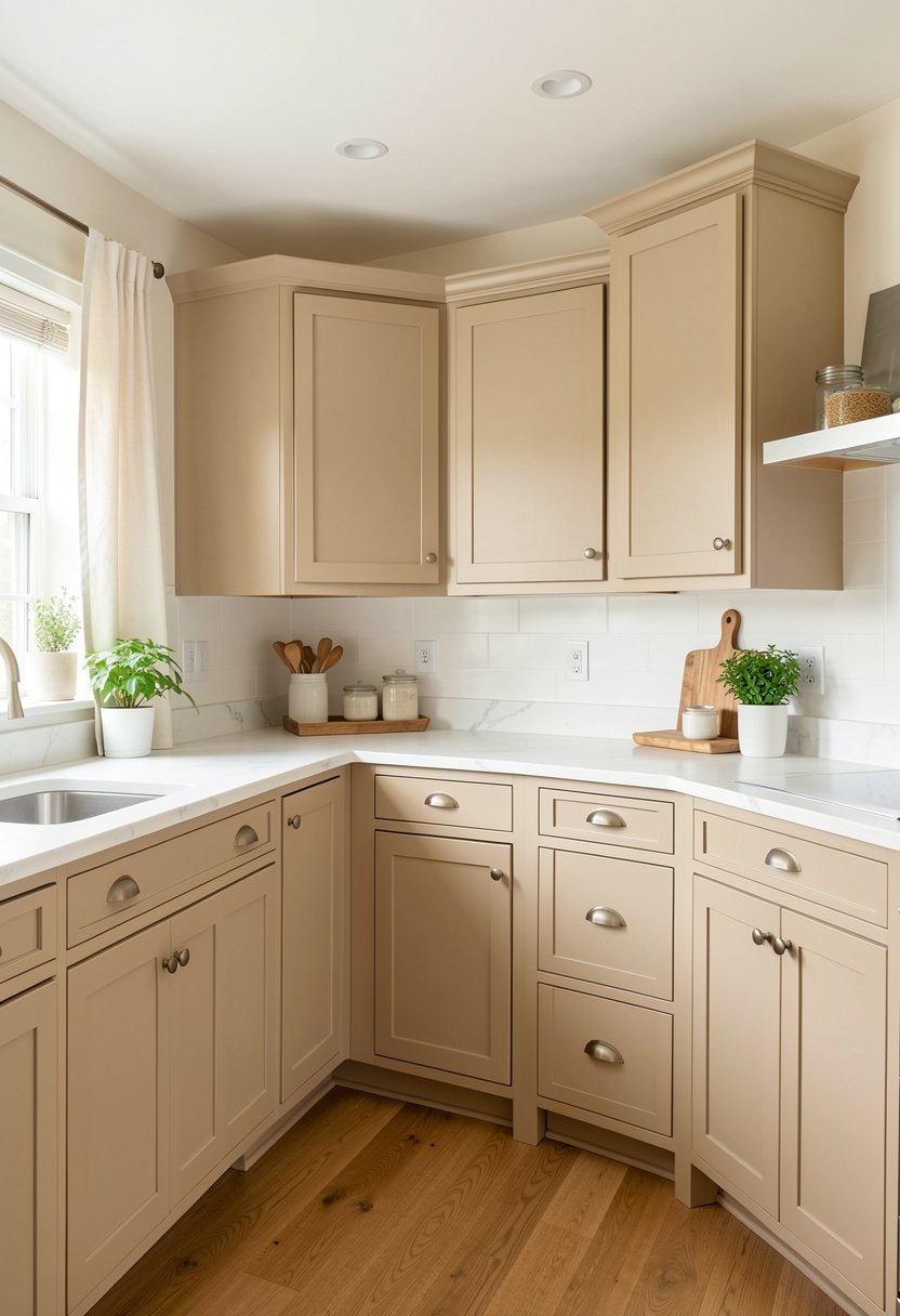
Warm sand is the safest, and most cozy, way to start. It is not yellow, and it is not gray, it is just soft. I used this in my first house, and I never got sick of it. It glows when the sun hits it, which is pure magic. Forget those trendy dark blues, they look messy in a year.
You should pair this with white walls, and maybe some light wood floors. It keeps the room airy, while feeling like a warm hug. If you have a small kitchen, this is your secret weapon. Most people choose cabinets that are too heavy, but this shade stays light. It is easy to live with, and it hides dust better than a stark white finish ever could. Stop overthinking it, and just go with this classic, soft look today.
- Use warm sand for small spaces.
- Pair with light wood floors.
- Avoid dark blue trends.
- Choose matte paint finishes.
2. the Grayish Earth Hue
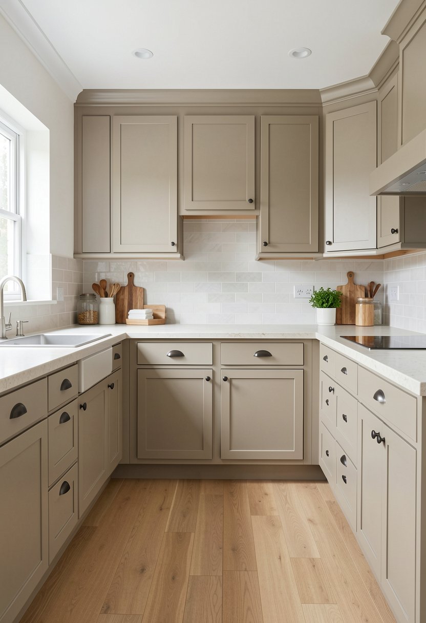
Some people call this greige, but I just call it smart. It bridges the gap between modern and comfy, which is a hard trick to pull off. I put this in my friend's place, and she stopped complaining about her dark kitchen instantly. It looks expensive, even if you buy cheap boxes from a store.
Most people mess this up by picking a shade that is too dark, or too muddy. You want a balance, something that looks clean but feels solid. This tone loves brass handles, and it looks killer with a dark floor. Do not listen to people who say you need black cabinets to be bold. This color is the real boss of the room. It lets your fancy lighting shine, instead of fighting for the spotlight. Stay simple, keep it sharp, and enjoy the result.
- Go with greige for balance.
- Use brass cabinet hardware.
- Avoid muddy dark shades.
- Match with dark flooring.

3. the Creamy Butter Shade
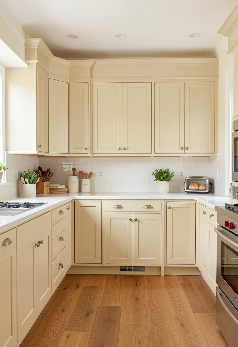
Creamy butter is for people who love a cottage vibe. It is sweet, but not fake, and it feels like a sunny morning. I have seen this in old houses, and it just works every time. It is warm, and it makes people want to sit down and have coffee.
If you have butcher block counters, this color is your best friend. They look like they were made for each other. People try to match their appliances to cold metal, but you should let the cabinets carry the weight. A creamy kitchen feels inviting, which is the whole point of a home. Do not go for bright yellow, that is a recipe for a headache. Stick to this soft, buttery tone, and your kitchen will feel like a warm, happy place.
- Choose cream for cottage vibes.
- Match with butcher block.
- Avoid bright neon yellow.
- Focus on warm lighting.

4. the Deep Toasted Beige
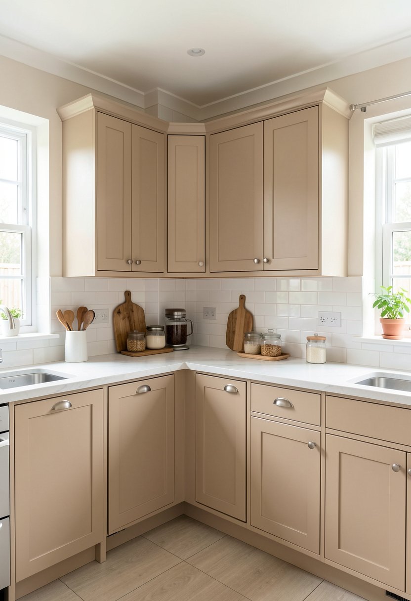
Deep beige is for those who want a bit of mood. It is not quite brown, but it has a lot of depth. I used this in a kitchen with big windows, and it looked like a million bucks. It is bold, but it stays grounded and quiet.
Most people are too scared to use color, so they pick white. That is boring. You should pick a tone that makes your backsplash tiles pop. Deep beige makes white plates look bright, and it makes gold hardware shine. It is a classy move that shows you know what you are doing. Avoid picking a shade that looks like chocolate, that is too heavy for cabinets. This is the perfect middle ground for a home that feels grown up and calm.
- Use deep beige for depth.
- Let backsplash tiles stand out.
- Pick gold cabinet knobs.
- Avoid dark brown shades.
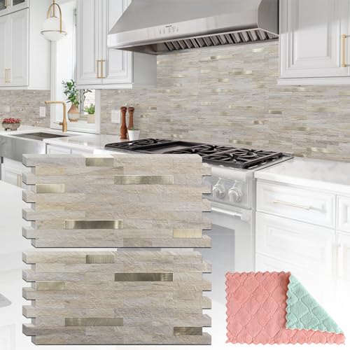
5. the Light Linen Look
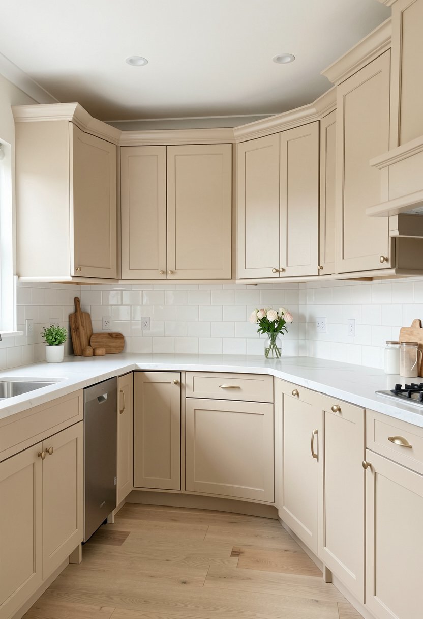
Linen is light, airy, and very clean. It feels like a fresh shirt on a summer day. I love this for modern homes that need a touch of life. It is not as harsh as pure white, but it still keeps things bright.
People often make their kitchen look like a lab. That is a bad look. Linen softens the edges of your room, and it makes your pendant lights look like art. You should use this if you want to hang some open shelving. It gives you a calm base that lets your plates and bowls look like decor. Do not worry about it being too plain. It is the perfect blank canvas for your style to shine through. Keep your walls a bit darker to make the cabinets glow.
- Use linen for modern airiness.
- Pair with open shelving.
- Highlight your pendant lights.
- Keep wall paint darker.
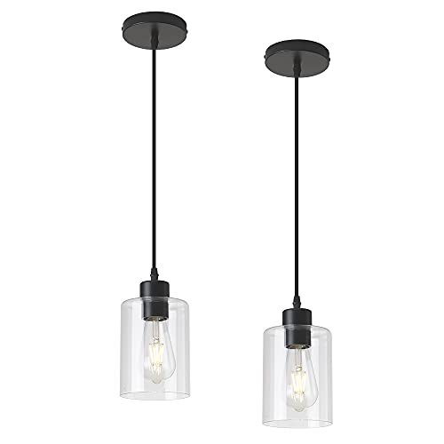
6. the Earthy Stone Beige
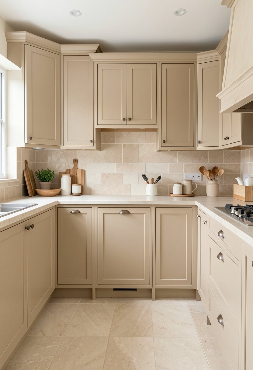
Stone beige has a bit of brown in it. It feels solid, like it has been there forever. I recommend this if you want a kitchen that feels traditional. It is not trendy, so you will not need to paint it again next year.
Most people waste money on cabinets that go out of style fast. That is a rookie move. Stone beige is a classic choice that looks great with natural stone counters. It feels organic, and it brings the outside in. Do not use high-gloss paint here. You want a flat, matte finish to keep it looking real and heavy. This color is for the person who wants a kitchen that lasts for ten years, not just until the season ends. It is reliable, sturdy, and honestly, just gorgeous.
- Go with stone for longevity.
- Use natural stone counters.
- Pick a matte finish.
- Avoid high gloss paint.

7. the Soft Oat Shade
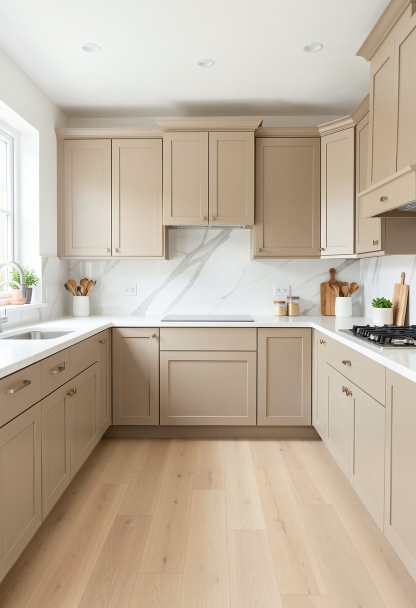
Oat is the best neutral. It is not too pink, and not too gray. It is just right. I have used this in many homes, and everyone loves it. It feels like a hug when you walk in the room.
People love to mix too many colors in their kitchen. Do not be that person. Use oat for your cabinets, and maybe a soft green for your accessories. It keeps the space calm, which is what we all want. Do not use dark granite countertops with this. You want something light to keep the flow going. This shade is subtle, but it has enough character to make a room feel special. It is a win, every single time, without question.
- Use oat as a neutral.
- Mix with soft green decor.
- Avoid dark granite counters.
- Keep the flow light.
8. the Dusty Almond Tone
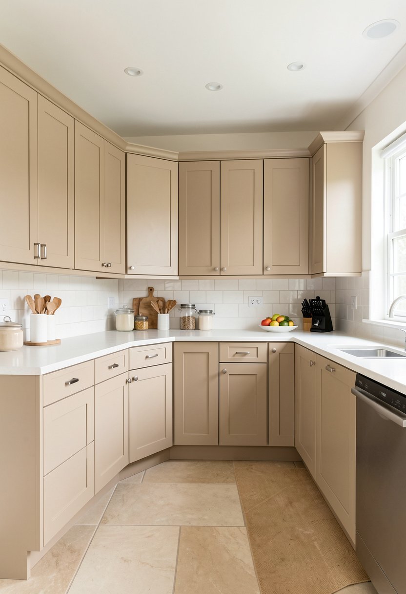
Almond has a tiny bit of red in it. It makes a room feel warm, even on a rainy day. I used this when I lived in a place with no sun. It really changed the feel of the whole house.
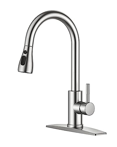
People often ignore the undertones in their paint. Then they wonder why it looks weird next to their floor. Check your sample in the morning, and at night, to see how the light changes it. You will see that almond stays warm in every light. Pair it with brushed nickel faucets for a clean, modern look. Do not use this with cold, blue-gray walls, it will look like a mistake. Keep the rest of your palette warm to get the best result.
- Choose almond for warmth.
- Match with brushed nickel.
- Check paint in all light.
- Avoid blue-gray wall colors.
9. the Pale Tan Finish
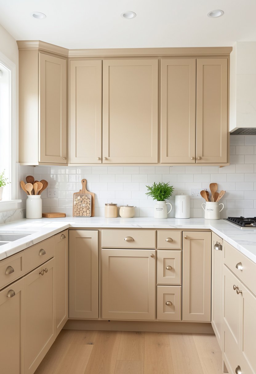
Pale tan is a very soft brown. It looks great in a kitchen with lots of plants. I love how it makes the green leaves pop. It is very natural and easy on the eyes.
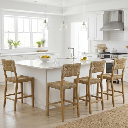
Most people overcomplicate their design. They think they need fancy patterns or bold colors. You do not. A pale tan kitchen is sophisticated, and it stays out of your way. Use some woven bar stools to bring in texture. It is a simple trick that makes a basic kitchen feel like a high-end home. Do not use black metal with this. Go for brass or wood to keep that organic, soft vibe going. It is a safe, smart, and beautiful way to update your space.
- Use pale tan for nature.
- Add woven bar stools.
- Use wood or brass hardware.
- Avoid black metal accents.
10. the Muted Mushroom Beige
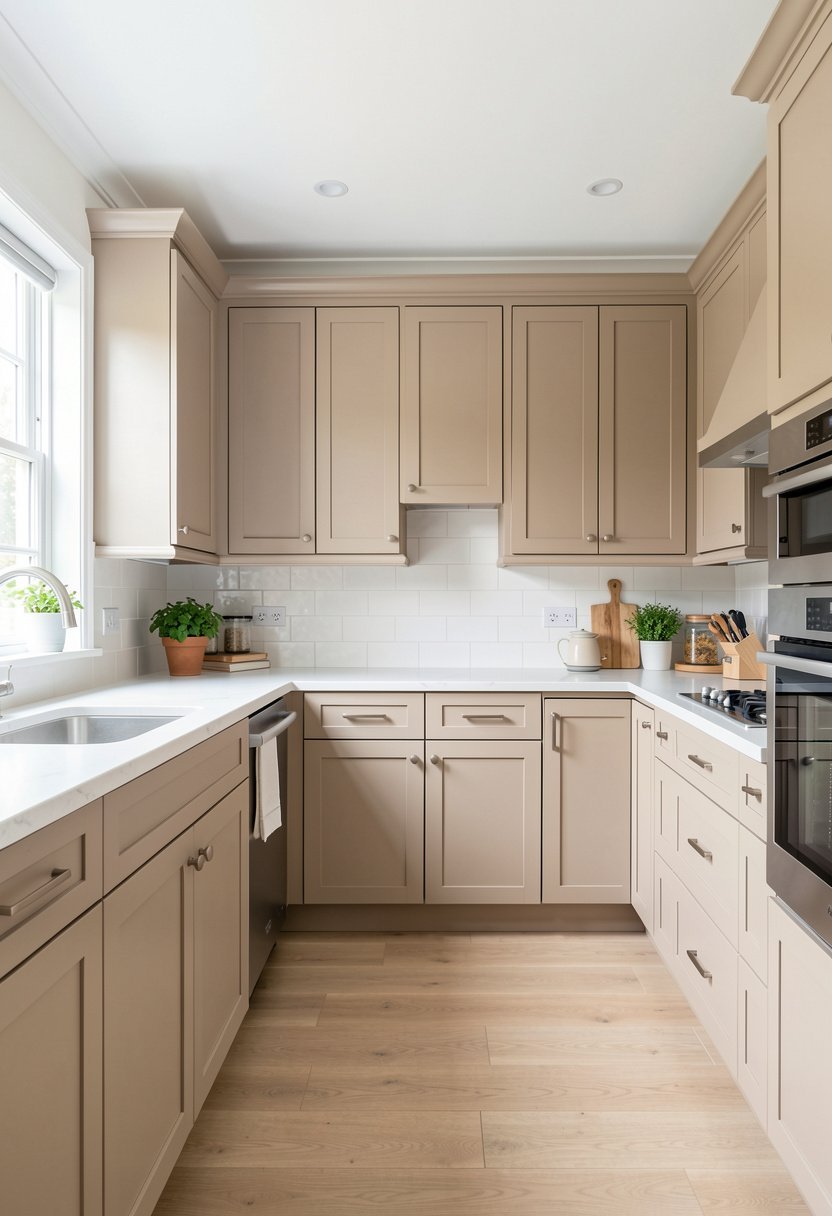
Mushroom is the trend that actually works. It has a bit of gray and a bit of brown. It feels earthy, and it looks very expensive. I put this in a client home, and they loved it.
You can use this with almost anything. It goes great with dark floors, or light floors. It works with white counters, or black ones. Do not be afraid of the dark, this color carries it well. Most people pick a beige that is too thin, so it looks washed out. Mushroom has enough pigment to stand up to your kitchen island, and your busy life. It is the perfect choice for a kitchen that needs a bit of weight, and a lot of calm.
- Choose mushroom for trendiness.
- Works with any floor color.
- Good for busy kitchens.
- Use with a kitchen island.

Final Thoughts
I hope you feel ready to pick your perfect shade. Beige is not boring if you choose the right tone, and stick to your vision. It is the easiest way to make your kitchen feel like a calm home, instead of a cold showroom. Just trust your gut, keep your samples, and go for it. You have got this, and your new kitchen will be worth every second.
| Idea Number | Best Pairing | Ideal Finish |
|---|---|---|
| 1 | Light Wood | Matte |
| 2 | Brass Hardware | Matte |
| 3 | Butcher Block | Satin |
| 4 | Gold Accents | Matte |
| 5 | Open Shelves | Eggshell |
| 6 | Natural Stone | Matte |
| 7 | Soft Green | Eggshell |
| 8 | Brushed Nickel | Satin |
| 9 | Woven Textures | Matte |
| 10 | White Counters | Eggshell |
| 11 | Warm Lighting | Satin |
| 12 | Patterned Rug | Matte |
| 13 | Dark Flooring | Satin |
| 14 | Gold Faucets | Eggshell |
| 15 | Glass Doors | Matte |
Frequently Asked Questions
Is Beige Going to Look Dirty Over Time?
Not if you pick a good, washable paint. High quality paint is a must in a kitchen. Most people blame the color when the problem is cheap, flat paint that grabs every smudge. Choose a satin or eggshell finish that you can wipe down easily.
Can I Mix Two Shades of Beige?
You can, but it is risky. I suggest picking one solid color for all your cabinets first. If you want to mix, keep the shades very close. A two-tone kitchen can look messy if the colors fight each other instead of working together like a team.
Are Beige Cabinets Too Dark for a Small Kitchen?
No, they are actually great. A light beige can feel more spacious than stark white. White can be too sharp and glaring. Beige softens the light, which makes the walls feel a bit further away. It is all about the tone you select.
Do Beige Cabinets Match White Appliances?
Yes, they match just fine. You just need to make sure your beige has a clean, warm undertone. If you pick a beige that is too yellow, your white appliances might look a bit blue or cold. Keep the beige clean and neutral.
Should I Paint My Cabinets Myself?
You should only do it if you have the right tools and patience. Painting cabinets is a huge job, and it takes days. Most people mess it up because they skip the sanding or the primer. If you are not an expert, hire someone.
Does Beige Work in a Modern Home?
It works better than you think. Modern does not have to mean black and white. A clean, matte beige cabinet looks very modern when you pair it with simple, flat hardware and good lighting. It brings much-needed warmth to a sleek space.
Will Beige Cabinets Stay in Style?
They will always be better than the latest bright trend. Beige is a neutral, so it stays relevant for a long time. People get tired of gray, and they get tired of white, but a warm, earthy beige is a classic that ages well.
Can I Paint Over Old Oak Cabinets?
Yes, you can, but you must use a heavy-duty primer. Oak grain shows through paint if you do not prep the wood. If you do the work, the results are stunning. It is a cheap way to change the whole house.